Back to packagingPackaging / Sports nutrition

Ripple Hydration

Electrolyte sticks made for Singapore heat. Zero sugar, five calories and a pack you can spot from across the gym.
Client
Ripple Hydration
Industry
Sports nutrition
Scope
Identity, packaging, digital, merch
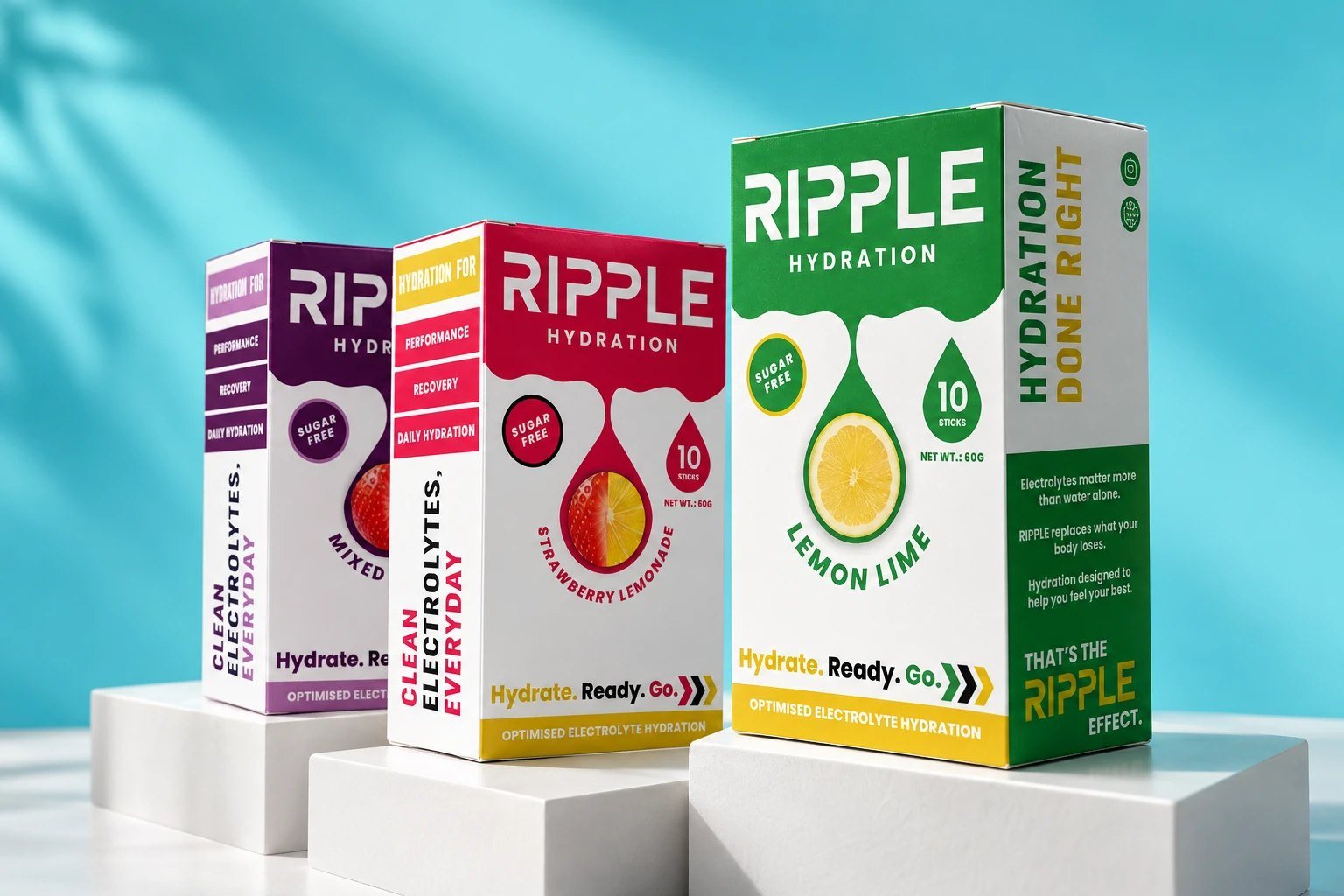
Mixed Berry, Strawberry Lemonade and Lemon Lime boxes on white plinths against a sunlit blue wall
The brief

Hydrate. Ready. Go.

The challenge

A sports hydration brand was competing against established players with generic sachet packaging. It had an 8% repeat rate and no retail distribution.

The insight

Market research showed that major sports drinks already owned familiar visual territories. The open space was premium hydration built around performance and recovery rather than simple thirst.

The approach

RIPPLE combined performance-led positioning with transparent electrolyte information and real athlete stories. Minimal packaging created a more premium feel while keeping the product information clear.

The impact

Repeat customer rate increased from 8% to 31%, online AOV by 38%, and the brand secured its first 24 specialty sports-store placements within six months. Twelve athlete partnerships were also reported.

The takeaway

Sports hydration is about more than the drink. The brand has to communicate the performance identity around it.

Identity

A rounded, heavy wordmark with a splash in the R. The R alone becomes the app icon and favicon. Poppins sets the headlines, Funnel Sans does the reading.
Ripple Hydration wordmark in white on navy
Ripple Hydration wordmark in navy on white
The R monogram and wordmark as favicon and app icon
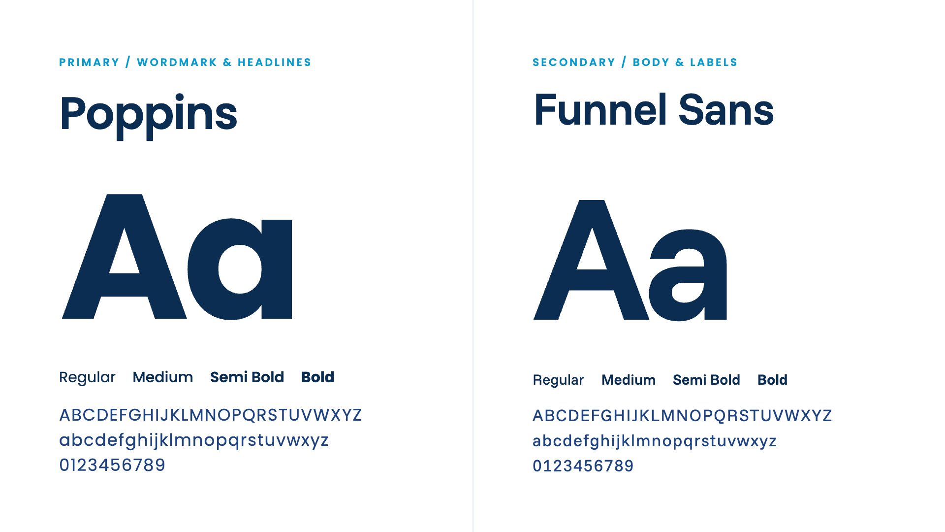
Poppins and Funnel Sans type specimens in navy
Navy#0B2D52
Blue#1F4381
Ocean#069ACE
Sky#29AAE1
Lime#2BA049
Strawberry#E11E57
Berry#551751
Sun#E5C120
Six navy benefit icons for recovery, lab tested, energy, speed, strength and bottle

Stick sachet

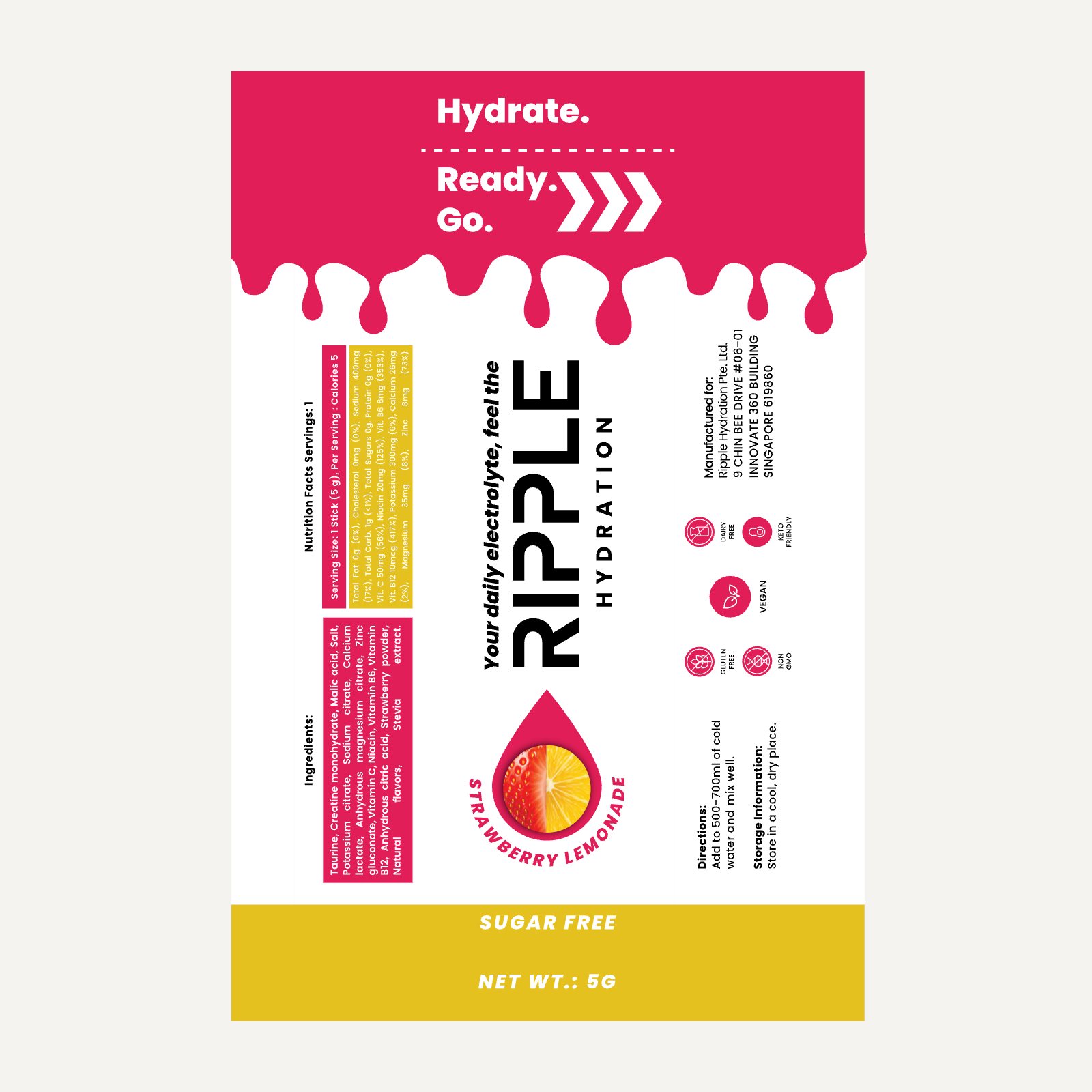
Flat artwork first, then the real thing. The flavour colour drips down from the tear line, the wordmark runs the full length and the back carries ingredients, directions and diet badges.
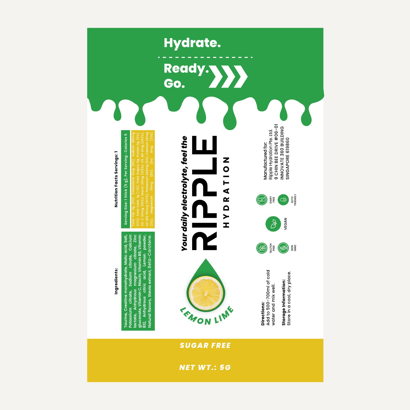
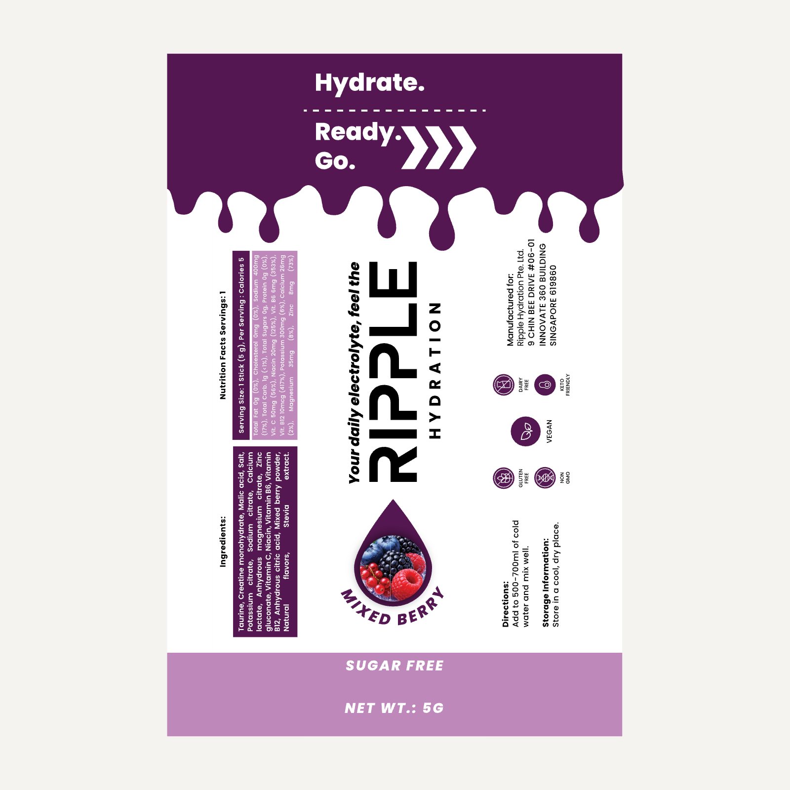
Lemon Lime sachet flat artwork
Mixed Berry sachet flat artwork
Strawberry Lemonade sachet flat artwork
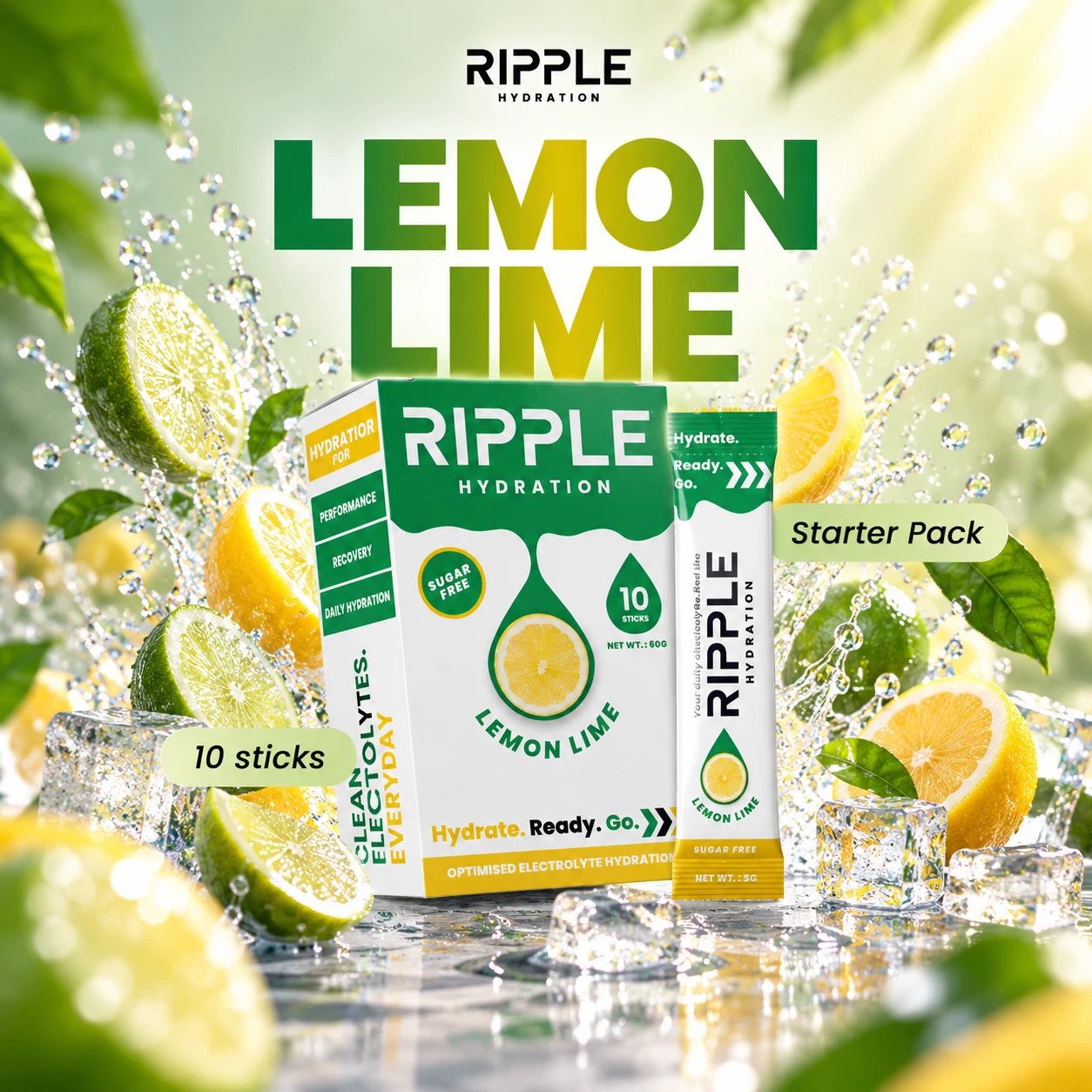
Lemon Lime box and sachet with limes, lemons and ice
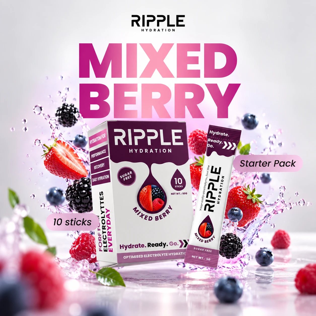
Mixed Berry box and sachet with berries and a splash
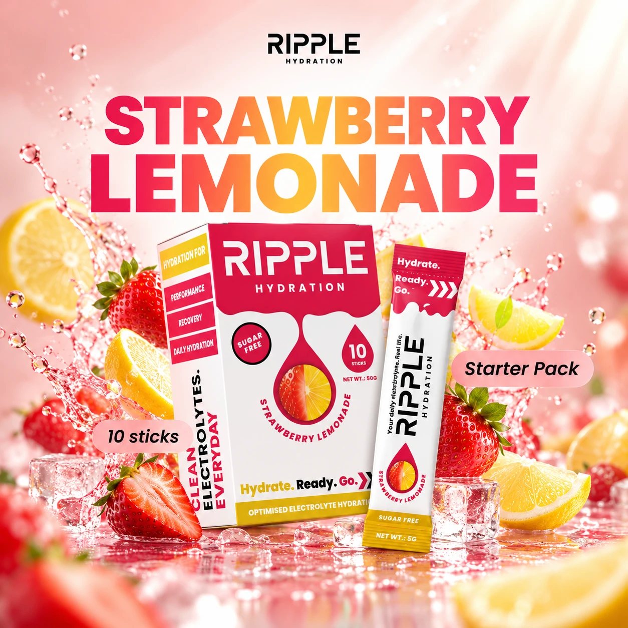
Strawberry Lemonade box and sachet with strawberries and lemons

Retail box

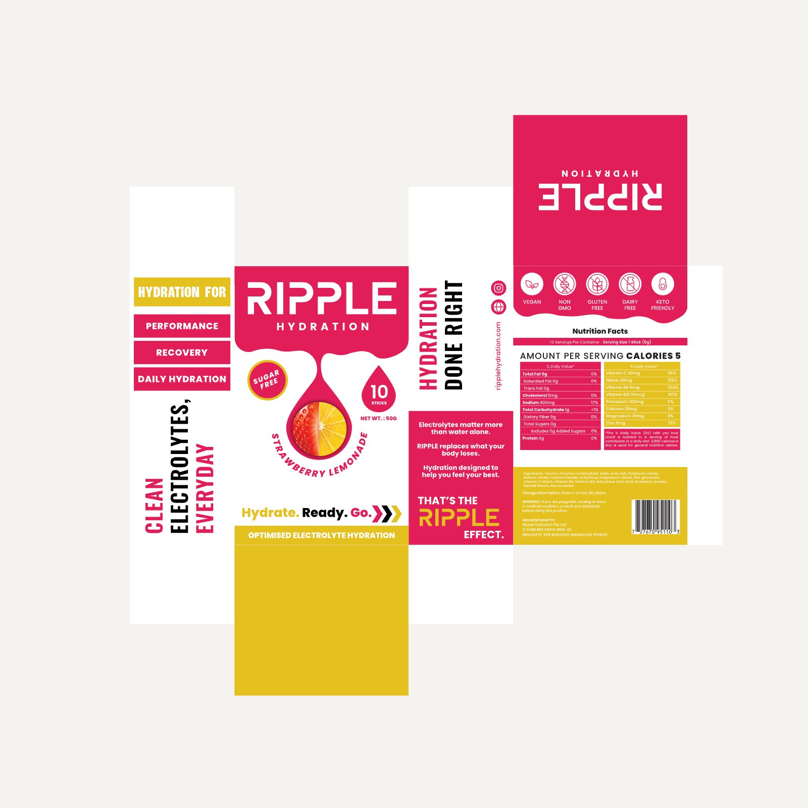
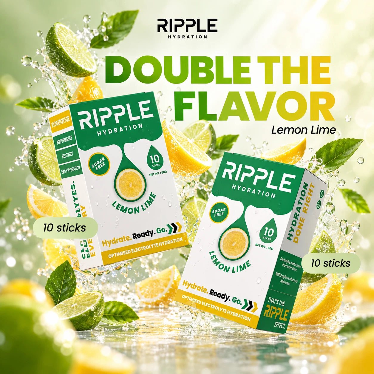
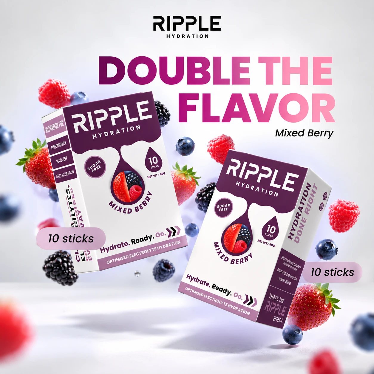
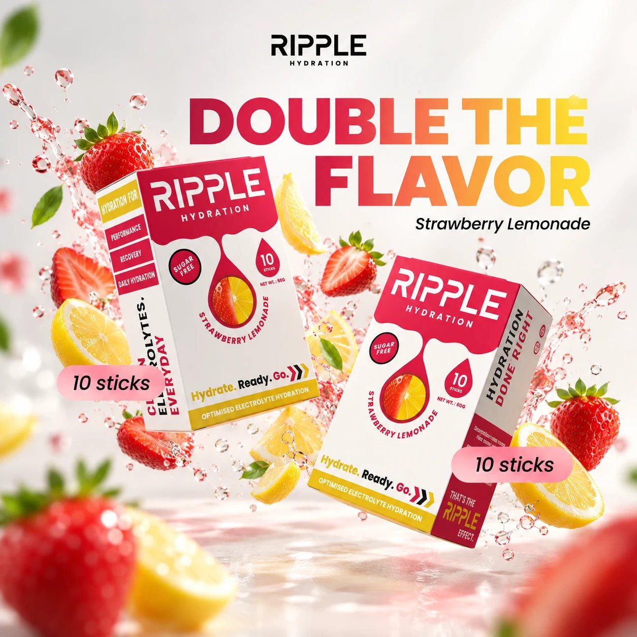
The box dieline, folded. Ten sticks inside, the fruit held in the drop on the front, nutrition facts and barcode on the back, and a bold side panel that reads from the shelf.
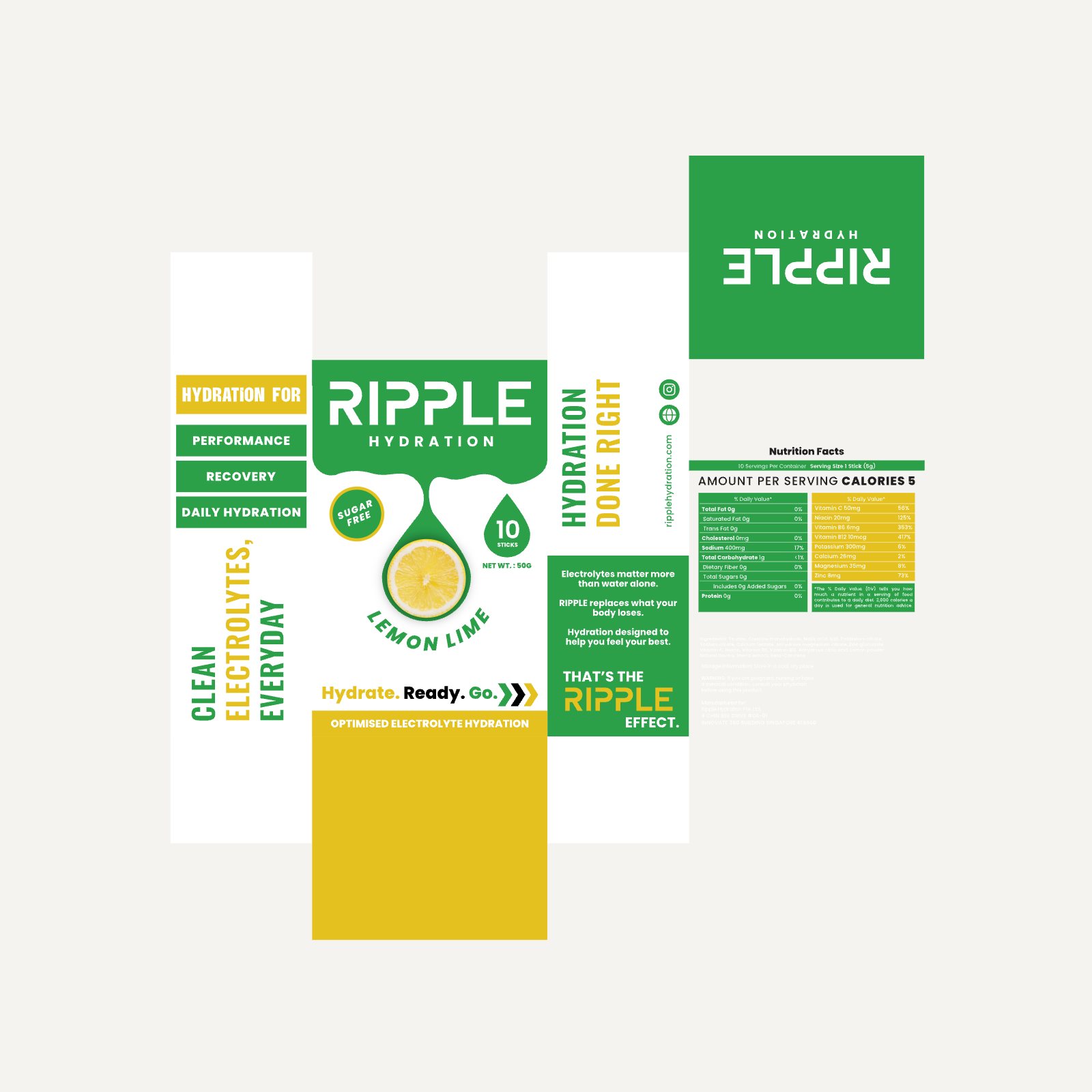
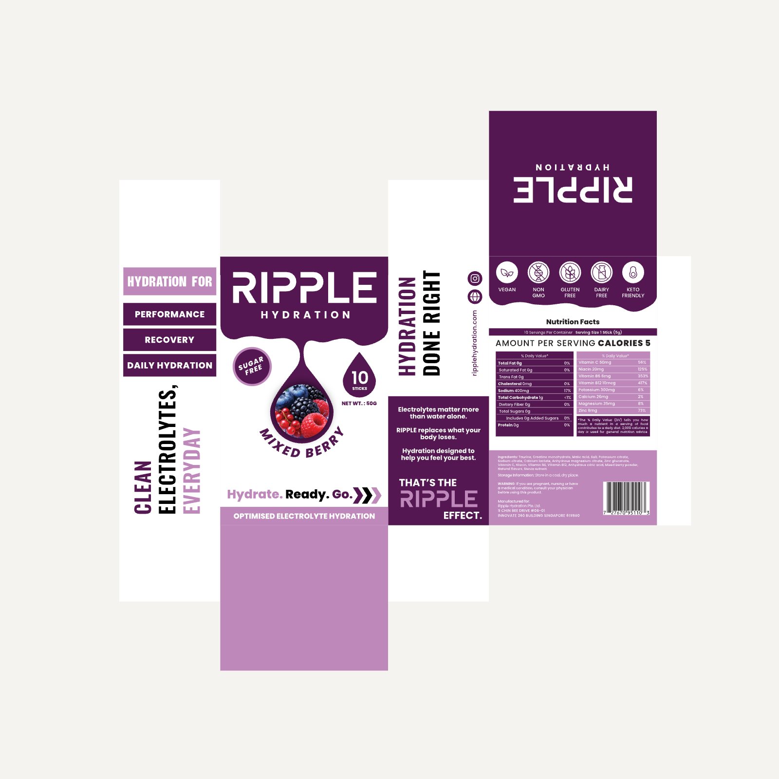
Lemon Lime box dieline
Mixed Berry box dieline
Strawberry Lemonade box dieline
Two Lemon Lime boxes in the air with lemon and lime slices
Two Mixed Berry boxes in the air with berries
Two Strawberry Lemonade boxes in the air with strawberries and lemons

Out in the world

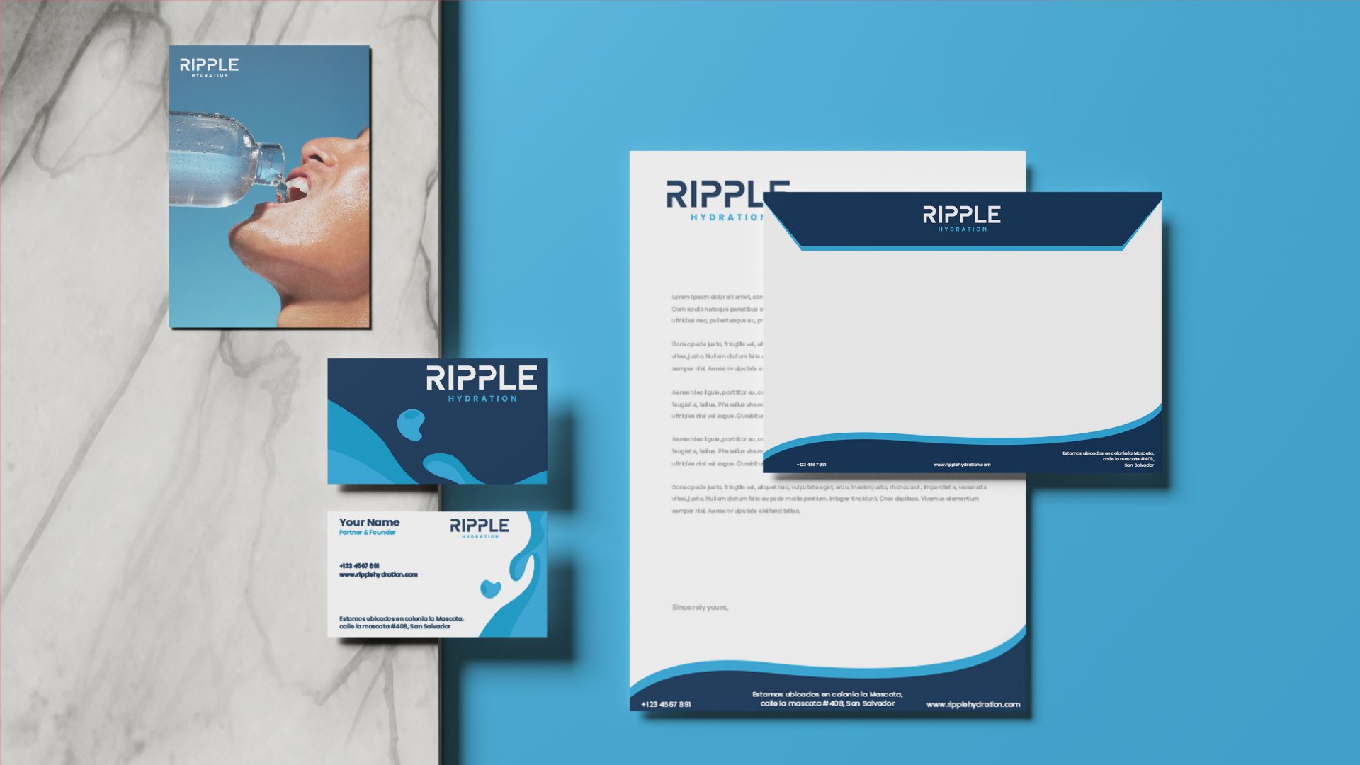
Stationery, a site and the kind of merch people actually wear to training.
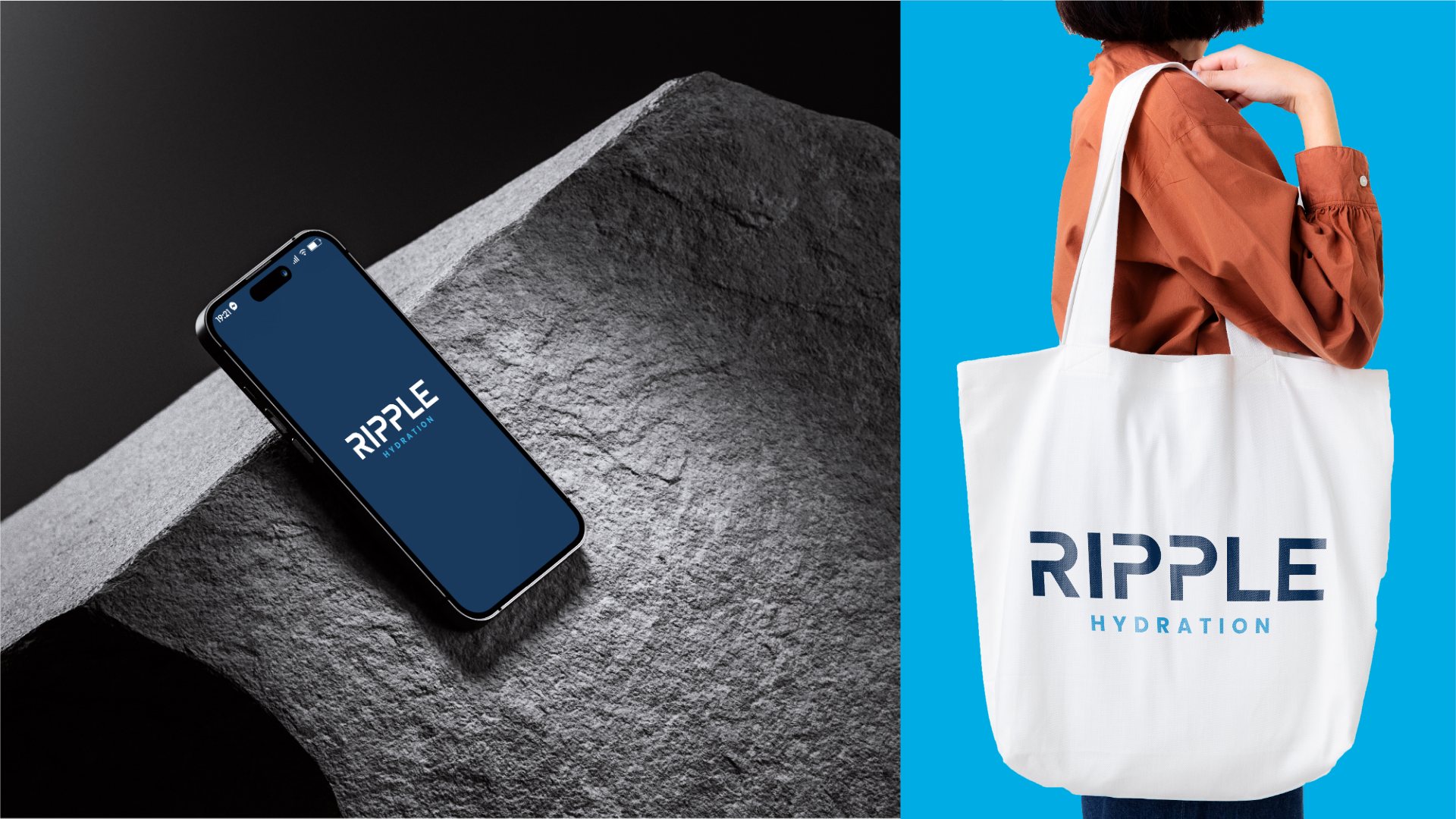
Phone on a rock and a tote bag with the wordmark
Letterhead, envelope and business cards
White mug with the wordmark on blue
A woman in a white Ripple hoodie
Browser tab with the R favicon and ripplehydration.com
The Ripple wordmark on the side of an office building under a blue sky
What I made
Logo & monogramColour systemTypographyIconsSachetsRetail boxesStationerySocial mediaWebsiteMerch
More packagingAll packs
ContactReplies within 24 hours, Monday to Saturday

Got a brandthat needs to work?