Coffee Circle
A neighbourhood cafe built around one idea: every cup should feel like it was made for the person holding it.
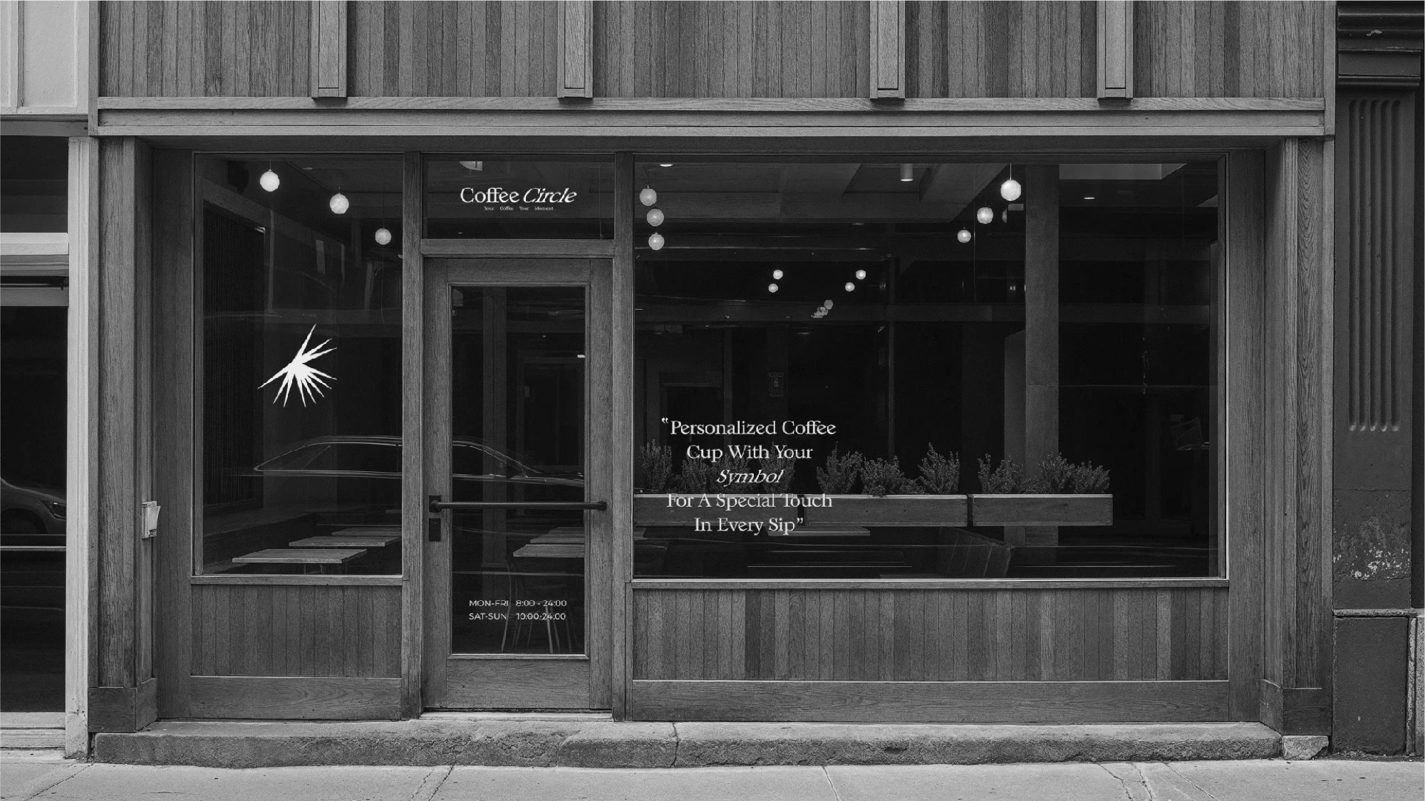
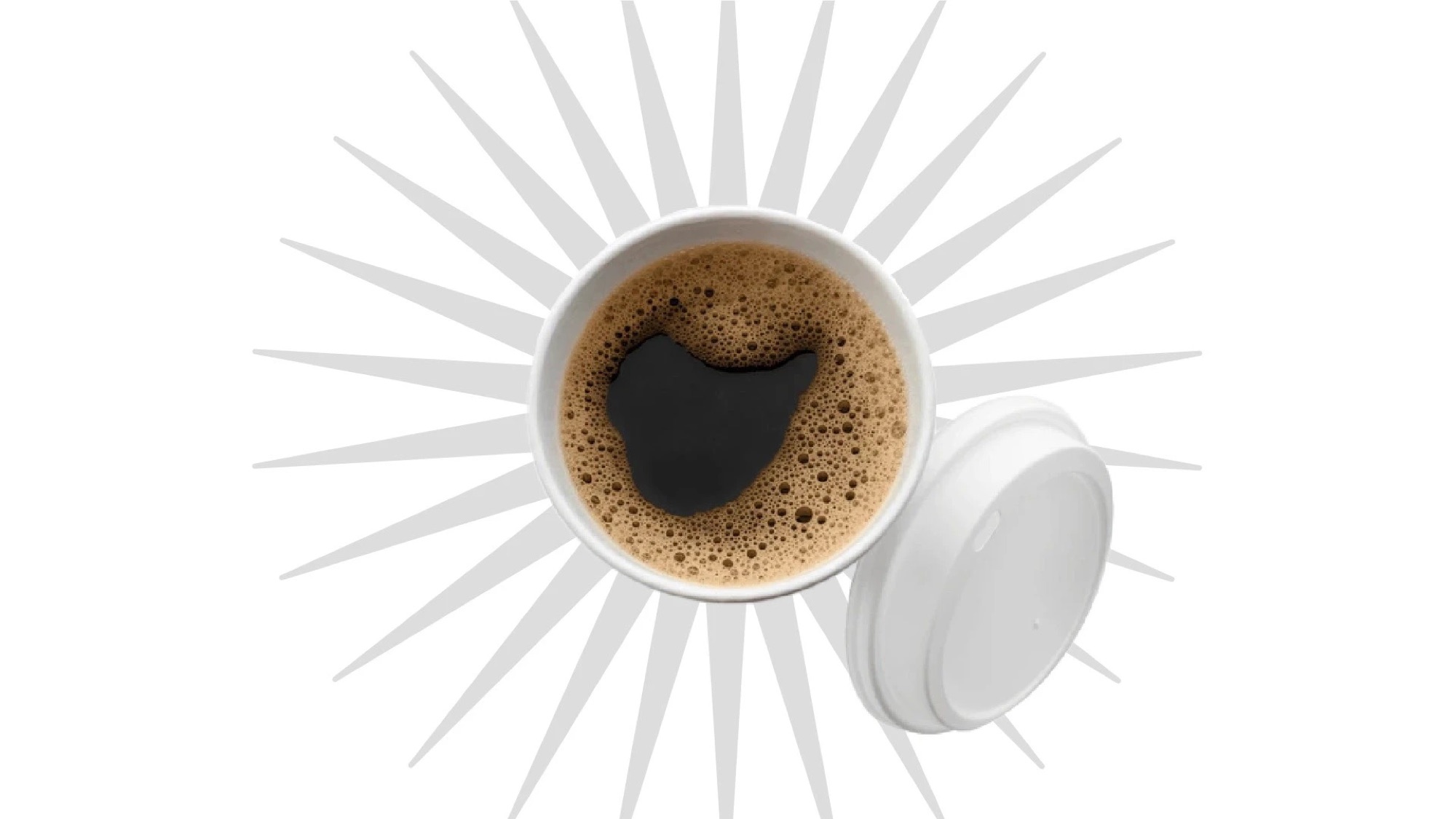
Most cafes write your name on the cup. Coffee Circle draws it.
A specialty coffee roastery in India had good product and local cafe distribution, but its functional packaging looked inexpensive beside international brands. Average orders were 10 bags per month and repeat rate was 15%.
Research into premium coffee in India revealed a gap between imported brands that felt foreign and local brands that felt homemade. The opportunity was a premium identity that still felt culturally relevant.
Packaging combined heritage-inspired patterns with contemporary execution. Origin, roast date, and brewing notes became part of the visual experience, making the story visible on shelf.
Average monthly orders increased from 10 to 32 bags, repeat purchase from 15% to 42%, and four new cafe partnerships were reported within three months. Online ratings moved from 3.8 to 4.6 stars.
Packaging is often the first part of the product customers experience. It should tell the story before the first sip.
Identity
The burst, the letter ring and the wordmark. Blue on white or white on blue, and nothing else.


Packaging
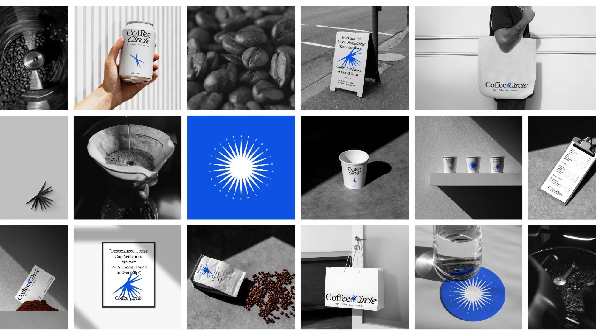
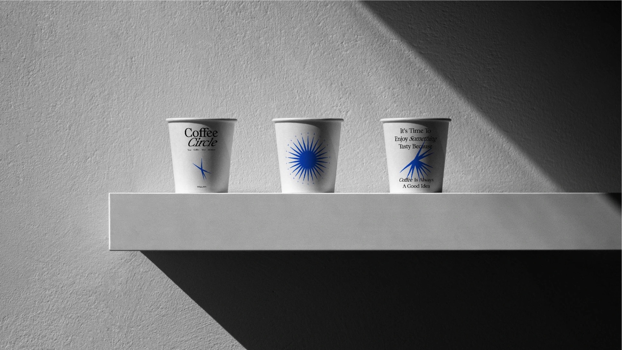
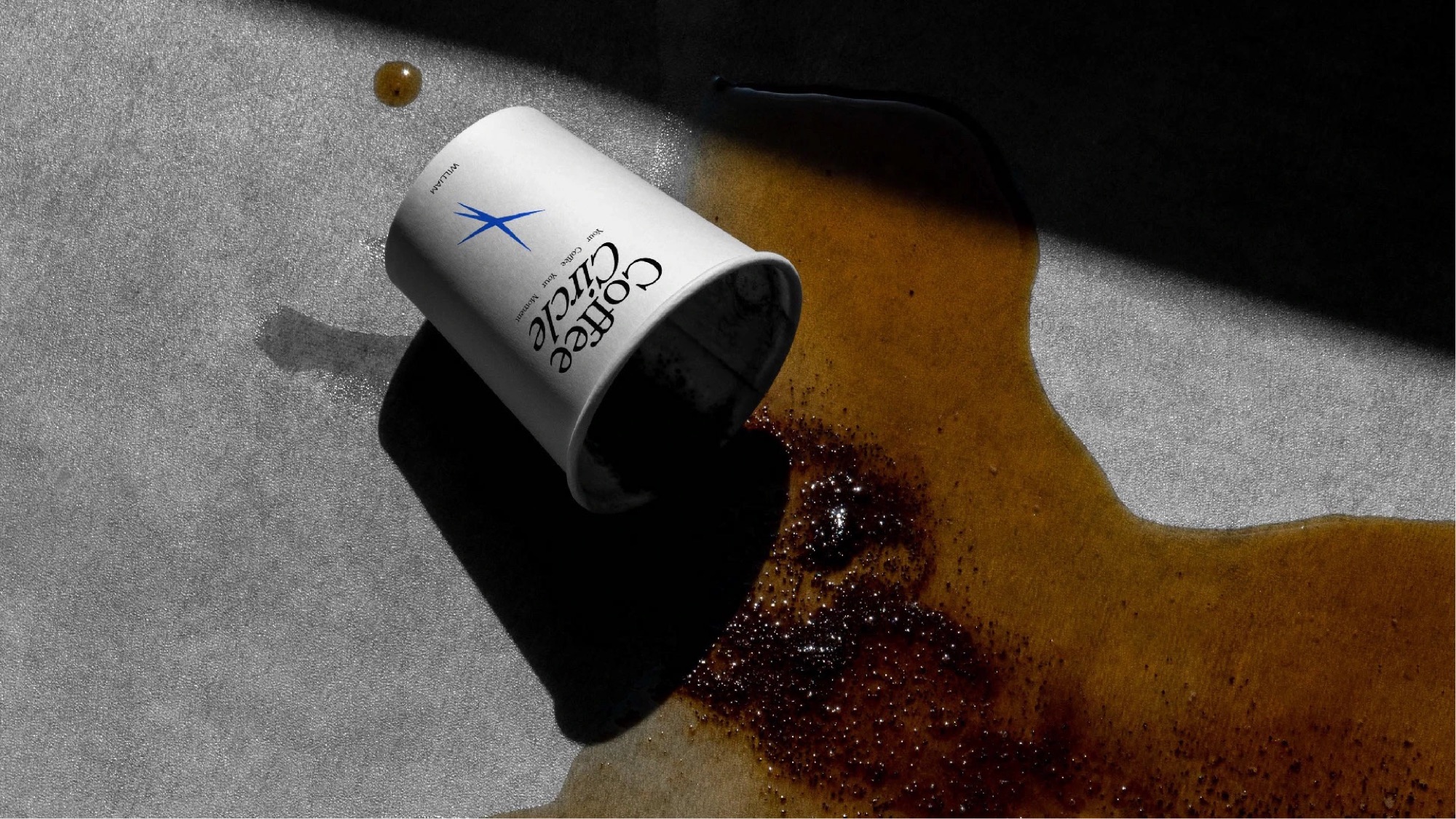
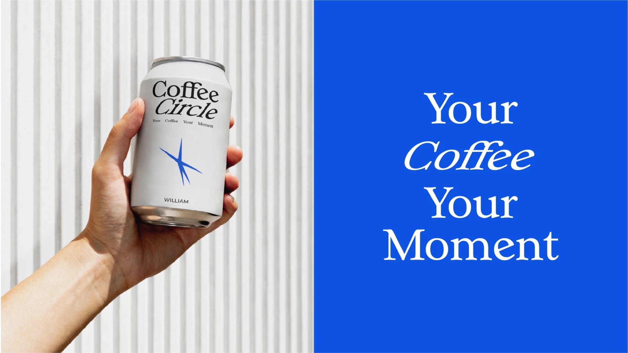
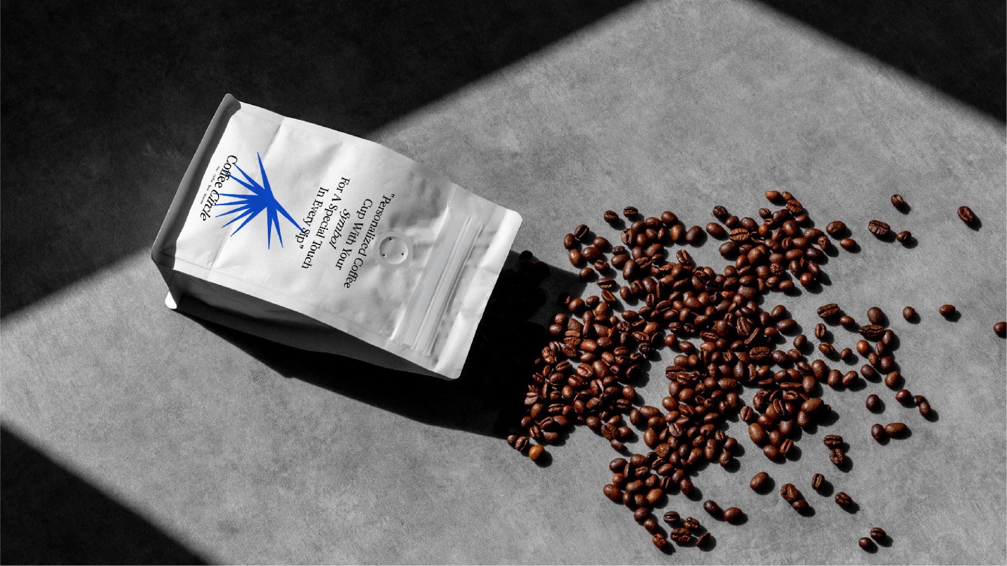
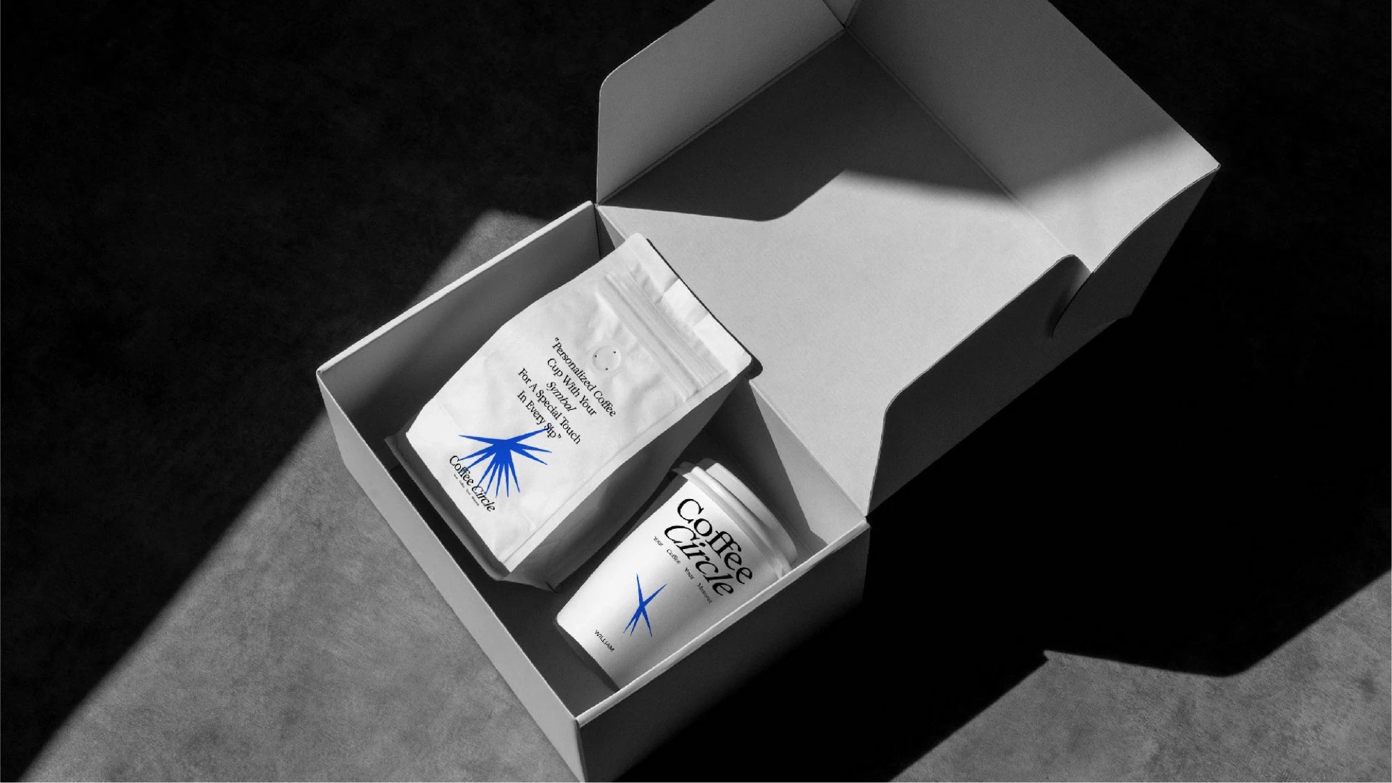
Cups and cans carry a name and its symbol, so the order is personal before the first sip. Bags and boxes keep the same quiet white with one blue mark.
Print collateral
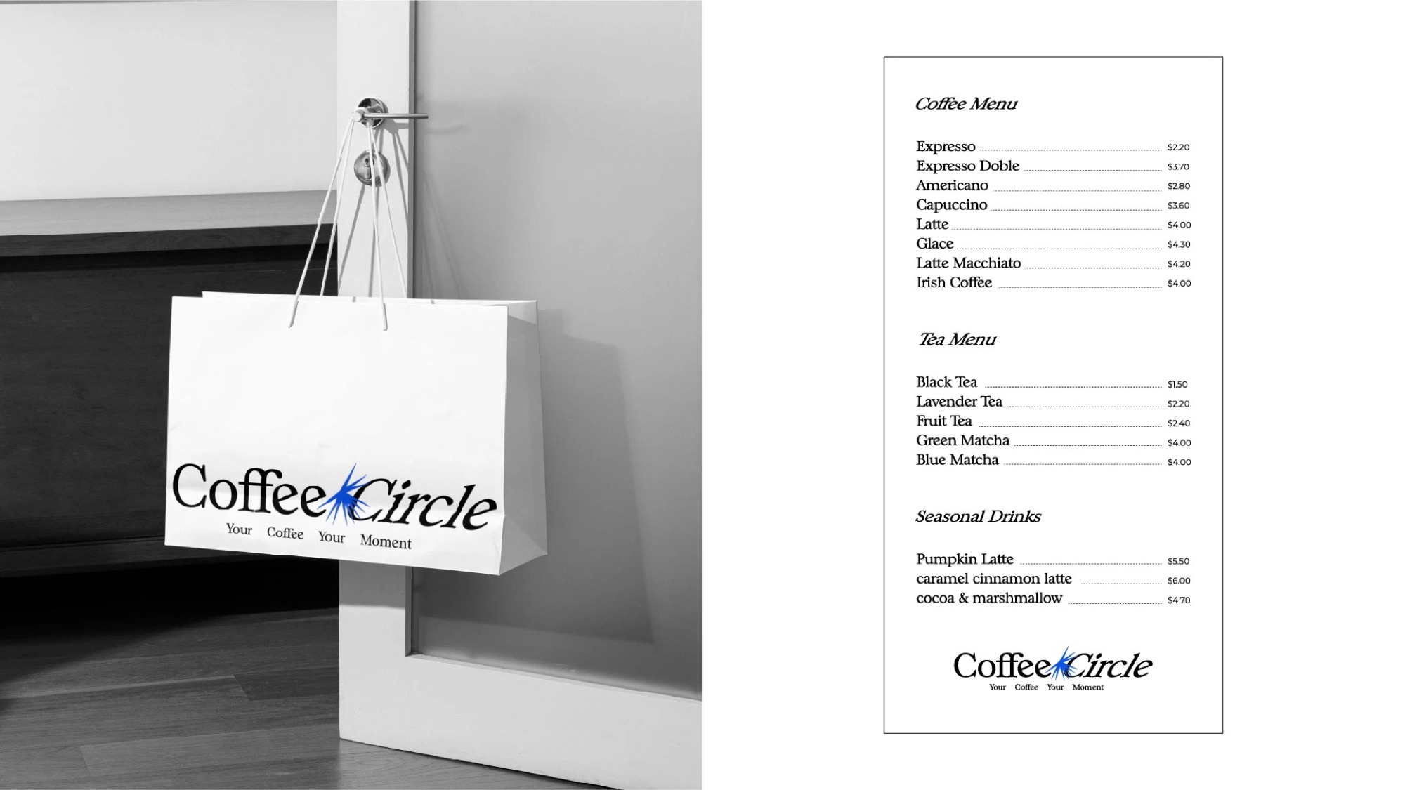
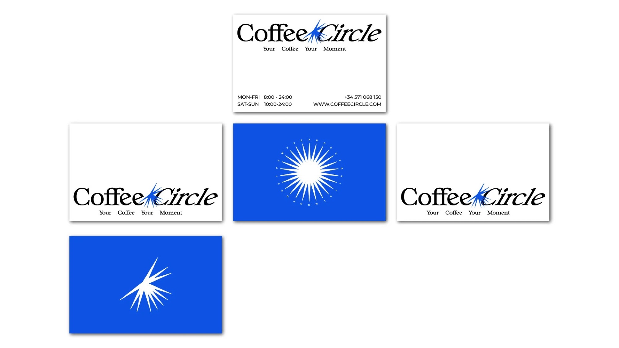
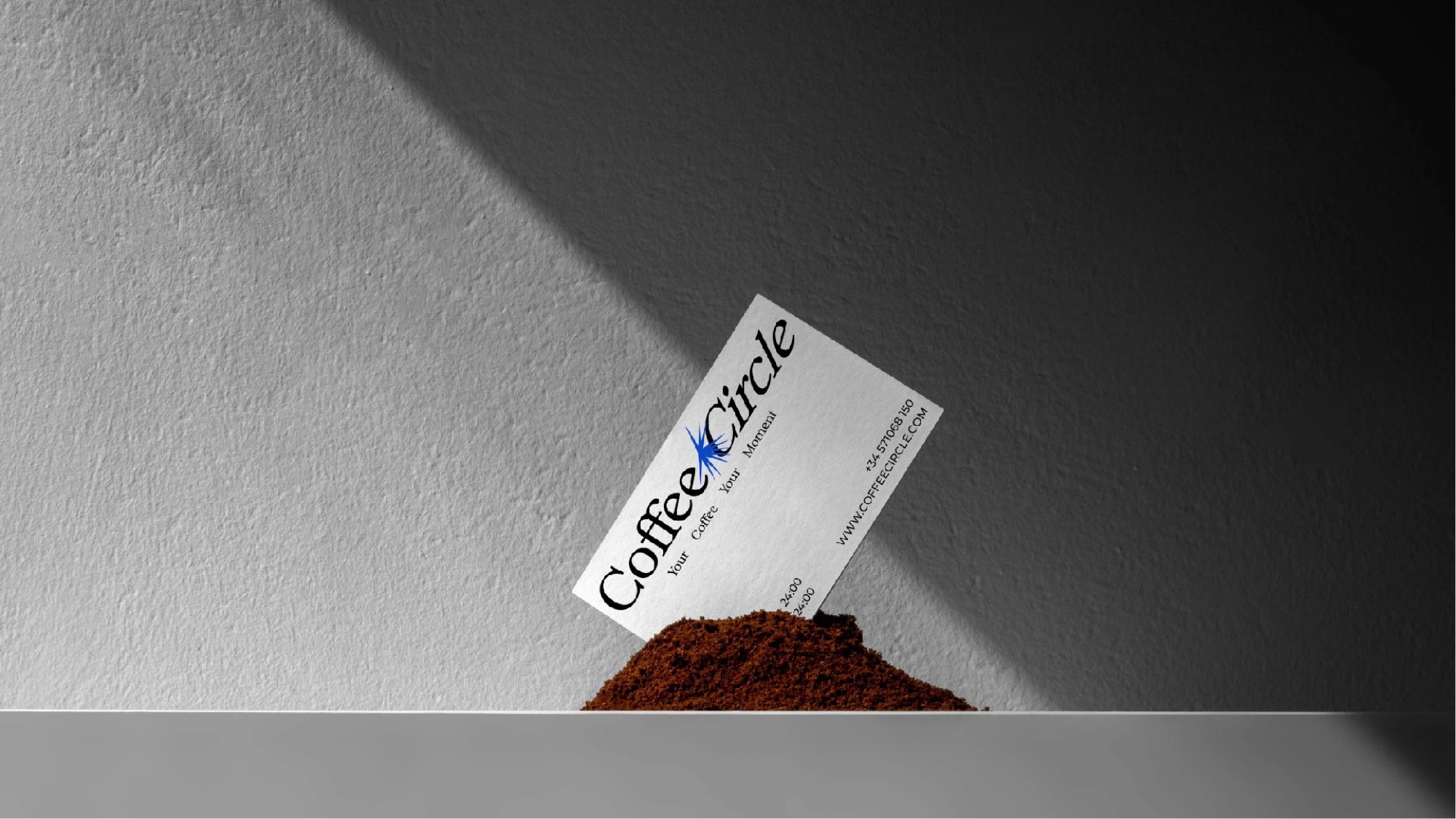
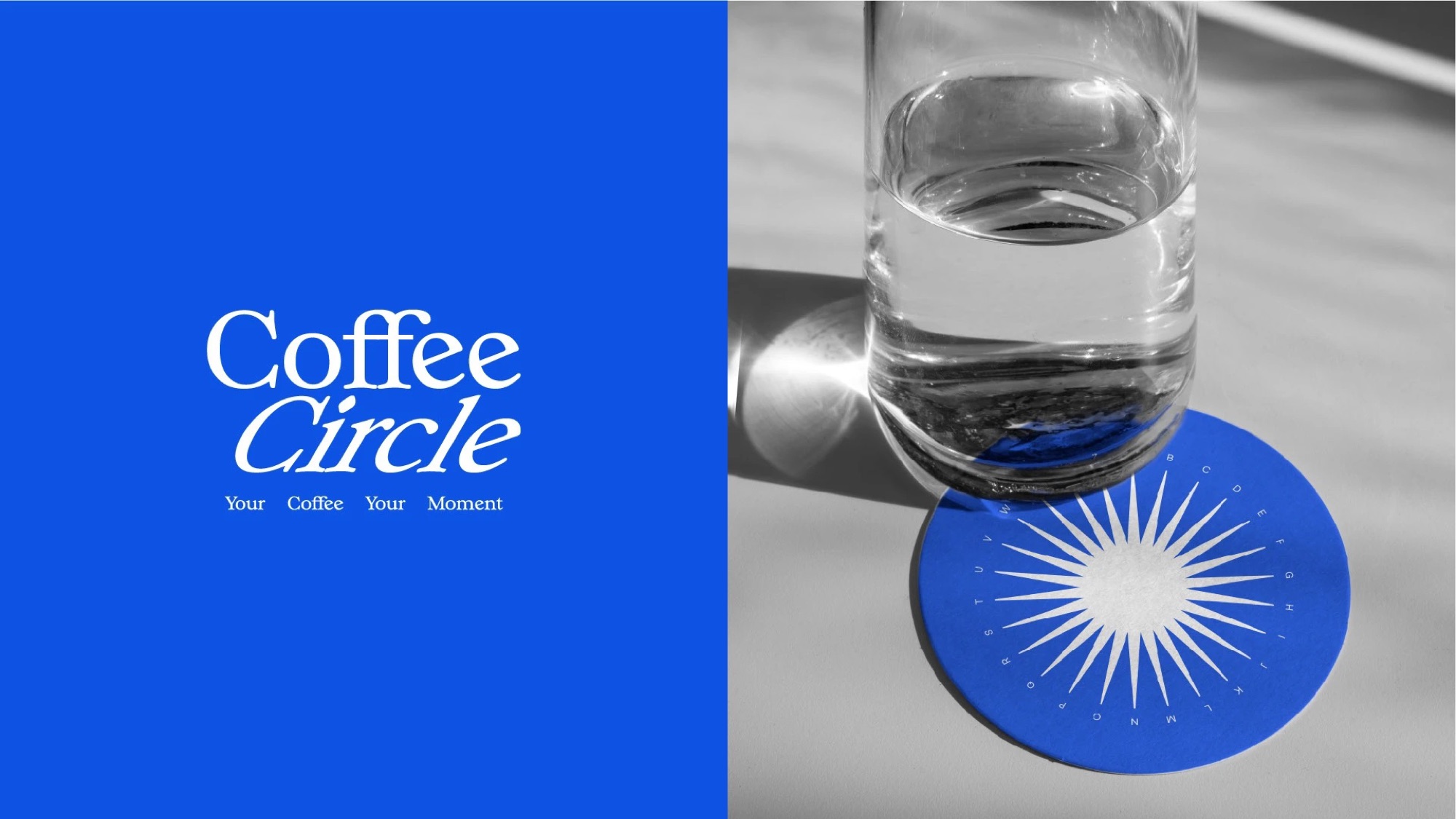
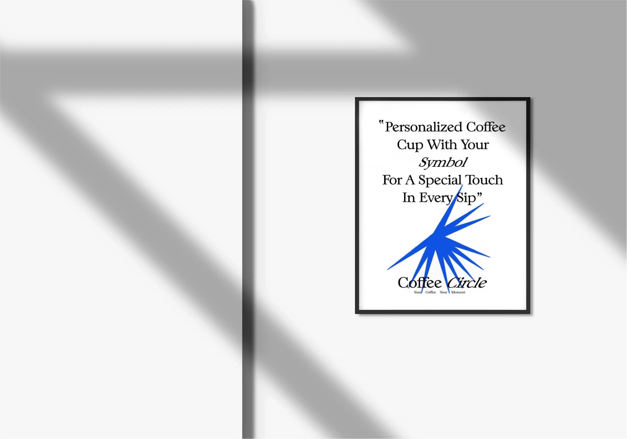
Cards, coasters and posters. Small pieces that go home in pockets and end up on fridges.
Outdoor & social
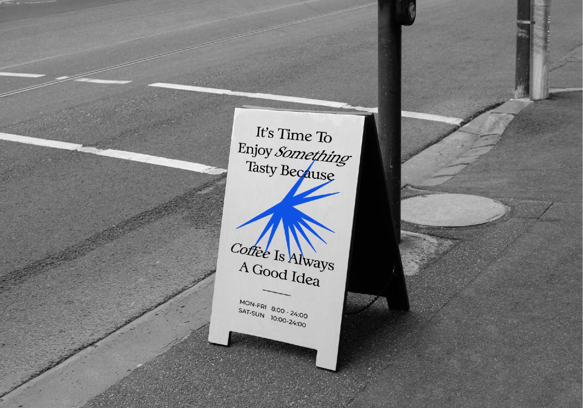
A pavement A-frame that stops people walking past, and a social grid that carries the same blue, paper and shadow into the feed.