Brietta
A skincare line where botanical extracts meet lab actives. Serums, creams and cleansers in soft sage cartons that feel as calm as the formulas inside.
But first, skincare. Where nature meets science.
A botanical skincare brand had premium products but struggled to turn that quality into market visibility. Customer acquisition cost was above $45, website conversion was 0.8%, and returning customers represented only 12%.
Competitor research showed a category dominated by gold, minimalism, and mystery. Customer research pointed elsewhere: people wanted transparency, education, and understandable ingredient benefits.
Brietta was positioned as “botanical without the mystery.” The brand and website were designed to explain product stories, sourcing, and benefits rather than rely on premium aesthetics alone.
After launch, reported CAC fell to $28, conversion increased to 2.8%, repeat customer rate reached 34%, and email open rates reached 42%. Revenue per customer was reported at 3.2× the pre-rebrand level.
For D2C brands, design earns attention, but education builds the trust that drives repeat purchase.
Identity
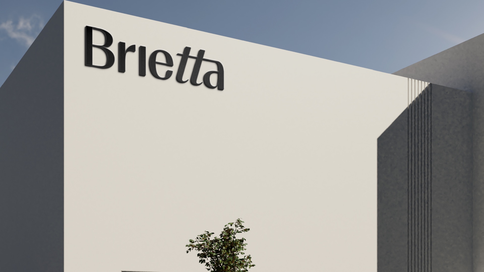
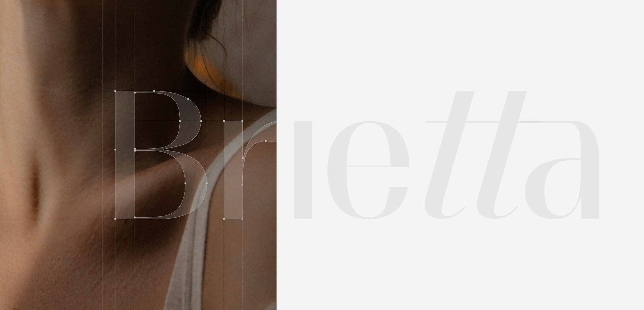
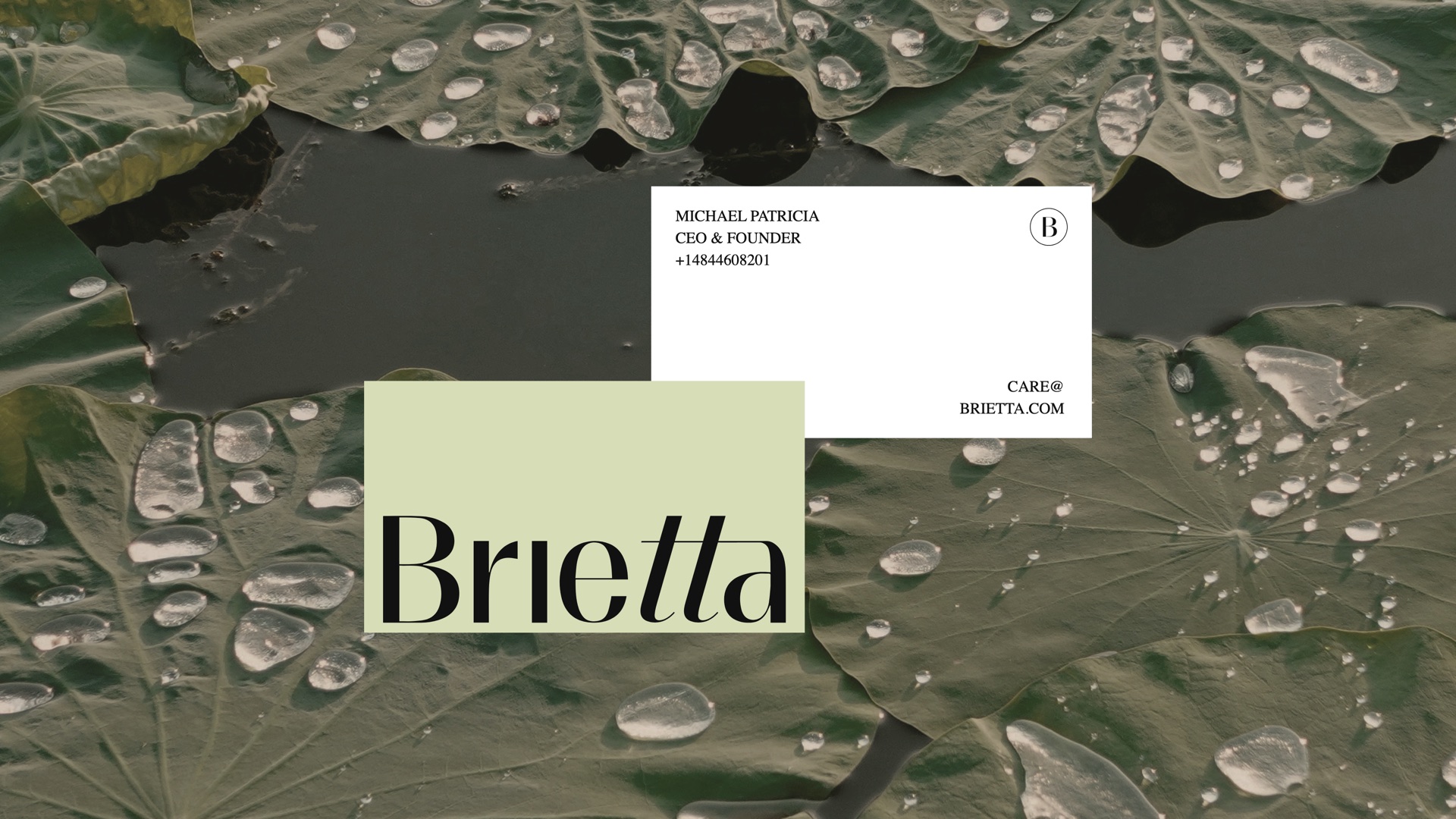
A tall serif wordmark with a light italic tt, a circled B for small spaces, and a tactile finish: blind embossed on sage stock, printed on cards laid over wet leaves.

Carton
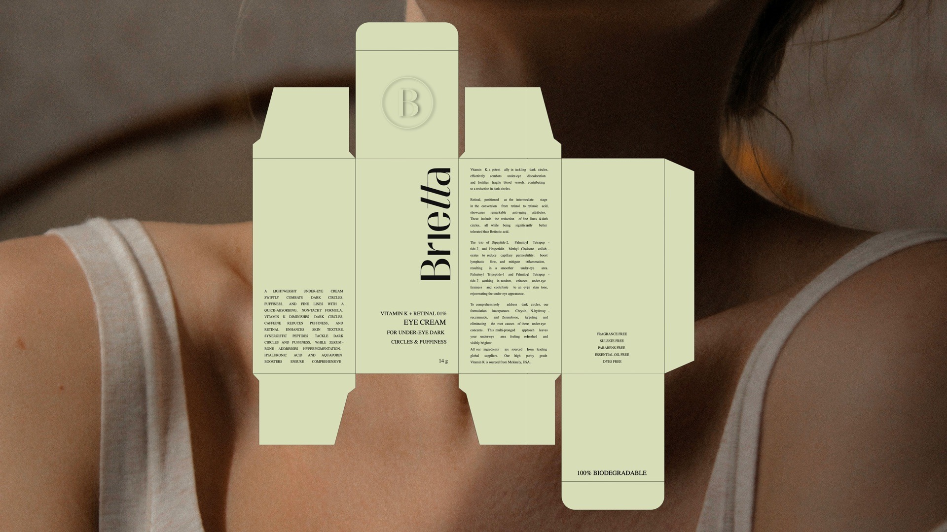
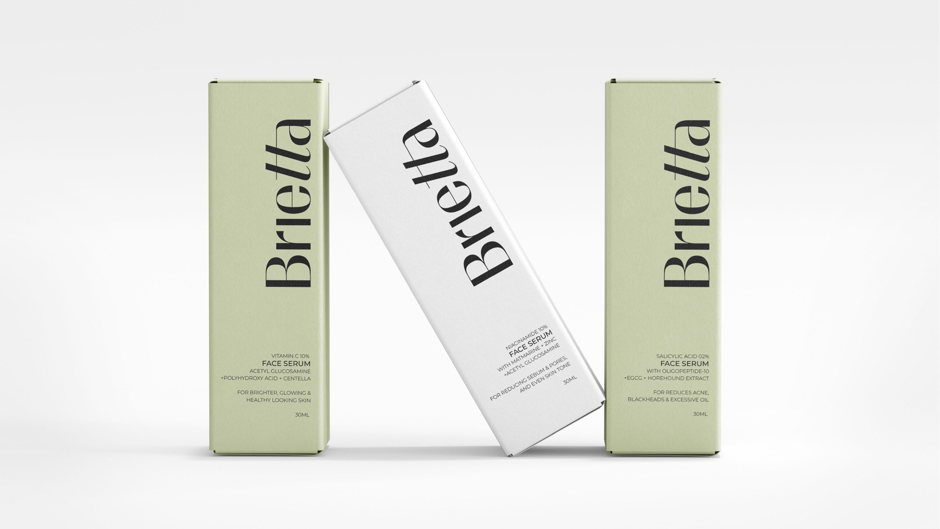
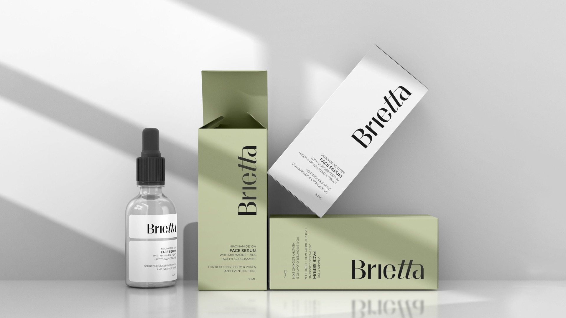
One dieline for the whole range. The wordmark climbs the front panel, the back carries the actives, directions and a 100% biodegradable mark, and the side panels name the product so it reads on a shelf.
The range
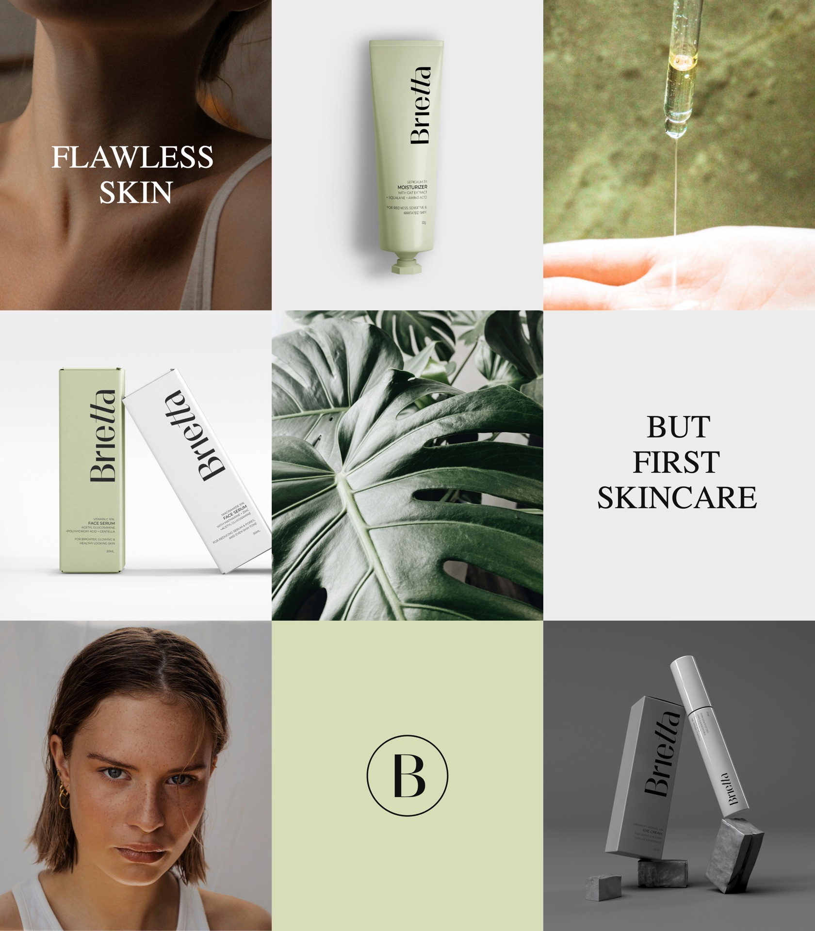
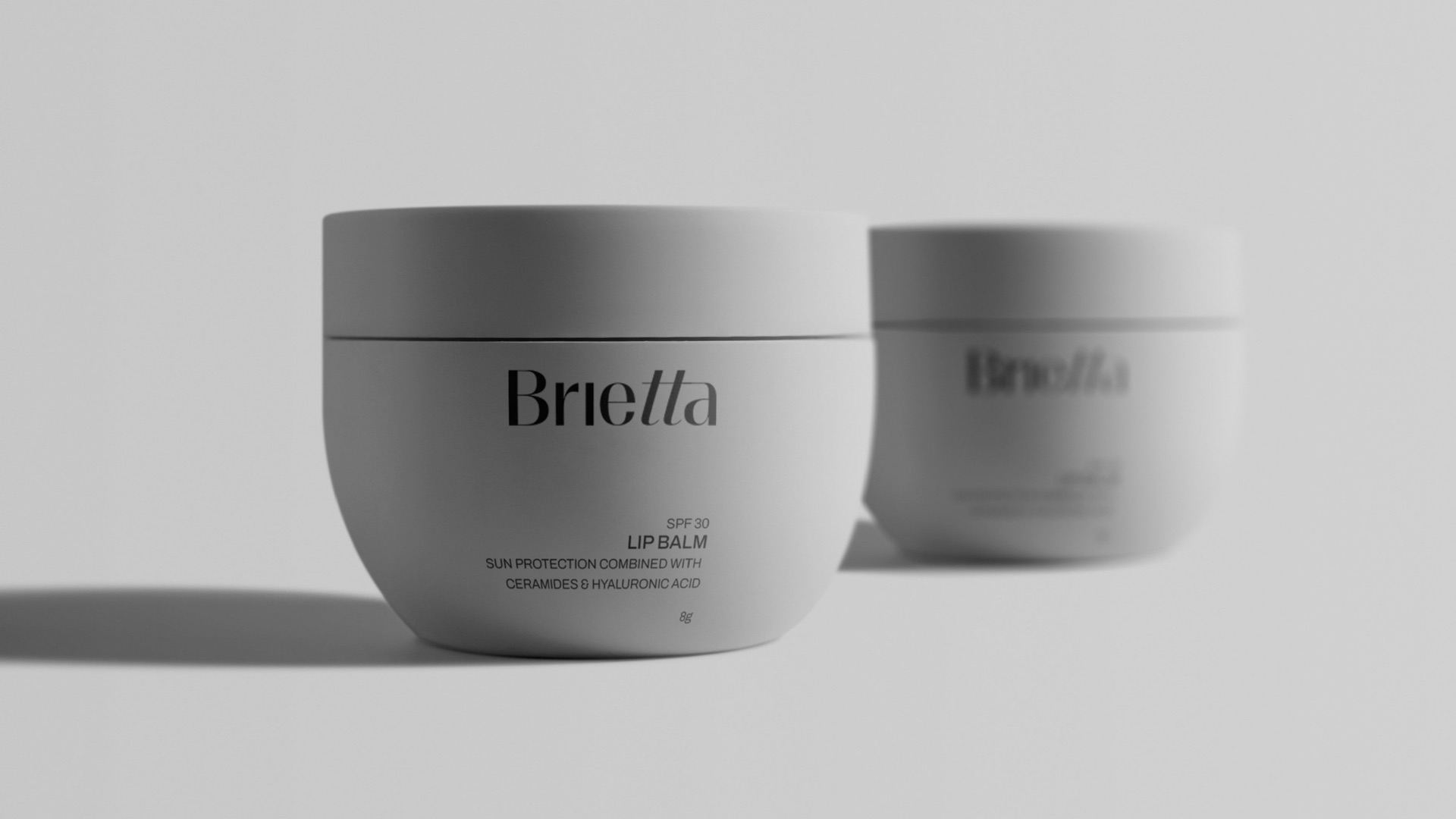
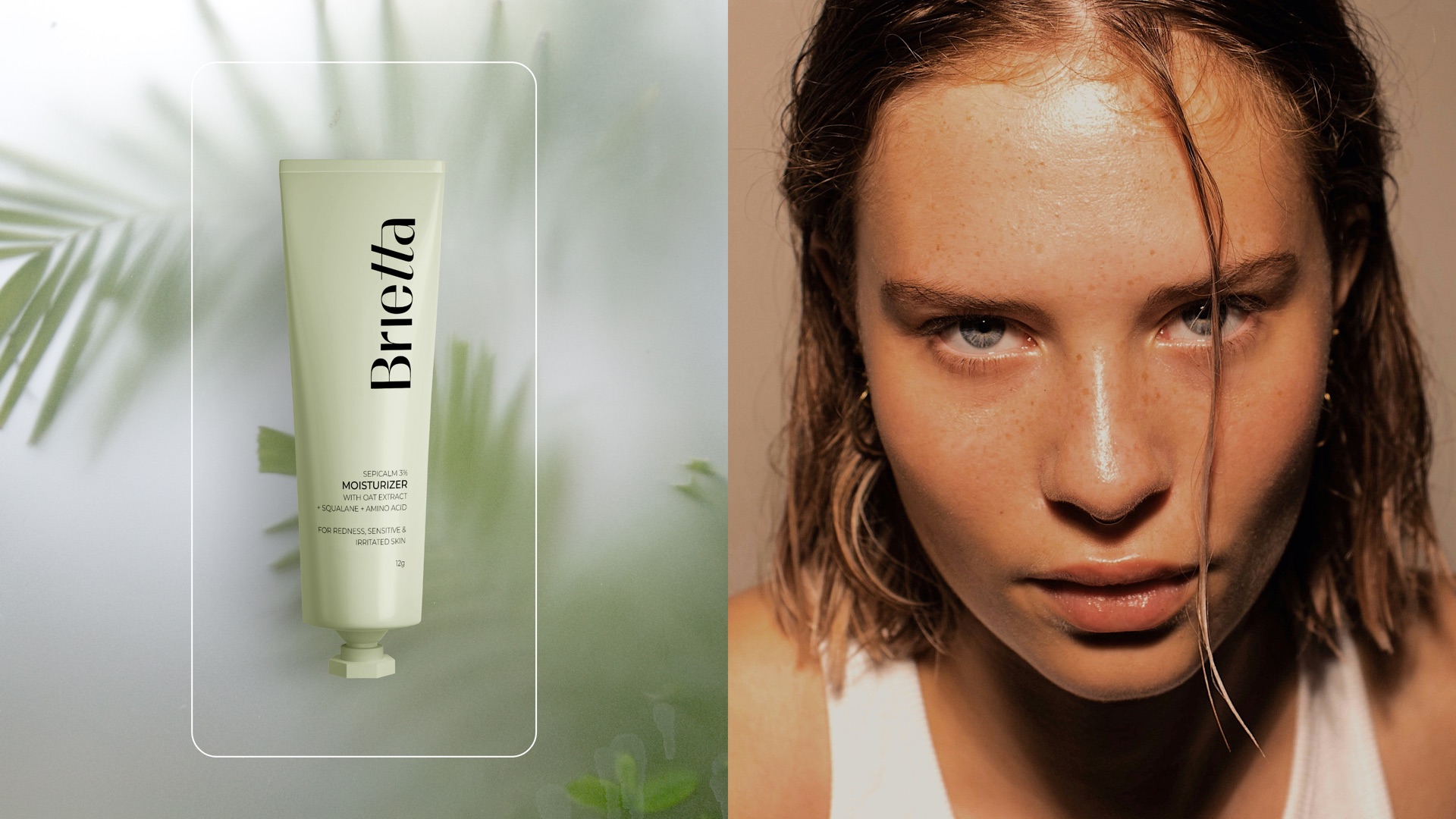
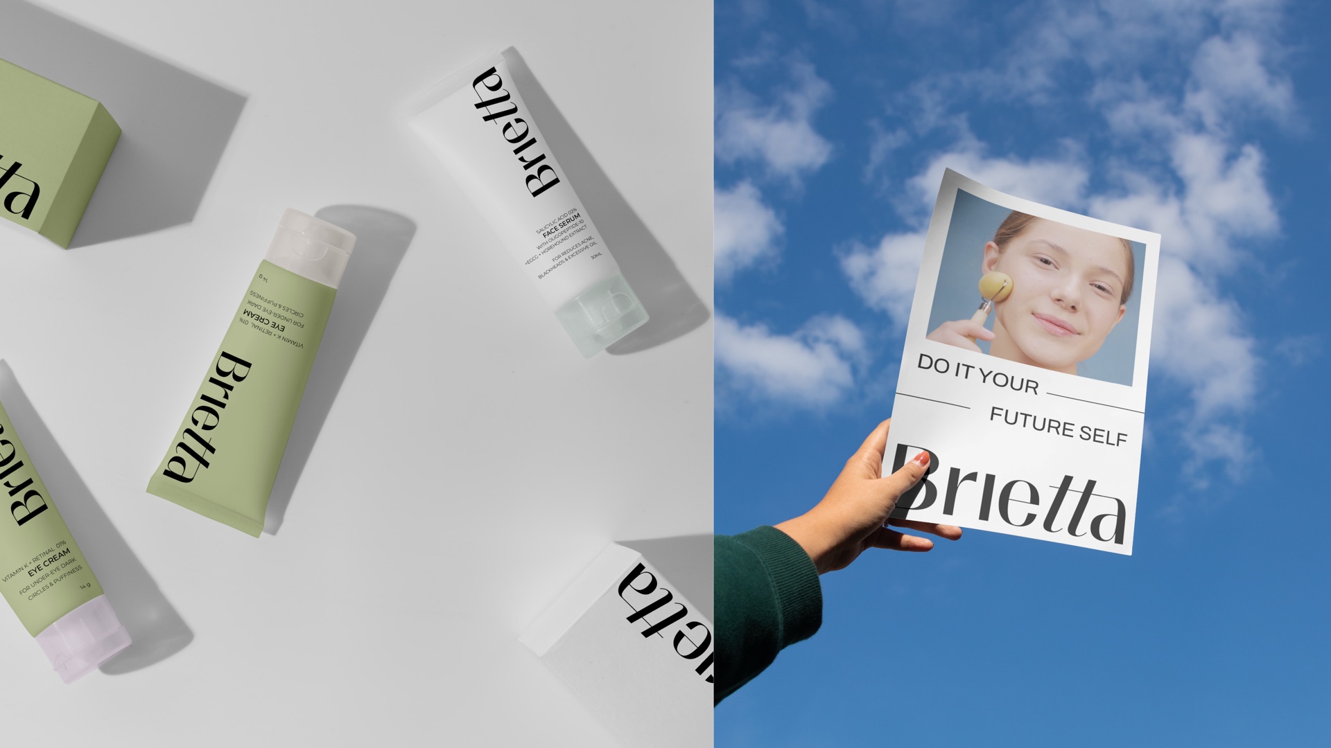
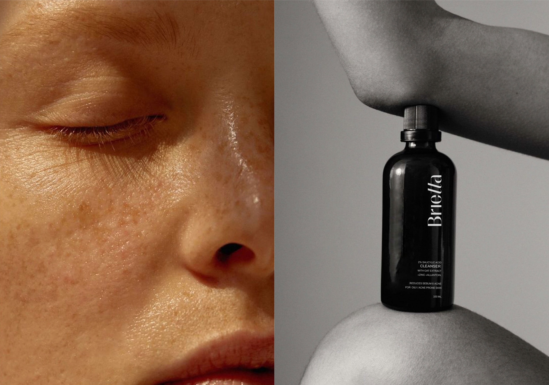
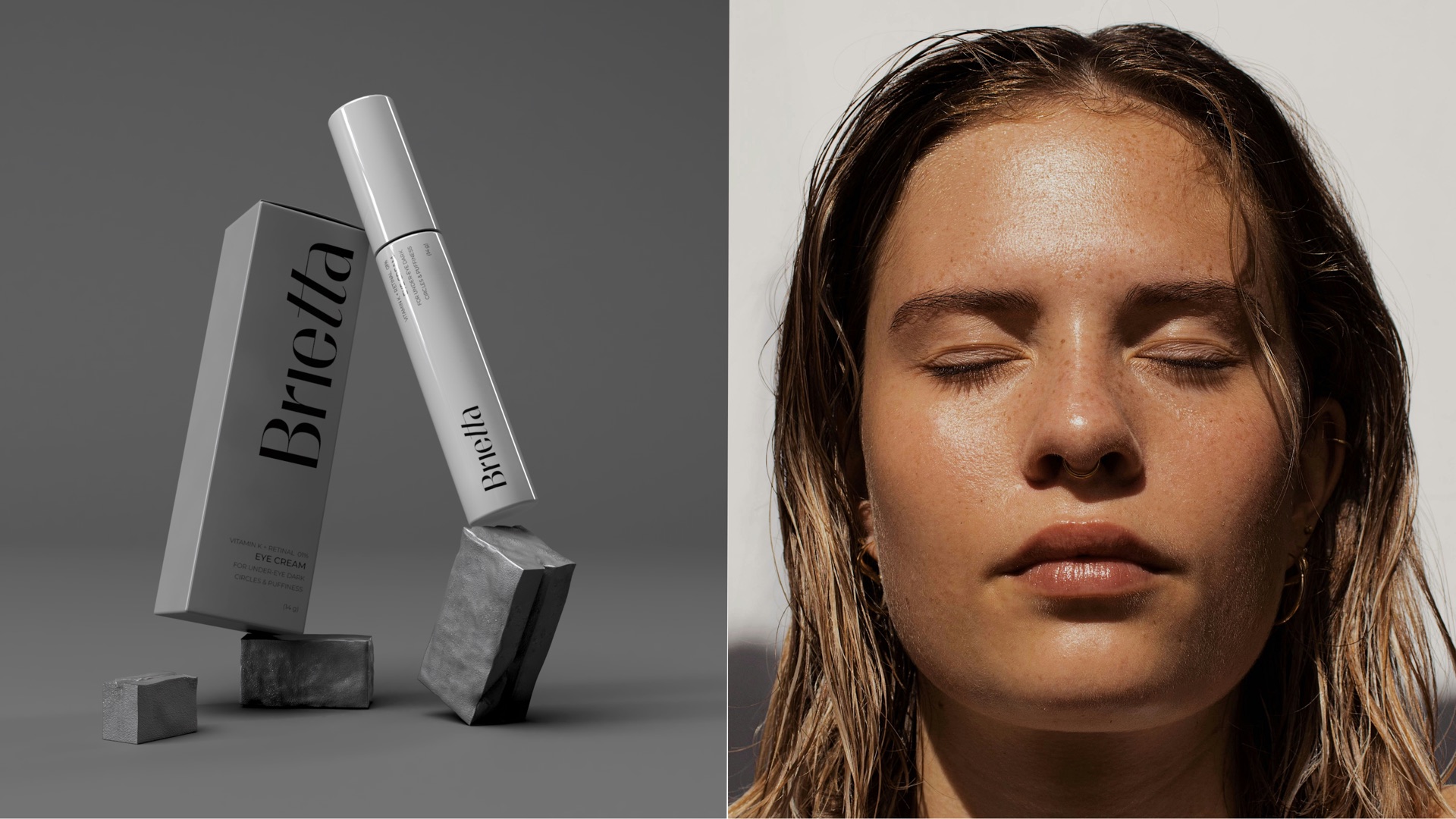
Tubes, droppers and jars carry the same vertical wordmark. Sage for the day to day, white and grey for the treatments, black glass for the oils.
Out in the world
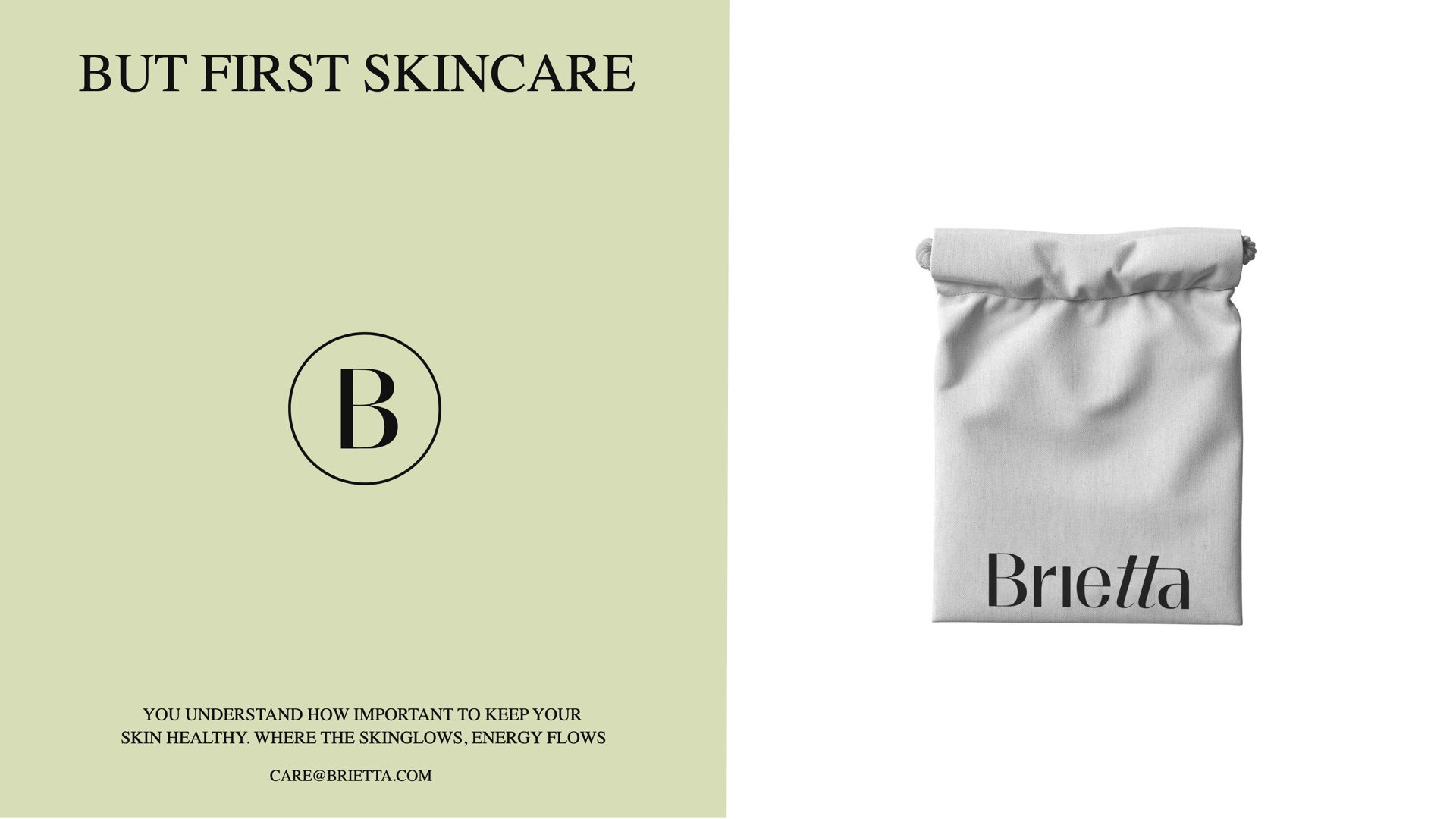
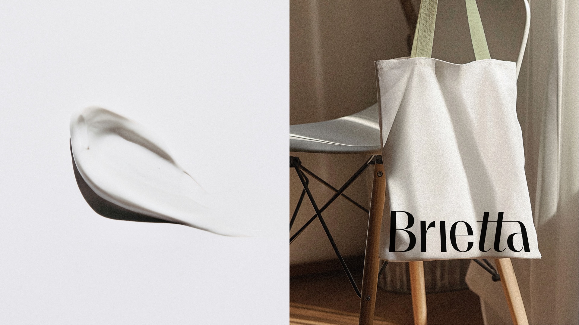
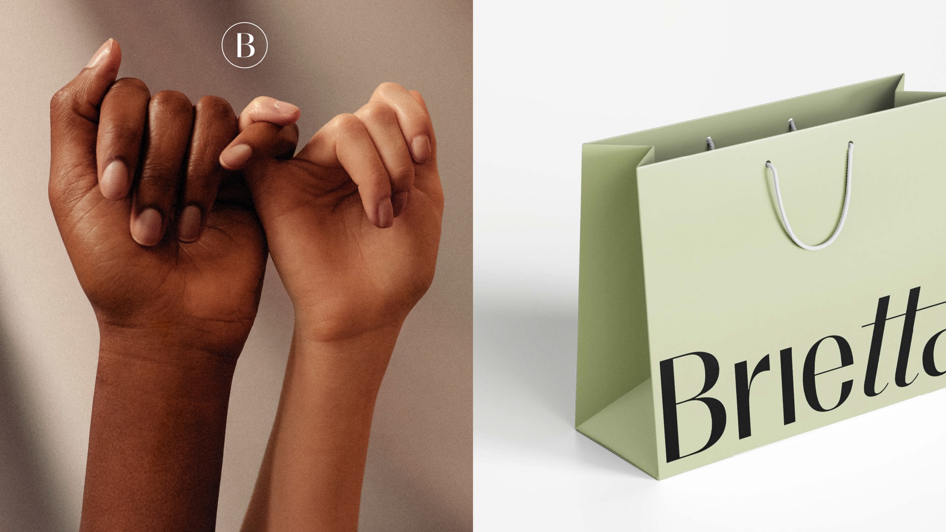
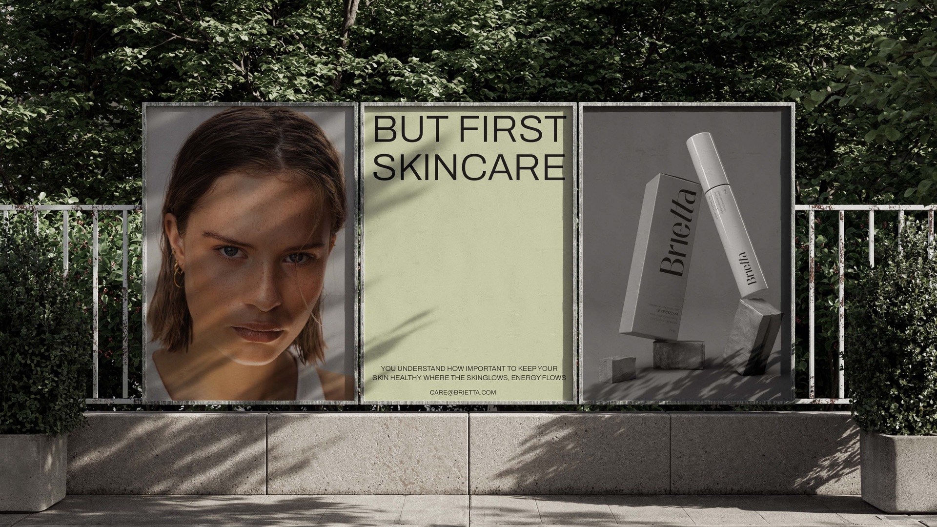
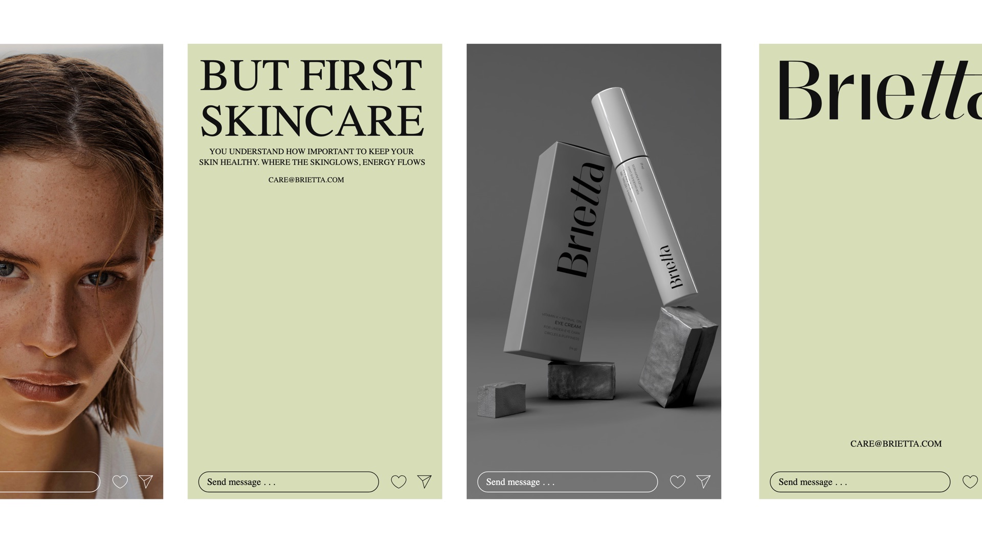
A drawstring pouch, a shopping bag and a tote in the same sage and white, a social grid built on the line But First Skincare, and posters and signs that carry the calm to the street.