Voltra
A money app built on the idea that finance should feel simple, open and easy to reach. Yellow, black and a mark that always points forward.
Finance that moves forward.
A new money-management app was entering a crowded category with 200+ competitors. Most competitors relied on safe blue identities. The founders wanted to stand out without sacrificing the trust expected from a financial product.
An analysis of 20 leading fintech apps showed that users were comfortable with creativity when the product still felt intentional and clear. The opportunity was to combine distinction with reassurance.
The brand system paired bold yellow with black to create visibility and trust. A moving mark represented the movement of money, giving the identity a simple idea that could extend across the product and launch campaign.
Ad creative download conversion reached 4.2%, compared with the cited fintech average of 1.8%. The app reached a 4.7-star rating in its first month, with reported brand recognition of 67% after six months.
Distinctive and trustworthy do not have to be opposites. The strongest identity sits where the two meet.
Identity
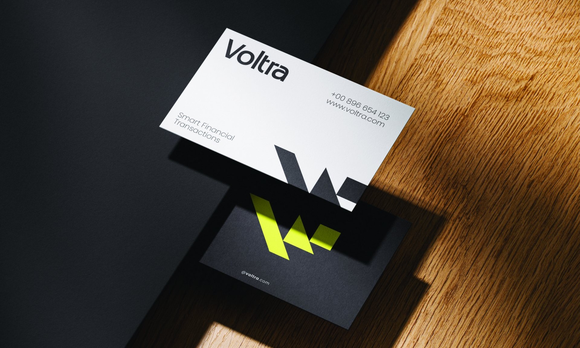
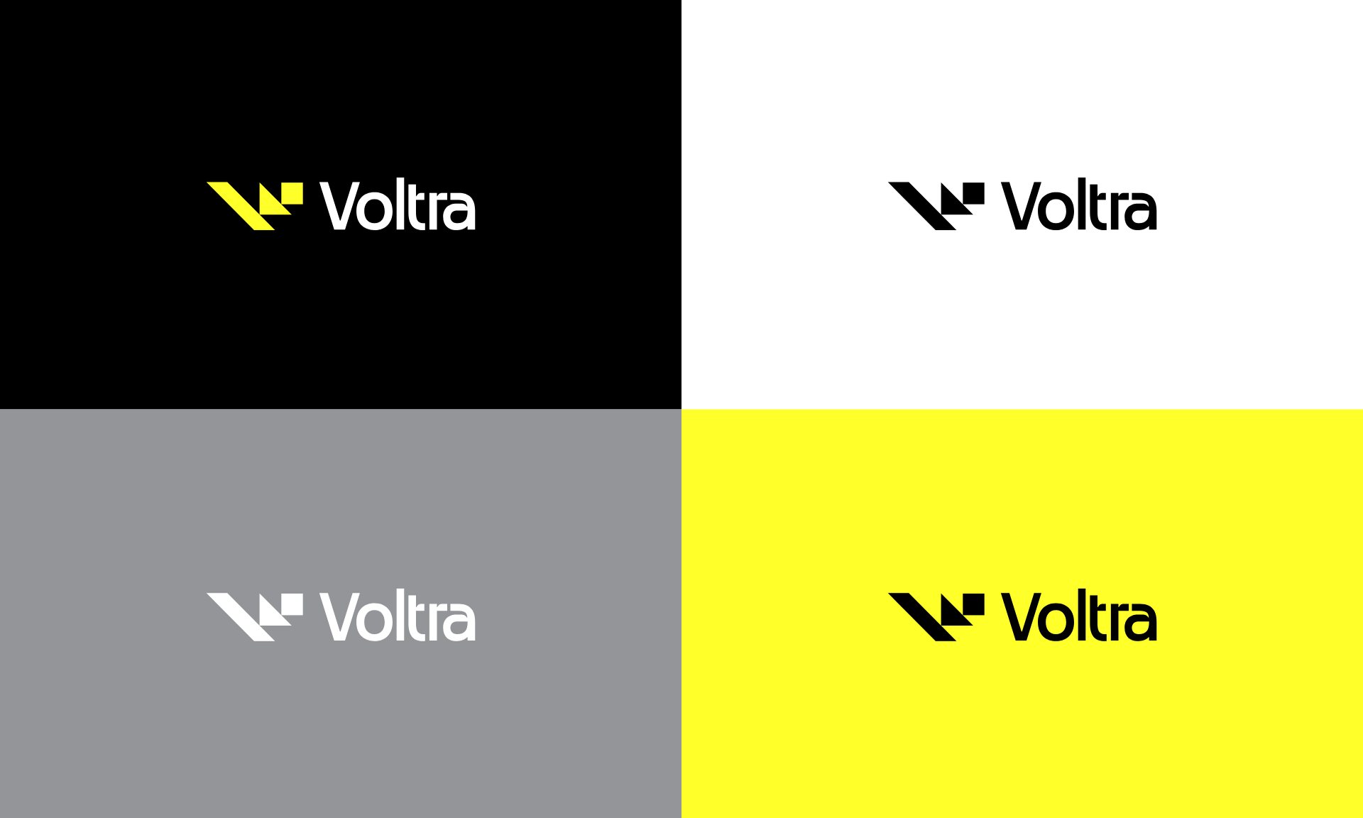
Three blocks form a V that climbs to the right, built on a simple 3 by 1 grid. It holds on black, white, grey and yellow without changing shape.

Out in the world
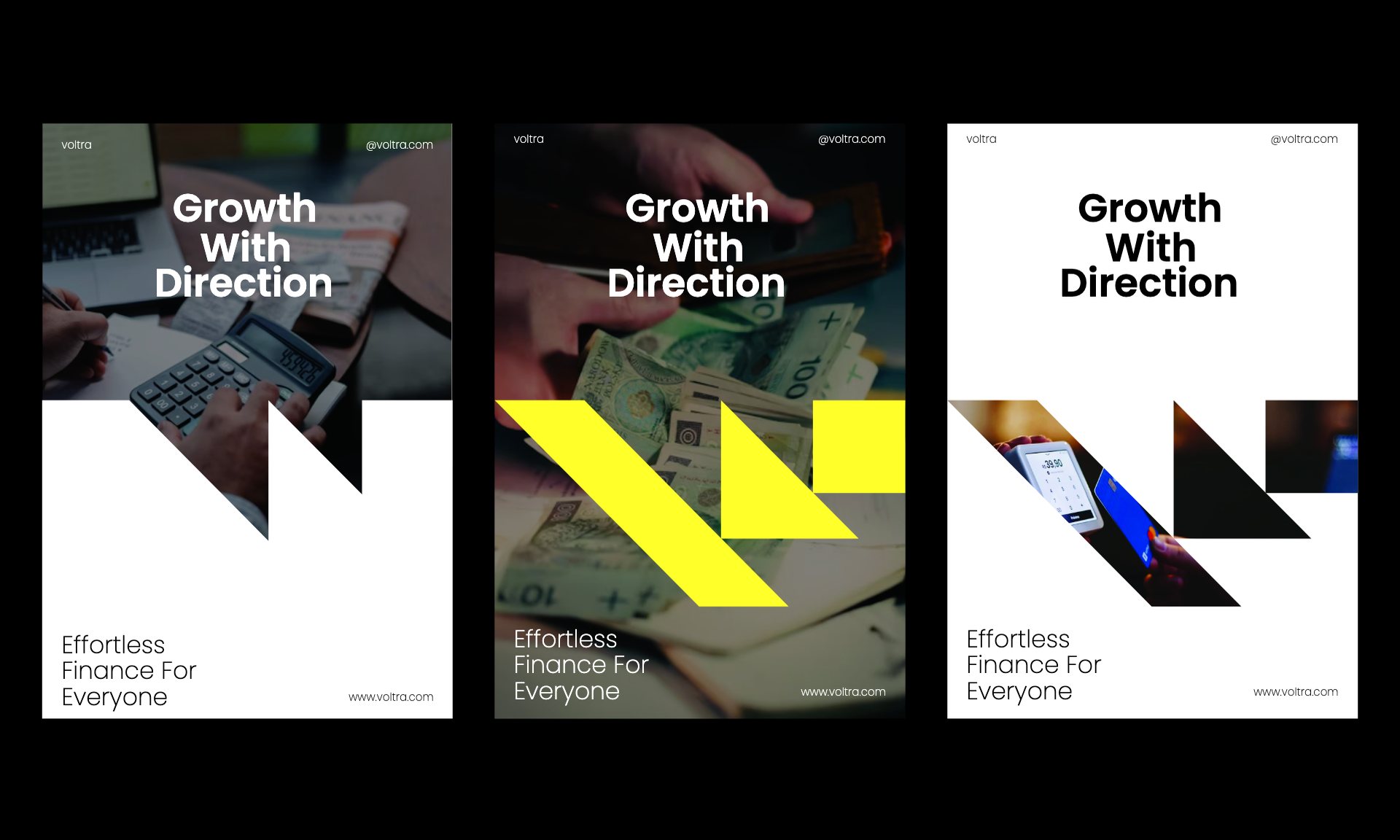
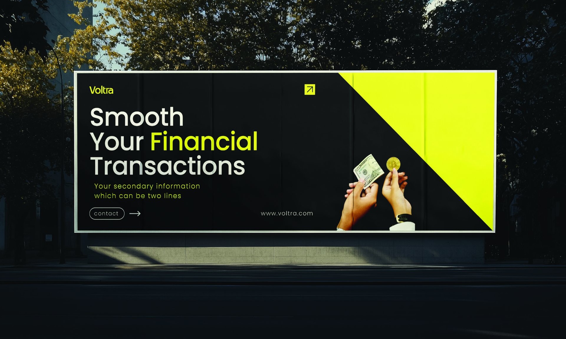
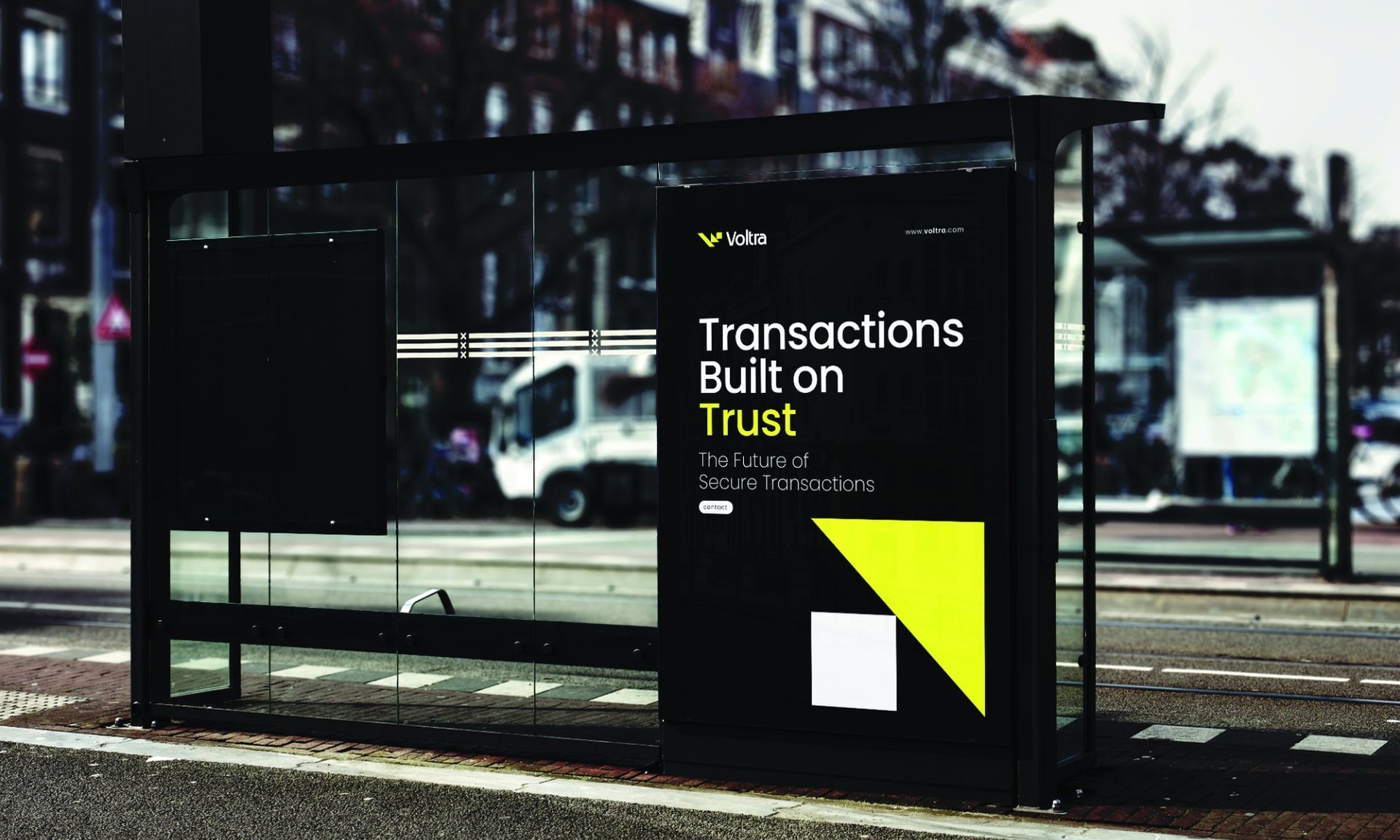
Posters where the V cuts through the photo, cards that split black and white, and street ads that are readable at a glance.