The Hi Rise
A premium hotel for business and leisure travellers. The brand had to feel like a quiet lobby: warm, calm and a little formal.
Modern hospitality, quietly done.
A premium hotel had the rooms, amenities, and service to compete at the top end, but its identity looked interchangeable with other luxury properties. The brand was being compared on price instead of perceived value.
Research across 15 luxury hotels in Asia revealed a familiar pattern: gold, serif typography, and ornamental details were being used as shortcuts for luxury. Time spent inside the hotel pointed to a different truth. The real luxury was calm, space, and quietness.
The identity was built around quiet luxury rather than conventional luxury codes. The visual system was intentionally minimal and calm, giving the hotel a more distinctive position and a clearer reason to command a premium.
In the first quarter after the rebrand, average nightly rate increased 22% while booking volume remained stable at the same marketing spend. Reported ROI on the branding investment was 340% in year one.
Luxury does not need to look ornate. It needs to understand what customers actually value.
Identity
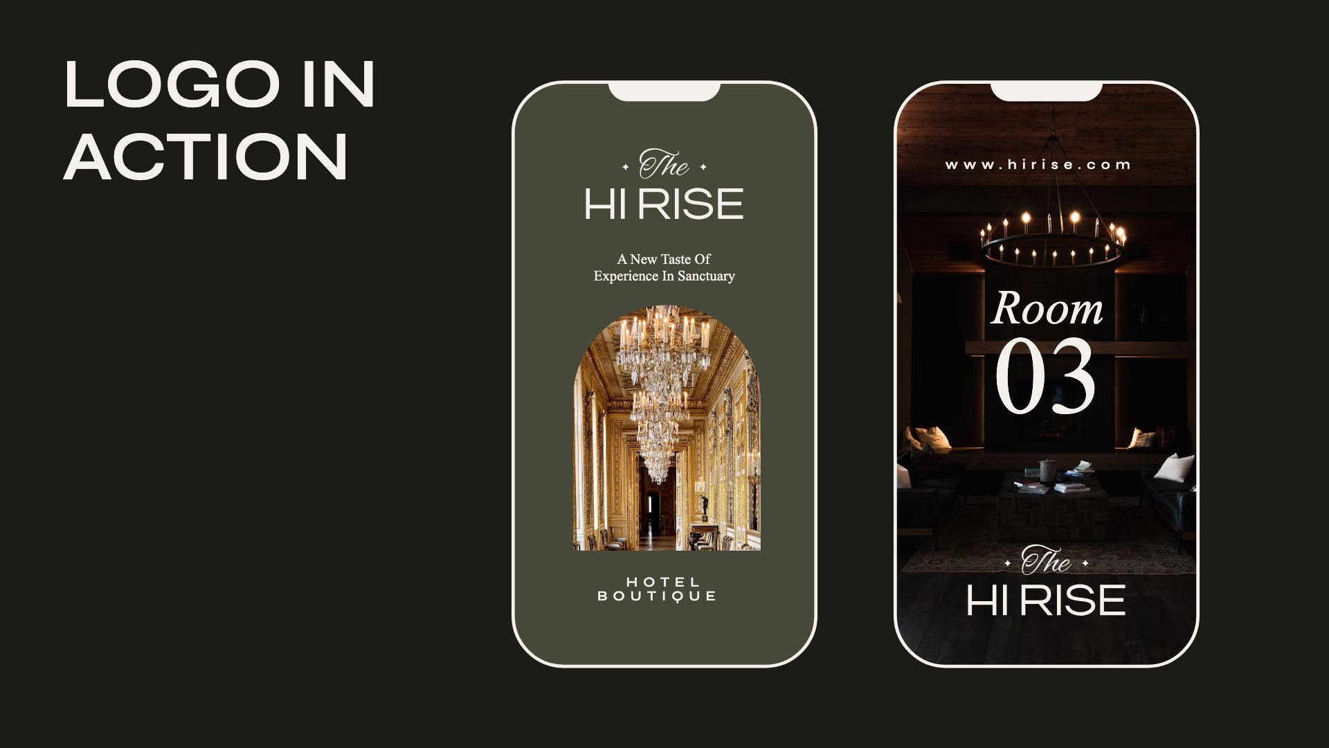
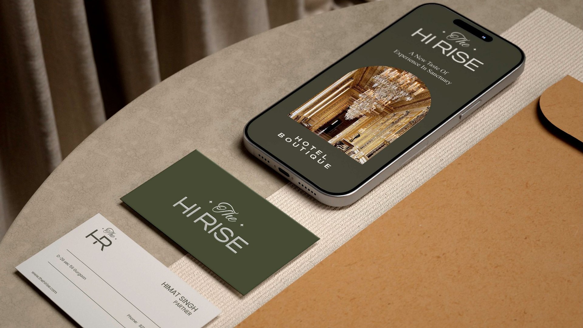
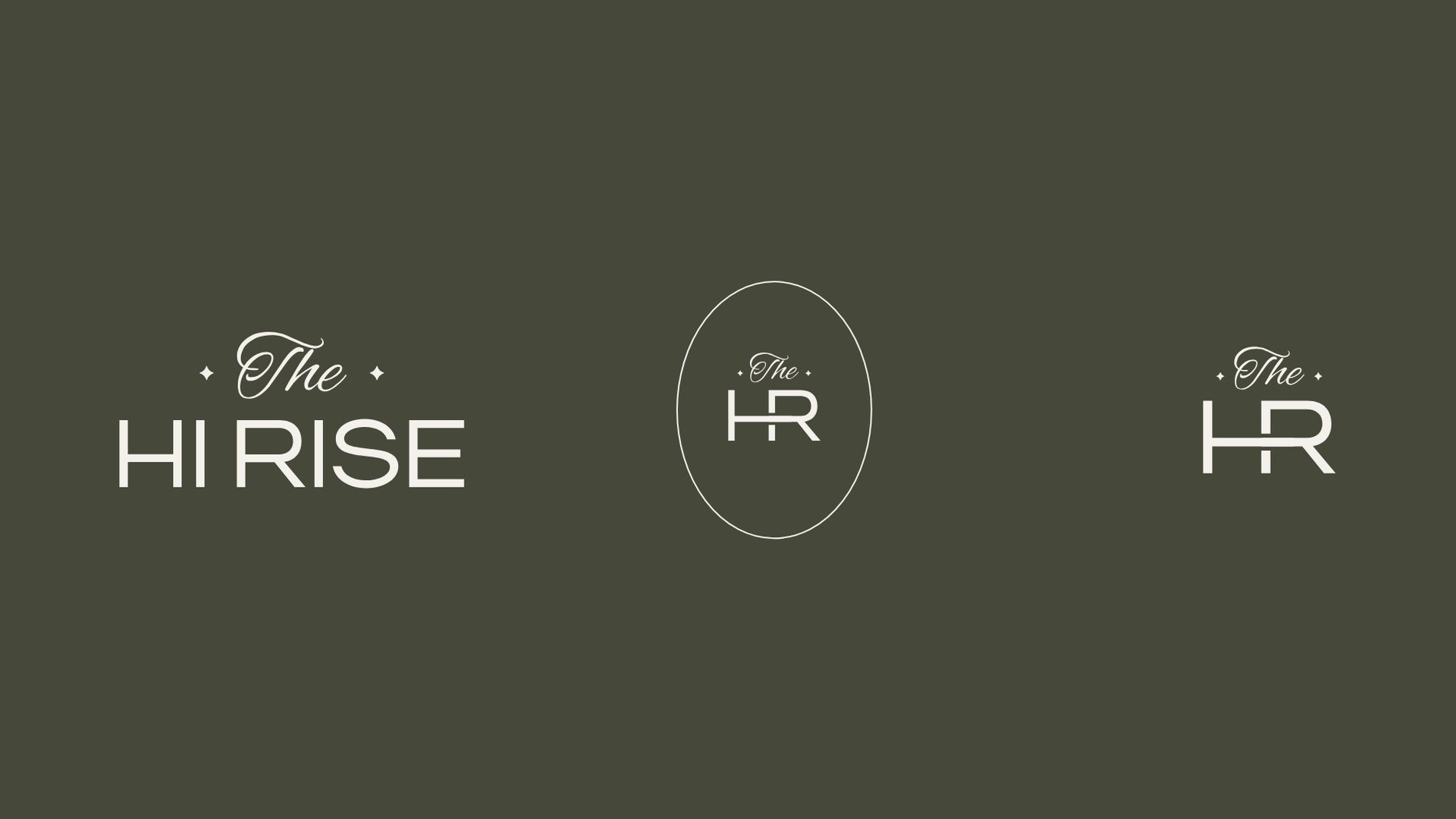
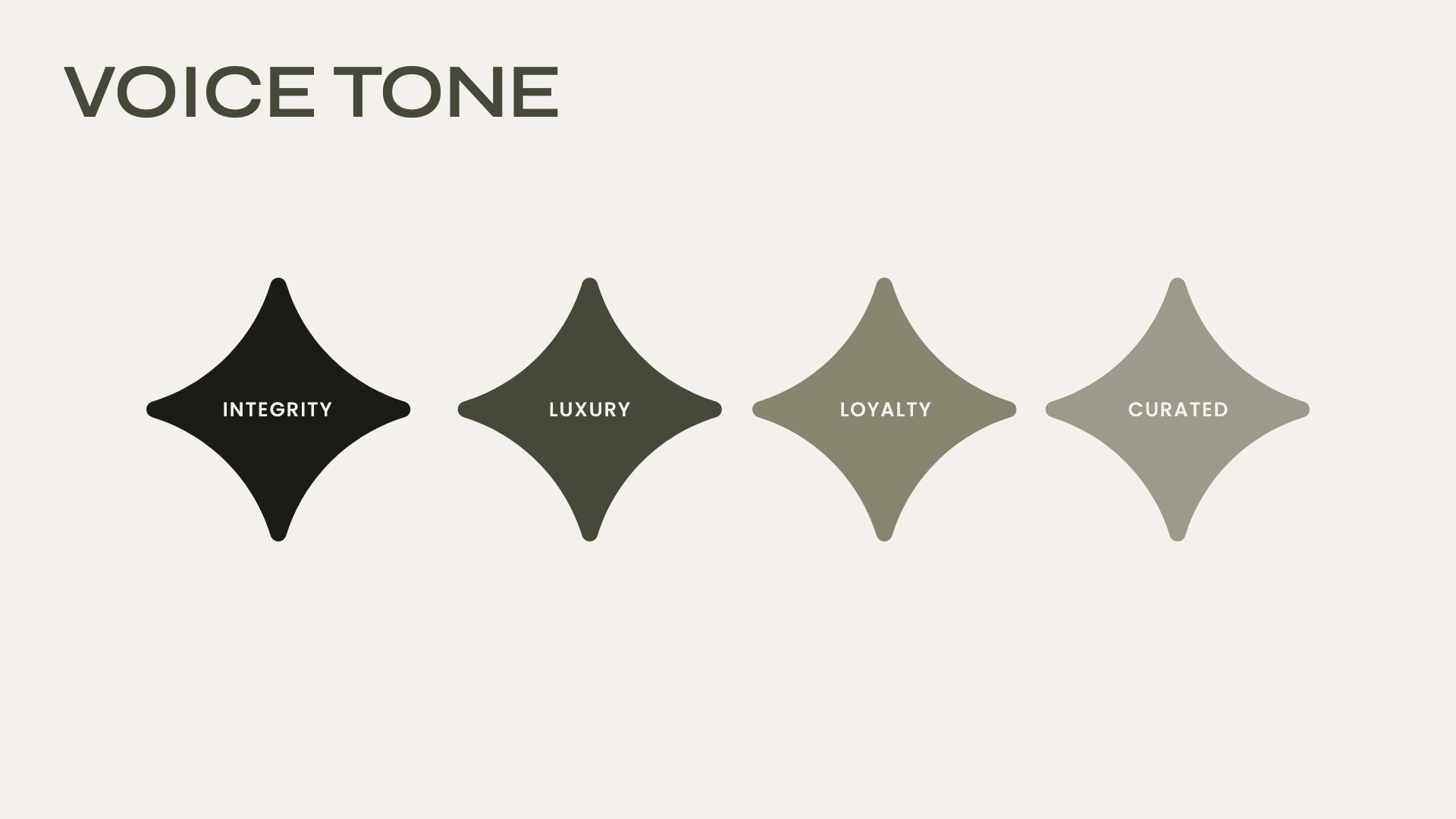
A script The over a wide, light HI RISE, and an HR monogram for small spaces. Integrity, luxury, loyalty and curated set the tone for every line of copy.
The stay
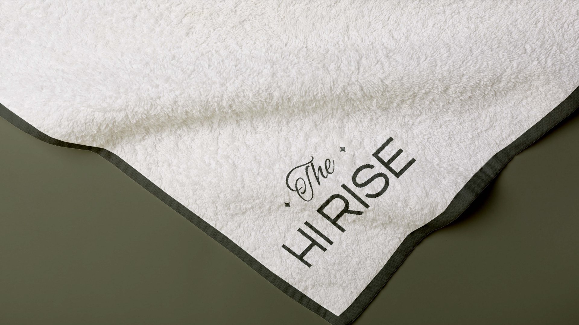
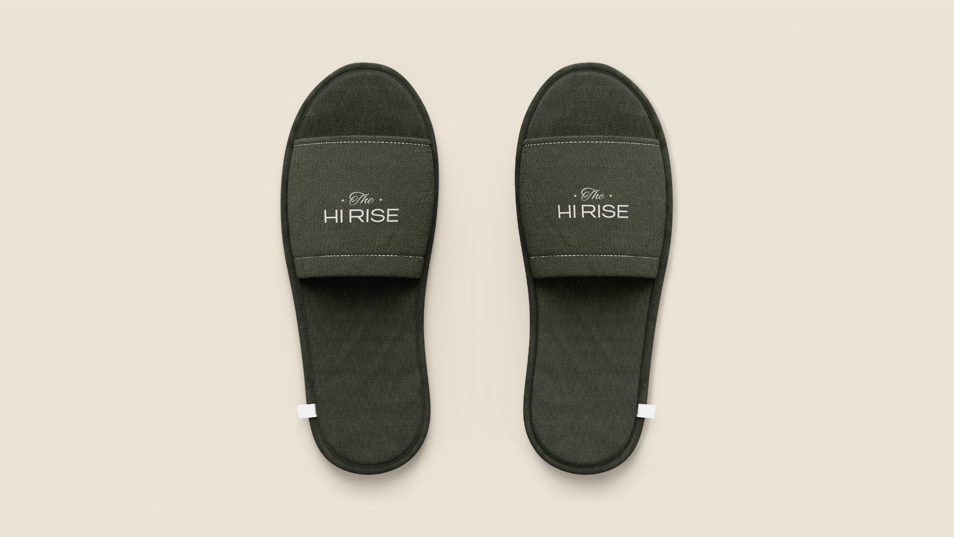
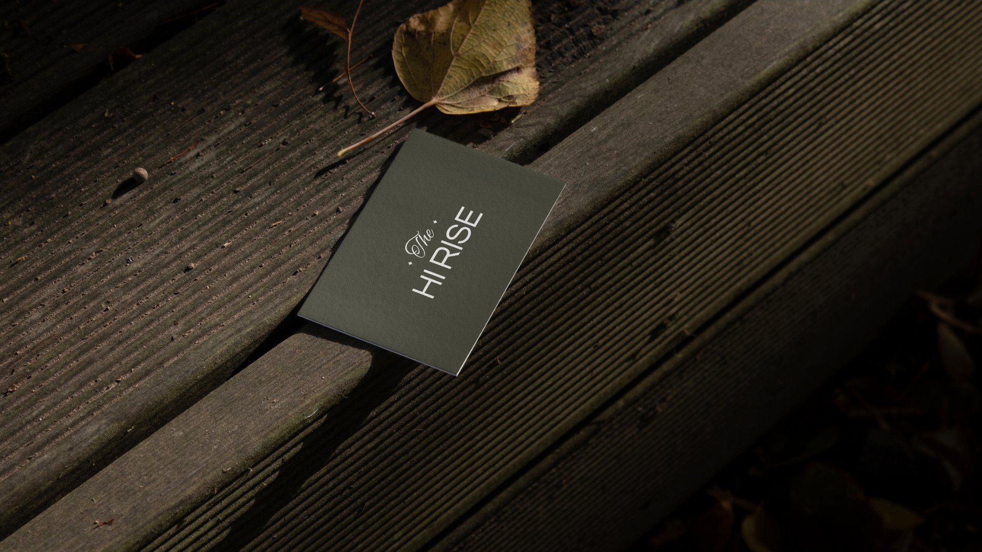
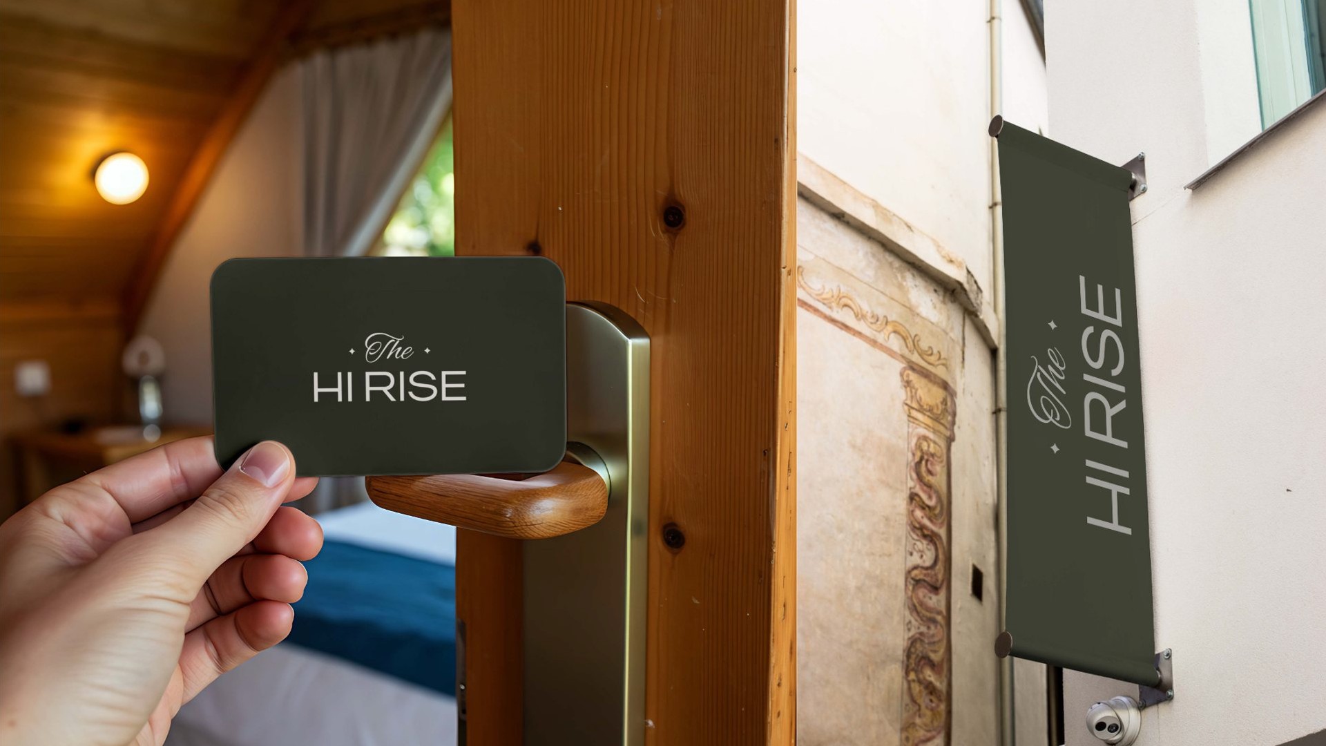
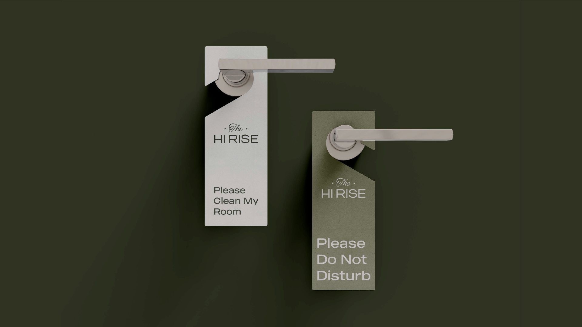
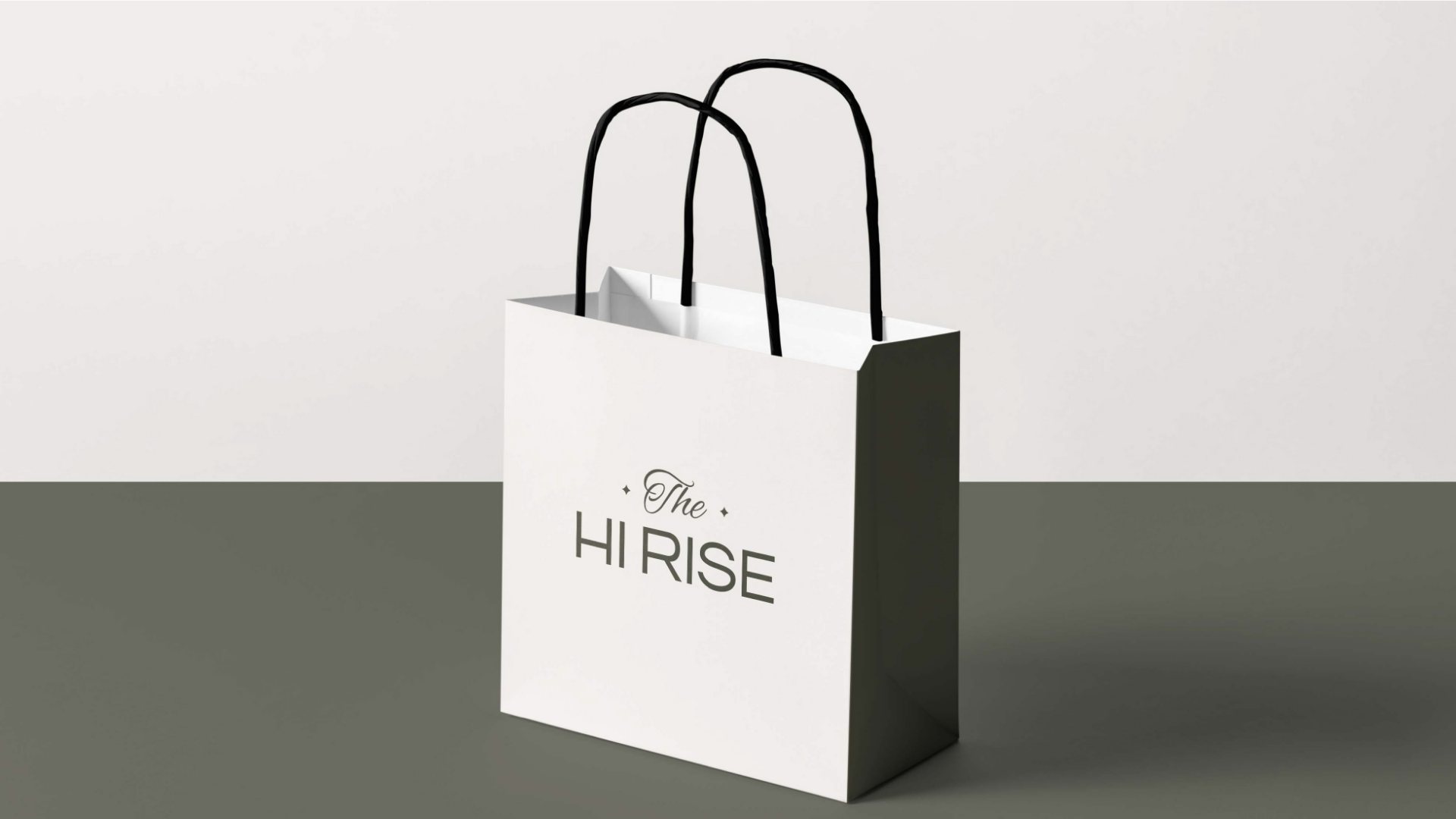
Every touch point a guest holds: the towel, the slippers, the key card and the sign on the door, all in olive with the logo pressed in linen.
Out in the world
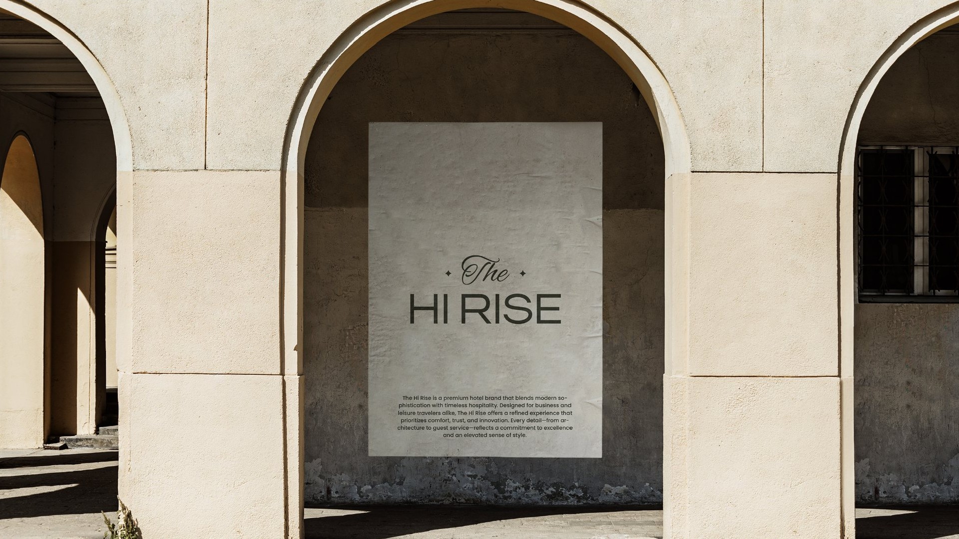
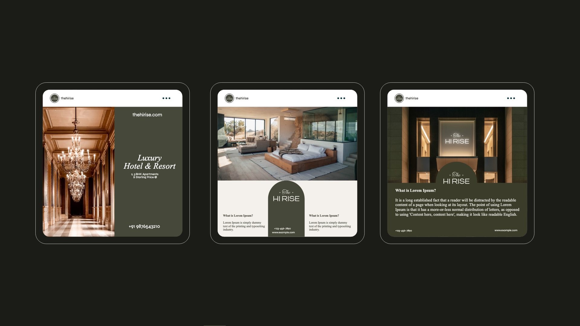
A poster in stone arches, a social feed of lobbies and rooms, and a booking flow that feels like the front desk.