Slite Media
A branding agency for direct to consumer brands. Loud colour, one playful shape and a logo that never sits still.
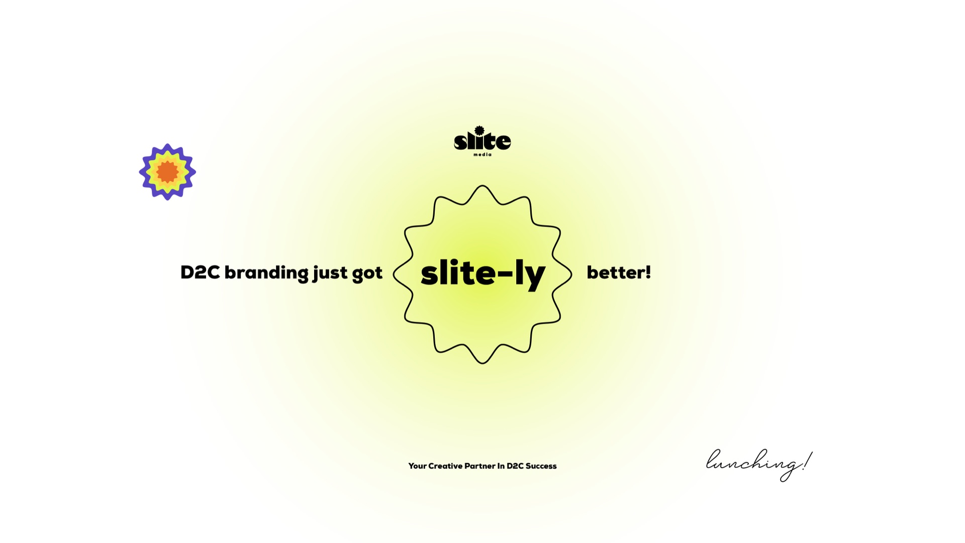
D2C branding just got slite-ly better.
A D2C-focused branding agency had a clear claim but an identity that looked like almost every other agency: dark backgrounds, sans-serif type, and a cold visual tone. The website generated 12 leads per month.
Research into agency positioning showed that founders often want a partner who feels like a peer rather than a distant expert. The opportunity was to make the agency feel both strategic and approachable.
The identity became playful but intentional. A flexible logo shifted perspective and could be read in multiple ways. Messaging focused on founder problems rather than agency credentials.
Website leads increased from 12 to 48 per month. Proposal-to-close moved from 18% to 41%, average project value from $12K to $18K, and inbound became 60% of business compared with 25% previously.
Agencies disappear when they look like other agencies. Show that you understand the customer's world.
Identity
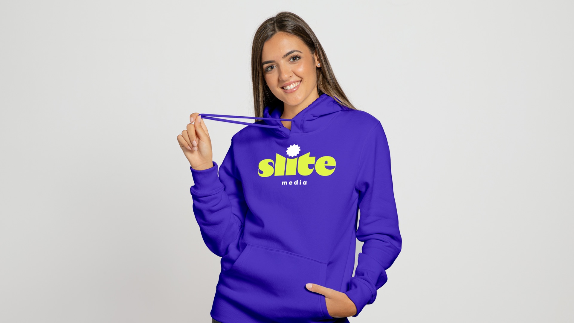
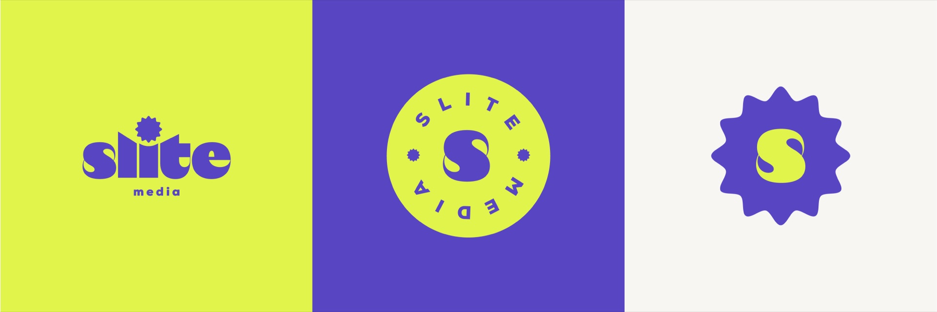
A chunky lowercase wordmark with a sunburst for the dot on the i. The same burst holds the S on its own, and a round seal spells the name for stamps and stickers.
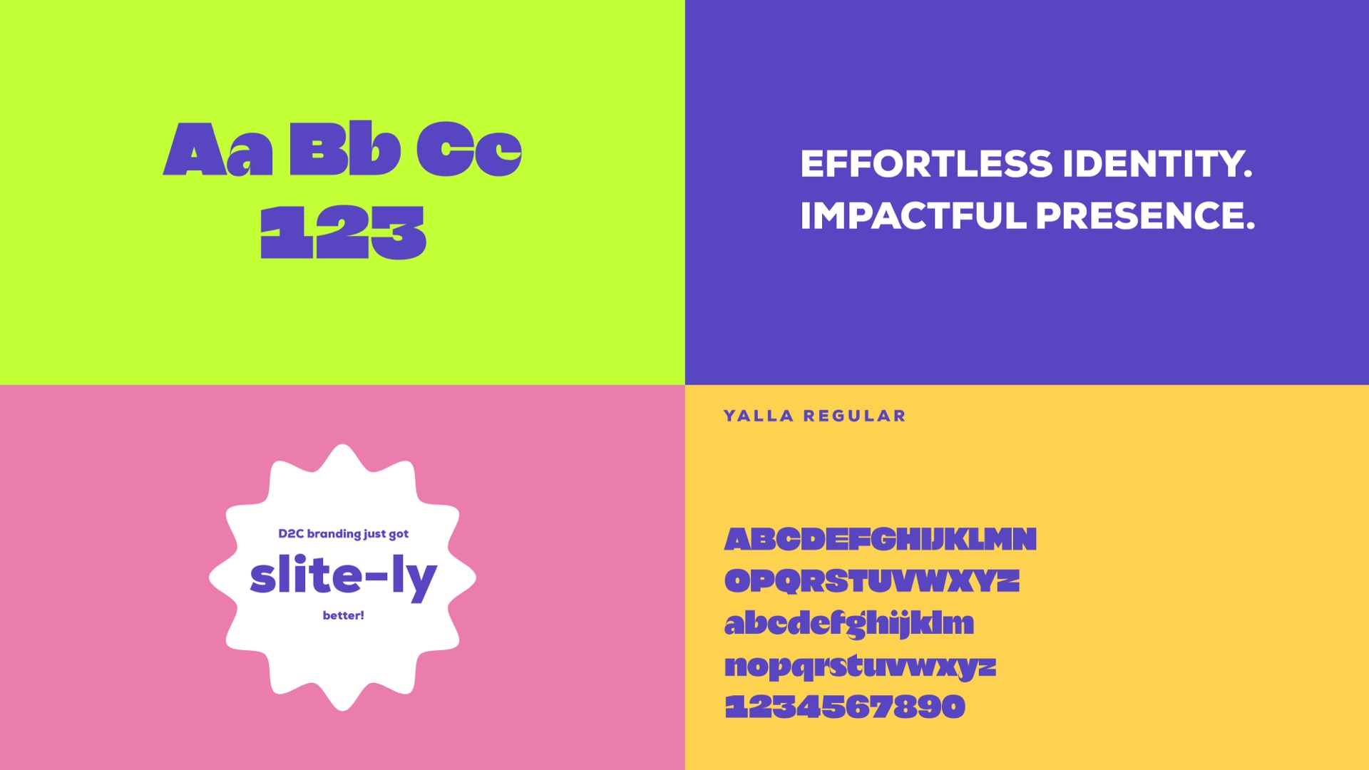
Voice
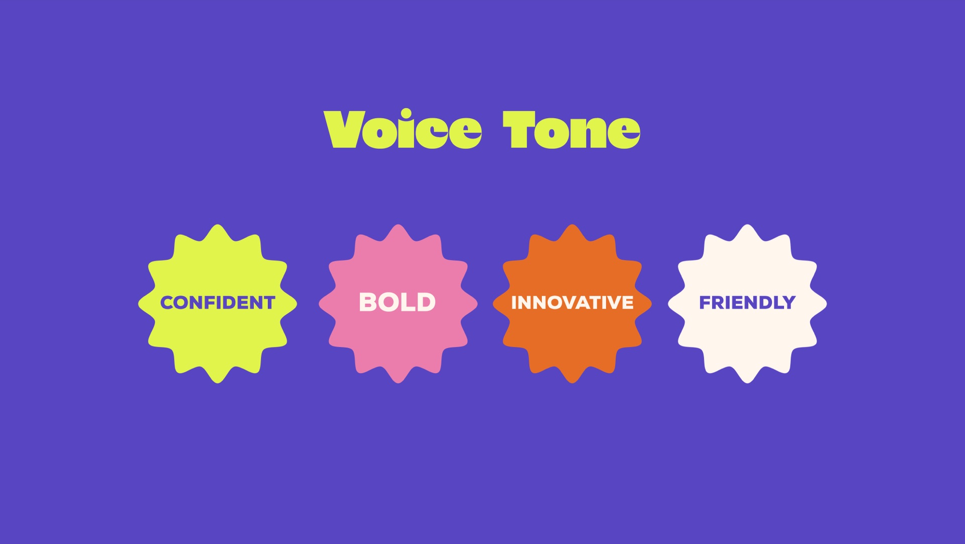
Confident, bold, innovative, friendly. Every service gets its own burst, and the launch line is a pun the team can say out loud.

Social & web
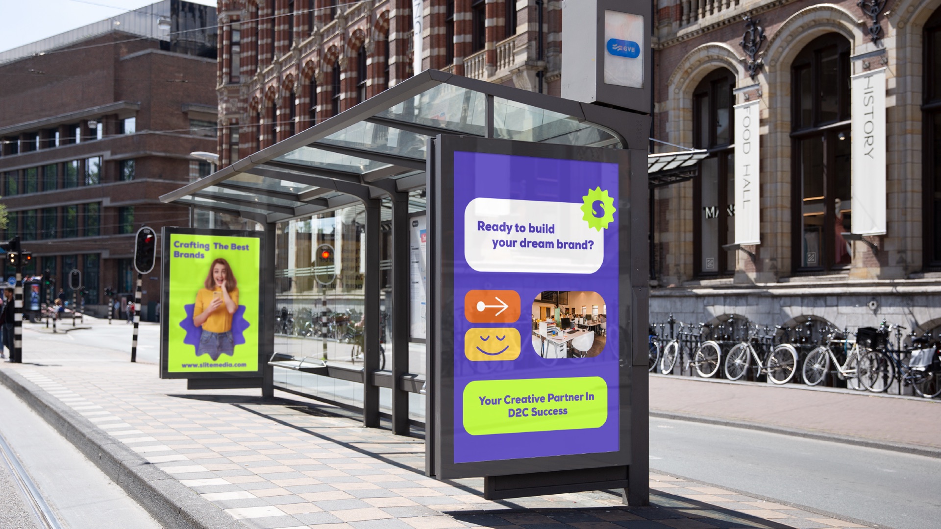
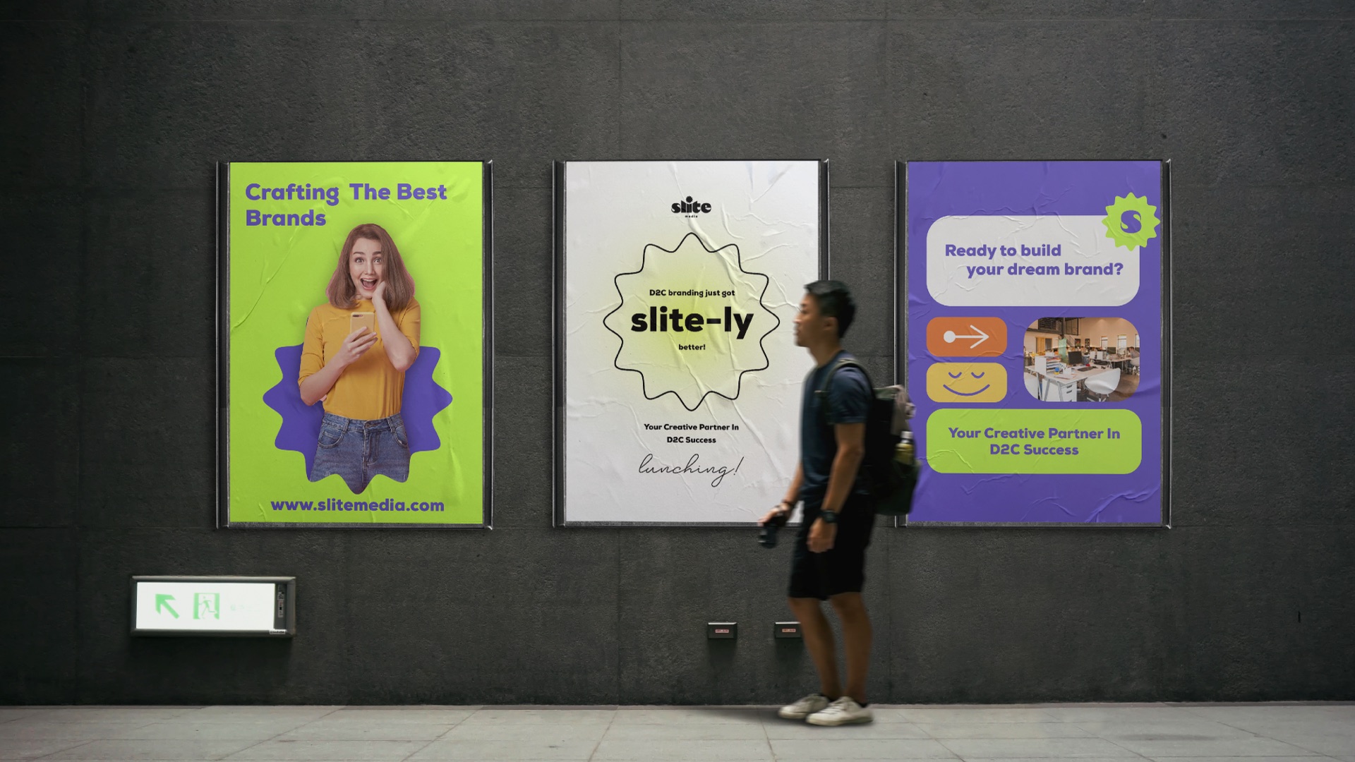
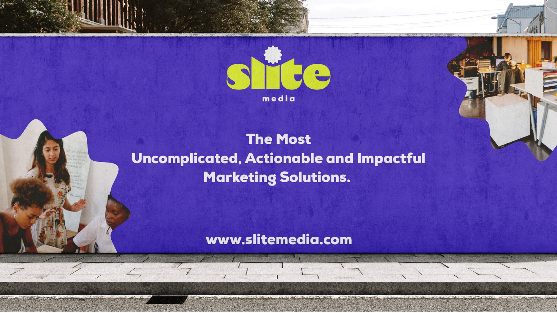
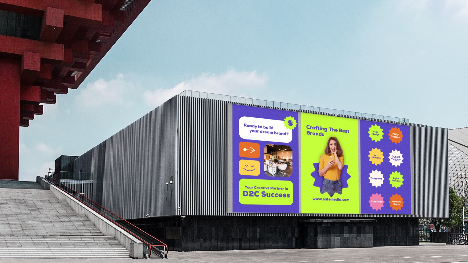
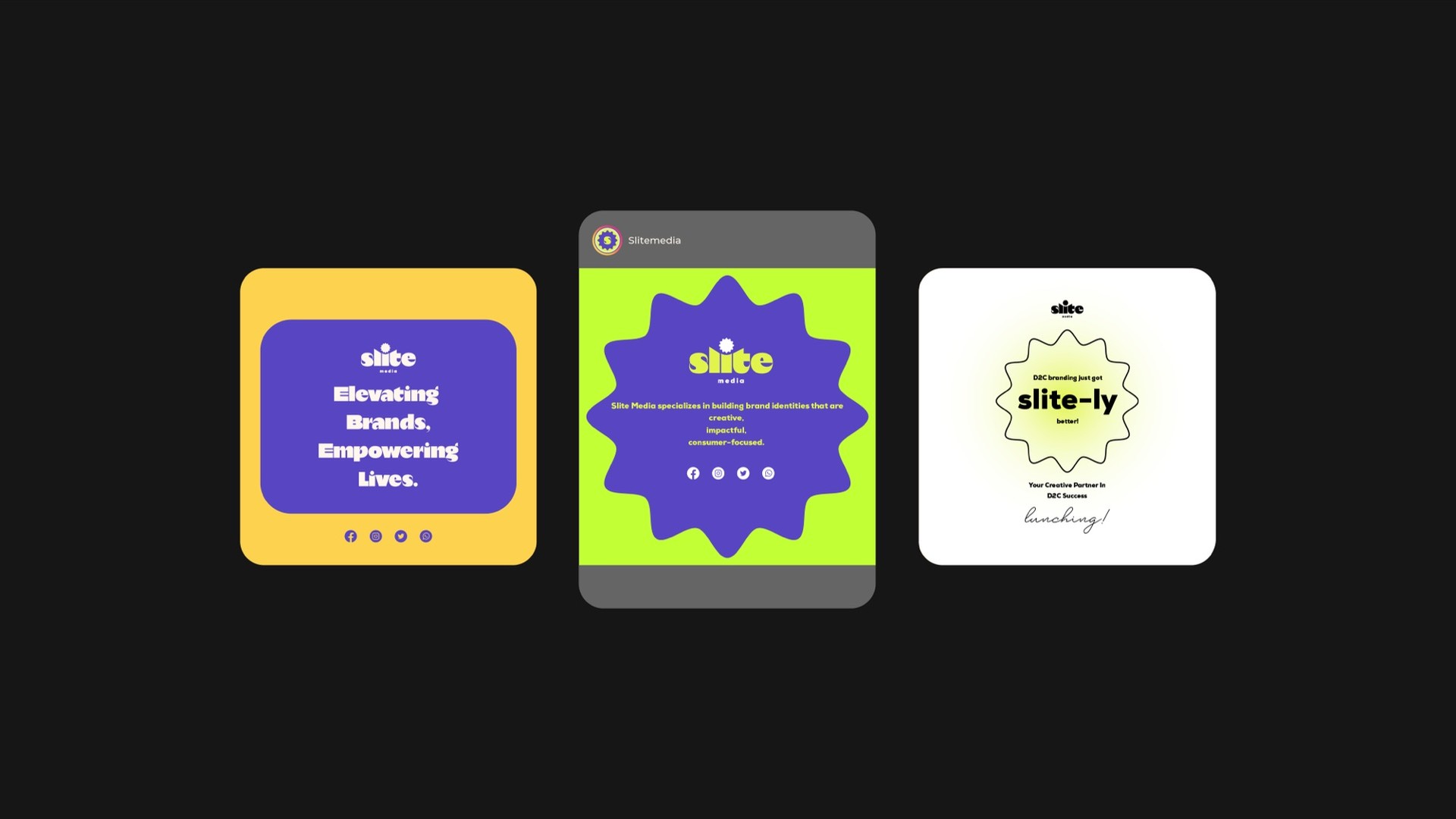
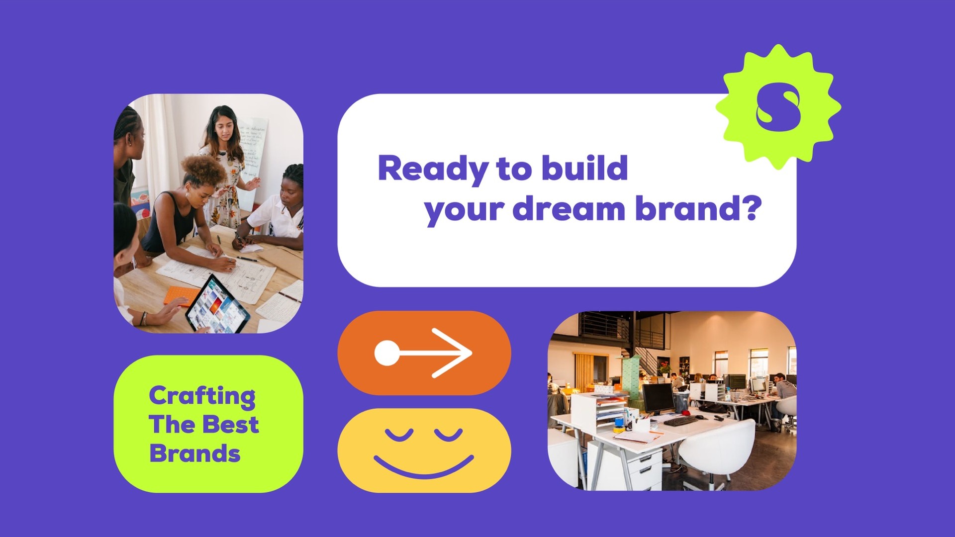
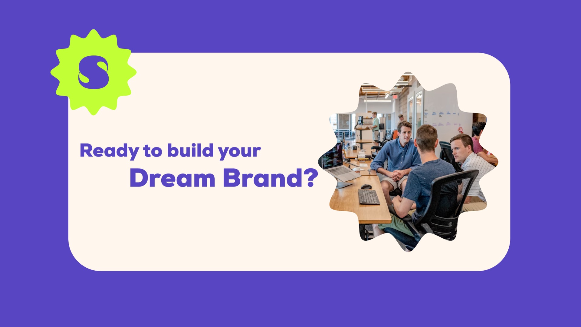
Rounded cards that stack like app tiles. Photos get cut into the burst, arrows and smiles do the pointing, and the purple keeps it all in one family.
Out in the world
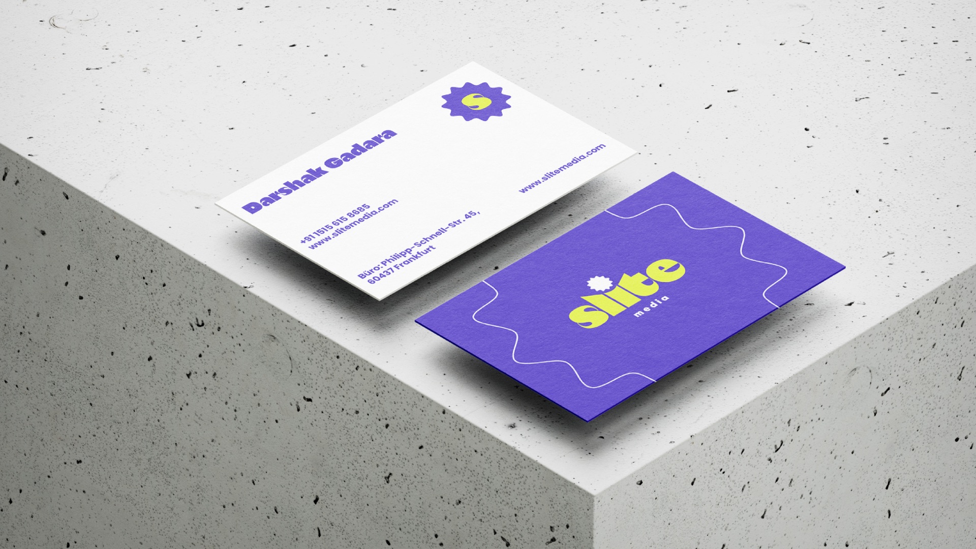
Business cards with a wavy line, a hoodie people wear off the clock and posters that hold up on a busy street.