Radius
A software company that builds products, not just code. The mark is a ring of arrows, all turning the same way.
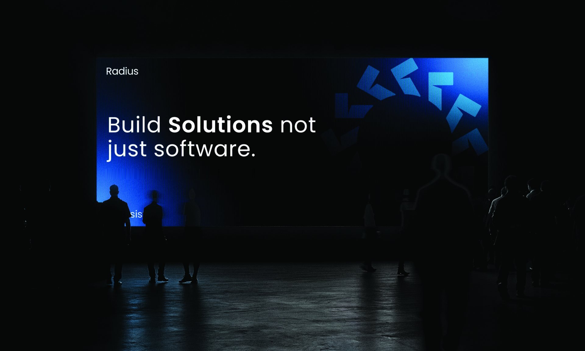
Build solutions, not just software.
A SaaS project-management company had strong features but struggled to communicate differentiation. Its identity looked similar to many other software brands, while growth had plateaued at 12% year over year.
Customer-success interviews revealed that the strongest product advantage was not another feature. It was speed and clarity: teams could make decisions faster.
The identity was built around direction and momentum. The logo used arrows moving in the same direction to represent alignment, speed, and clarity. The rebrand extended into the website and sales deck.
Website conversion increased from 2.1% to 4.2%, demo requests rose 85%, and CAC decreased from $1,200 to $840. Reported enterprise sales reached $2.8M in year one and growth accelerated to 34% YoY.
Software brands should communicate the outcome they create, not simply the features they contain.
Identity
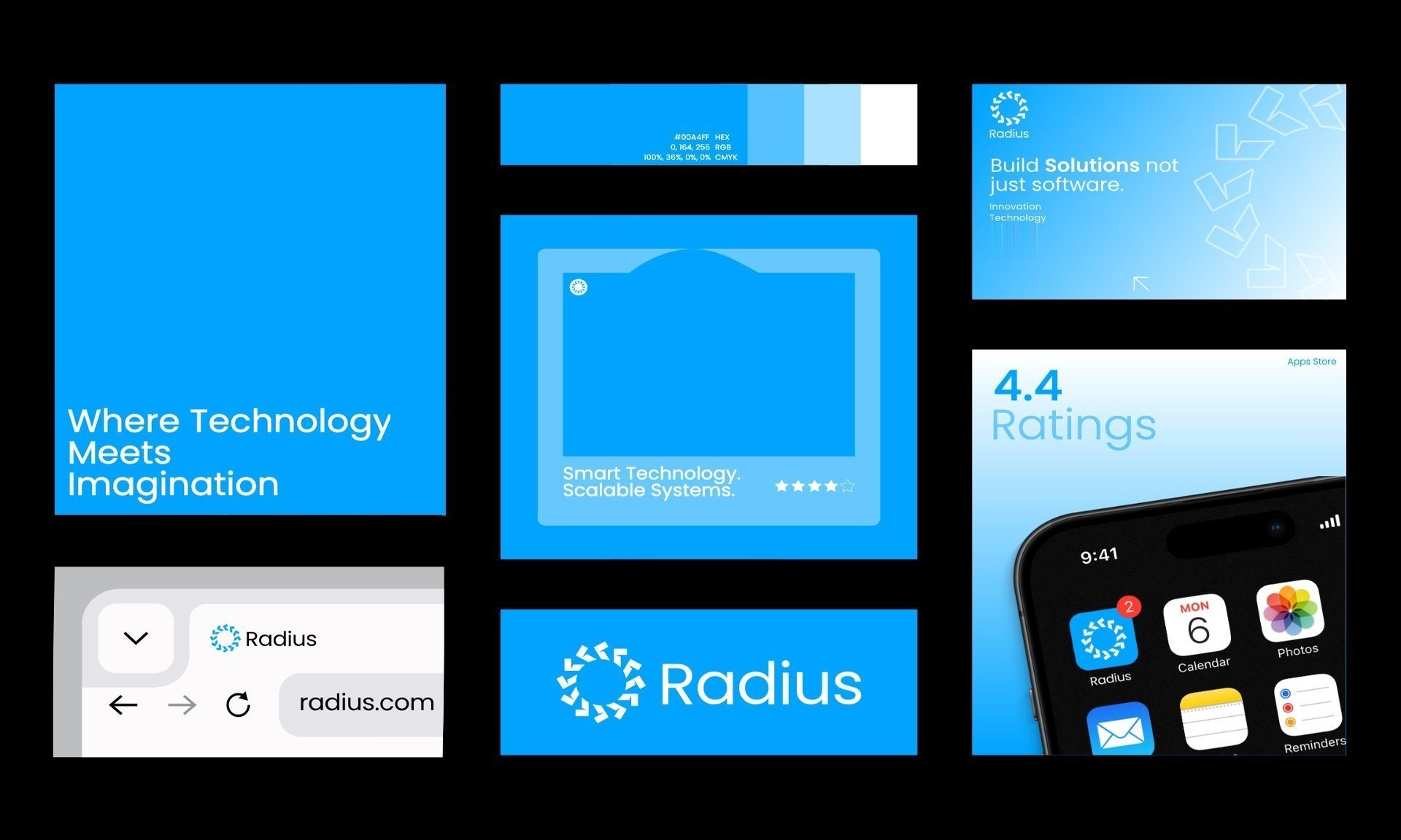
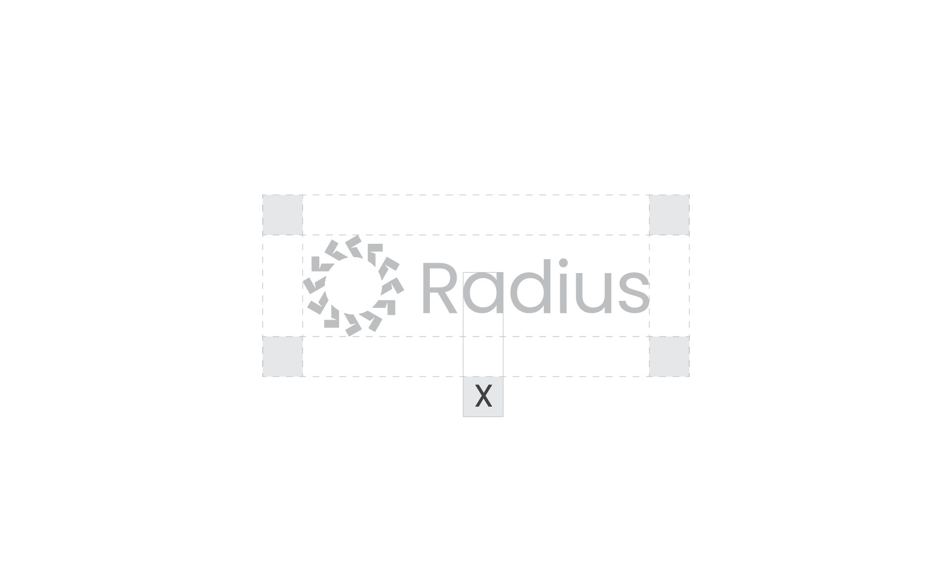
The arrow ring and a friendly rounded wordmark, with clear space set by the height of the R. It works in white on blue, blue on black and grey on white.
In use
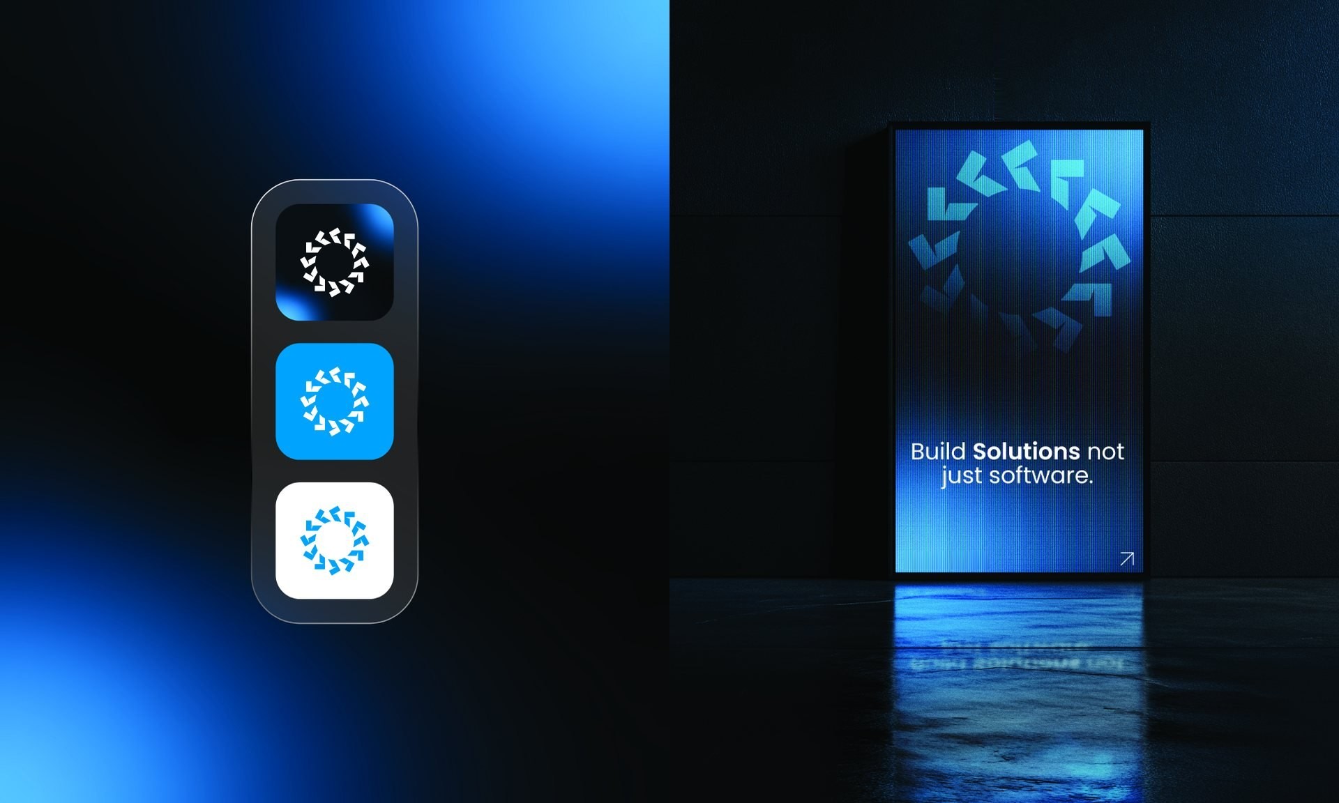
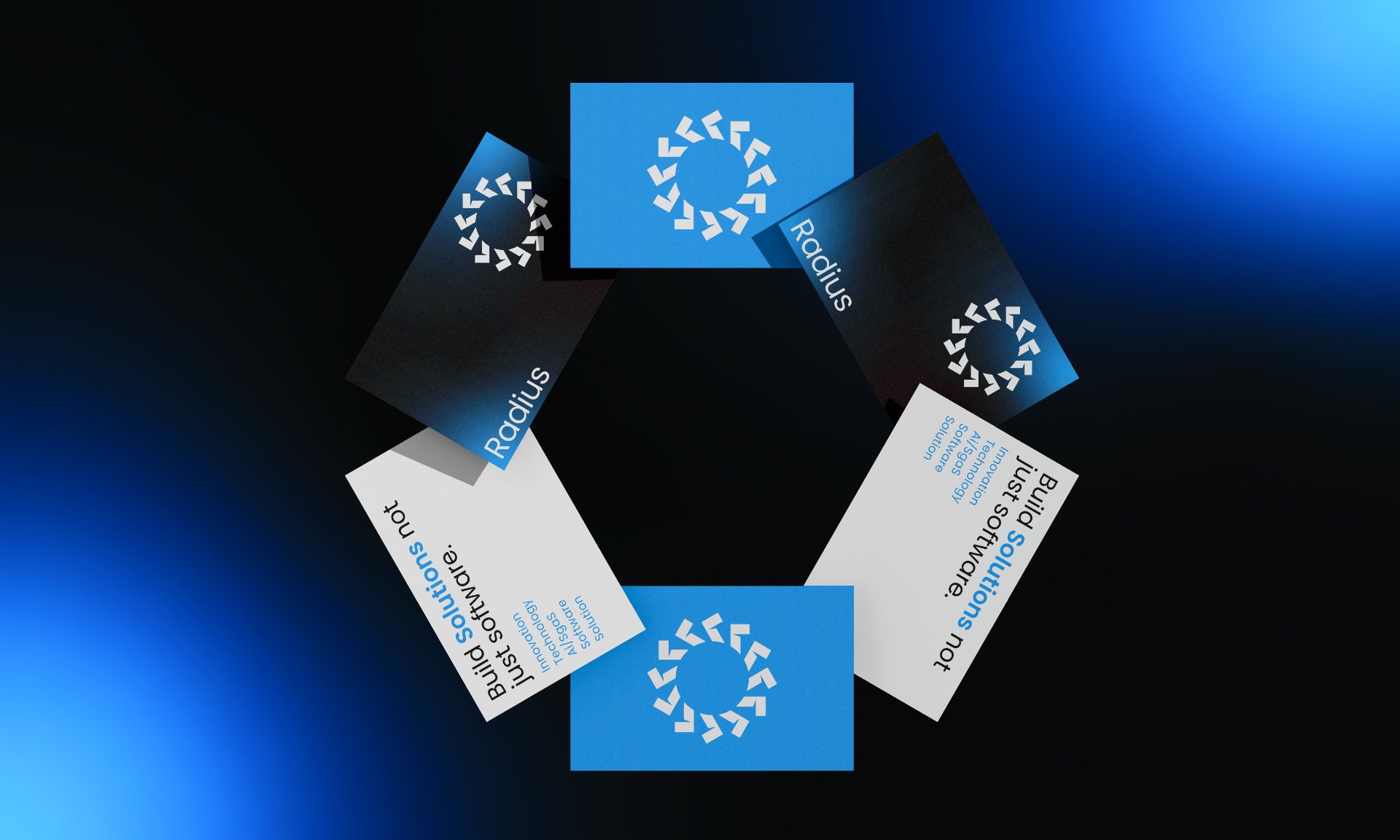
App icons, a website, a social profile and cards that turn the ring into a pattern. On stage, the arrows grow big enough to fill the screen behind the speaker.