Netro
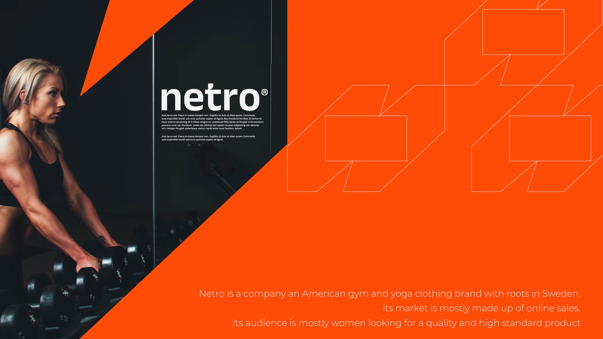
A gym and yoga clothing brand for women, sold mostly online. The old look was soft and generic. The new one had to feel like the last rep of a good session.
Fitness is trend.
A five-year-old activewear brand had loyal customers but an identity that felt dated. Competitors were gaining share, and the brand needed to feel current without simply following trends.
Interviews with 40 customers revealed a clear emotional driver: women bought activewear to feel strong and seen. Competitor communication focused heavily on the body rather than the athlete.
NETRO was built around movement and power. The logo referenced the shape of a bicep curl, while bold colors and strong typography reinforced the idea of strength.
Website traffic increased 180%, conversion moved from 1.4% to 2.9%, the email list added 4,200 subscribers in three months, and the #NetroStrong campaign generated 8,200 UGC posts. Reported year-over-year revenue increased 67%.
Activewear is not only about fitness. It is about how people want to feel when they wear it.
Identity
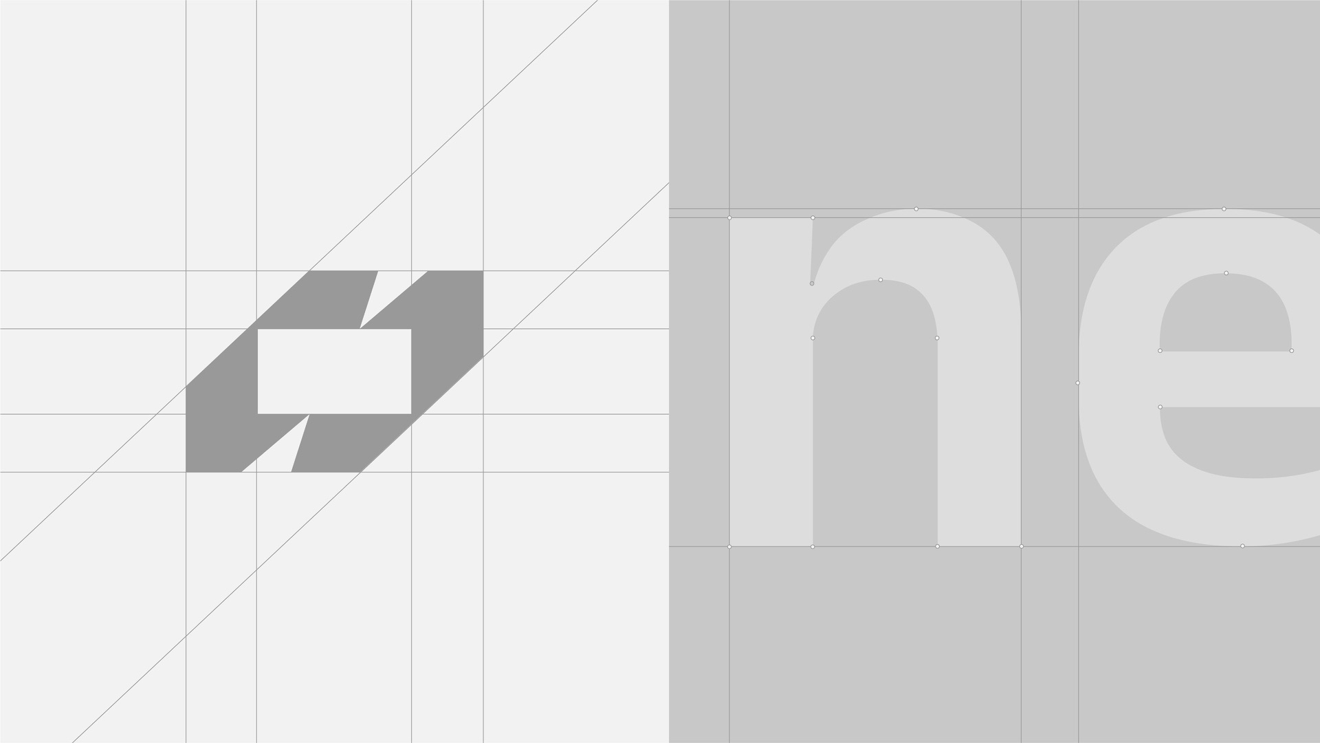
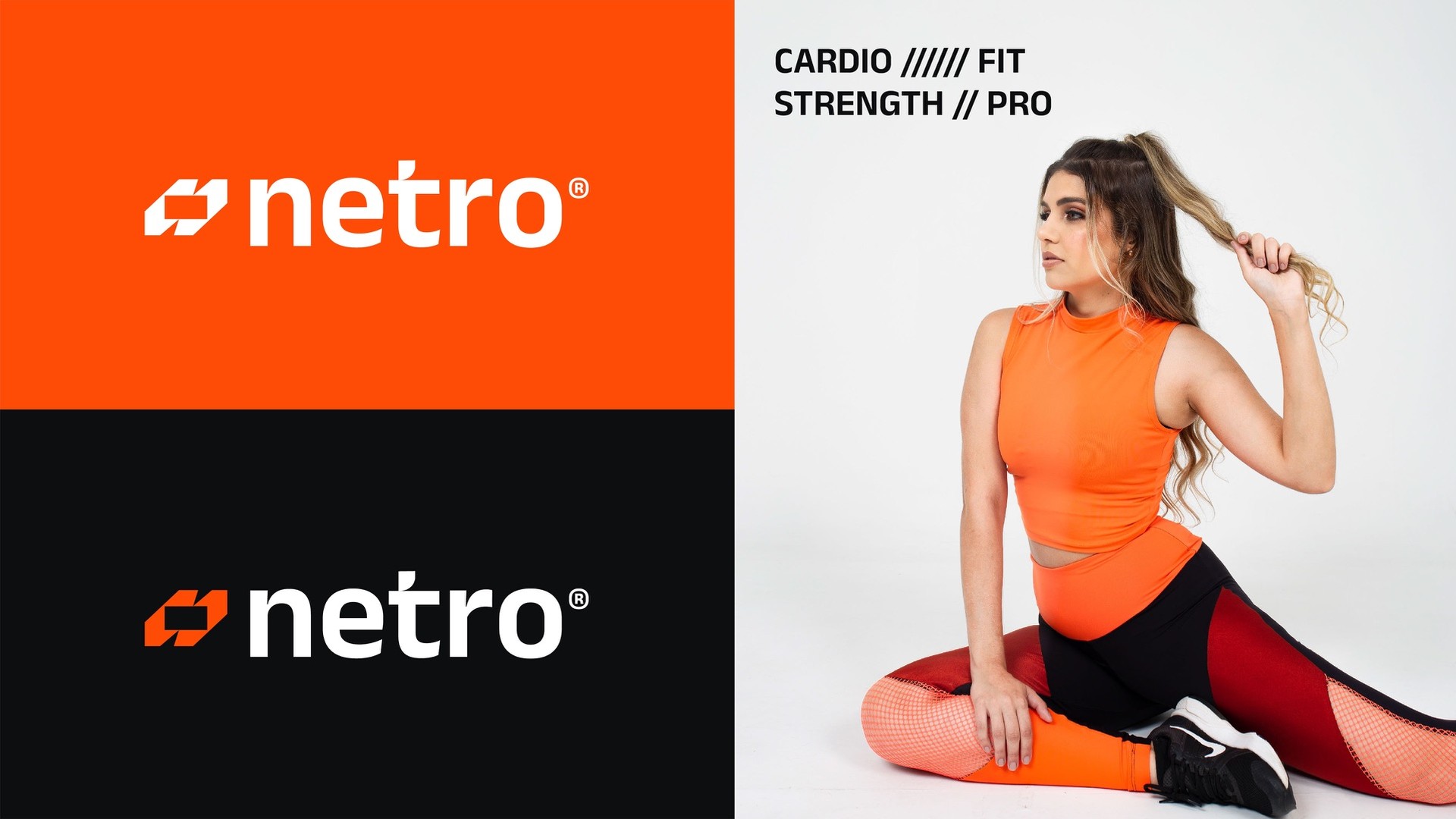
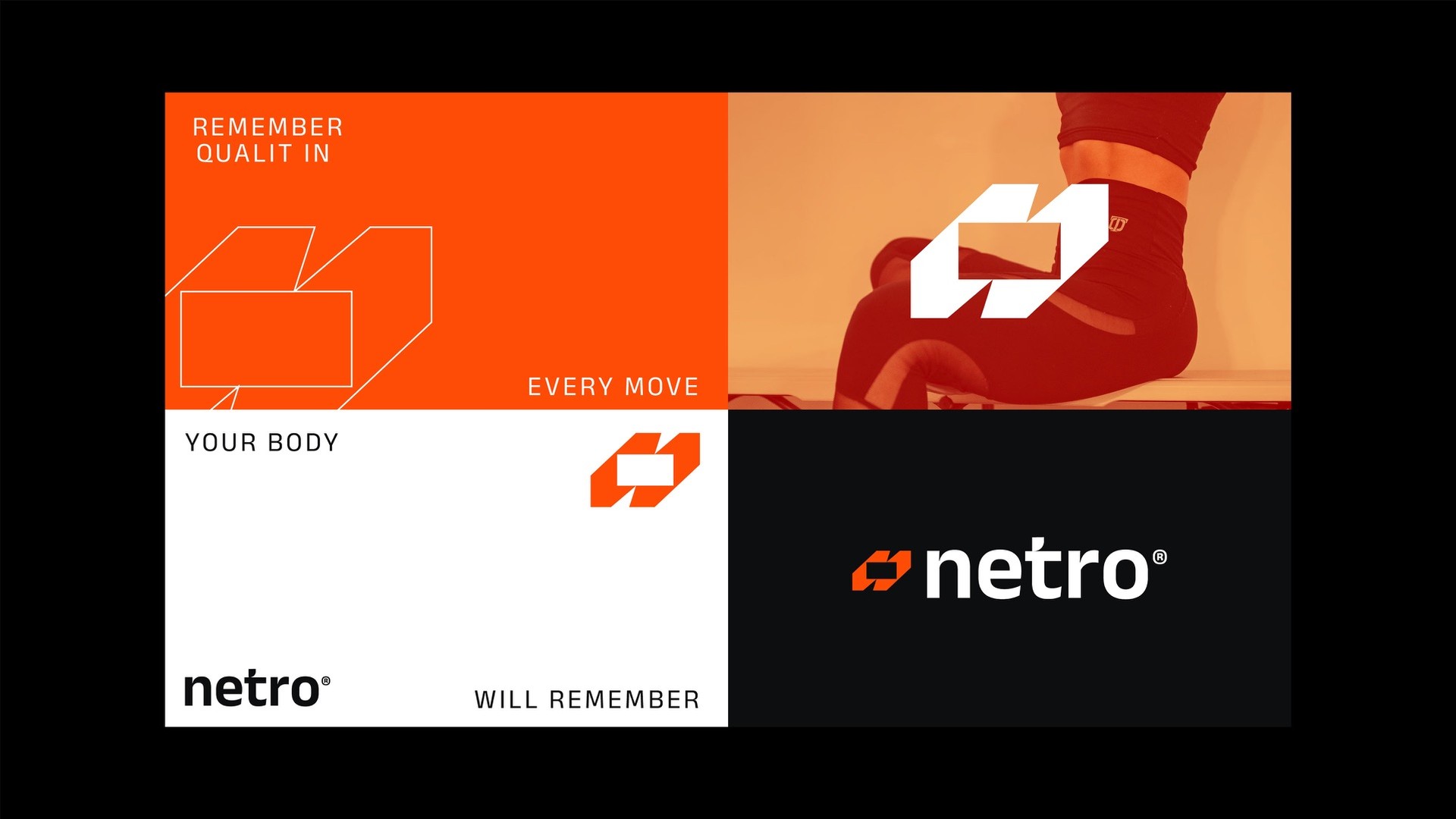
Two slanted blocks lock into an N that also reads as a bolt. Built on a strict grid, it sits next to a short, heavy wordmark and holds up at the size of a label or a stadium banner.
Voice
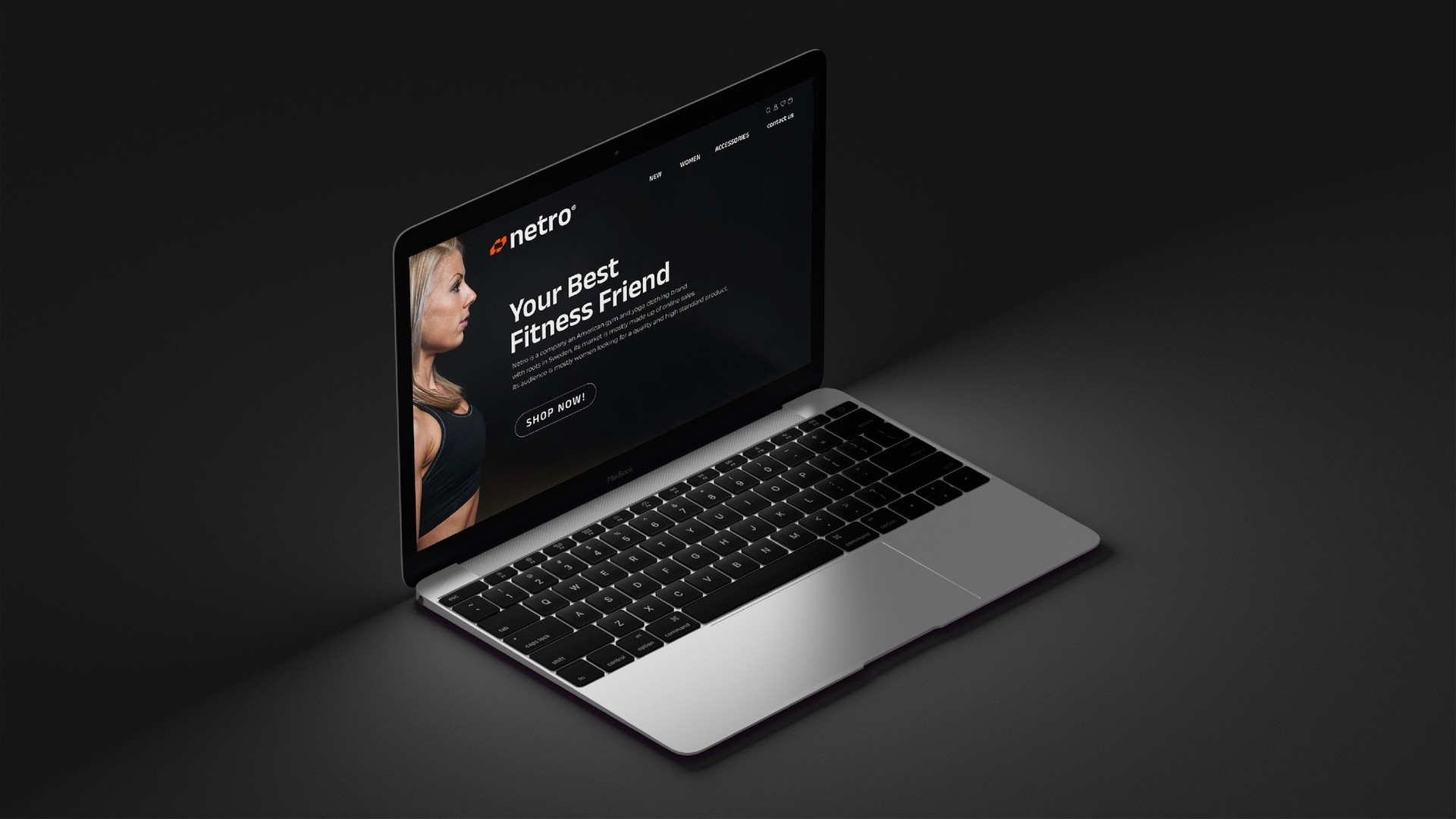
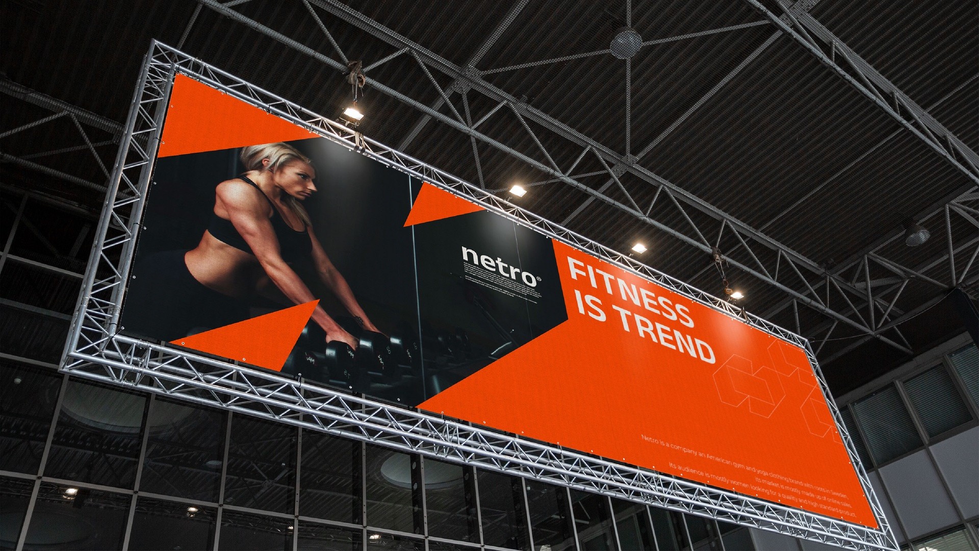
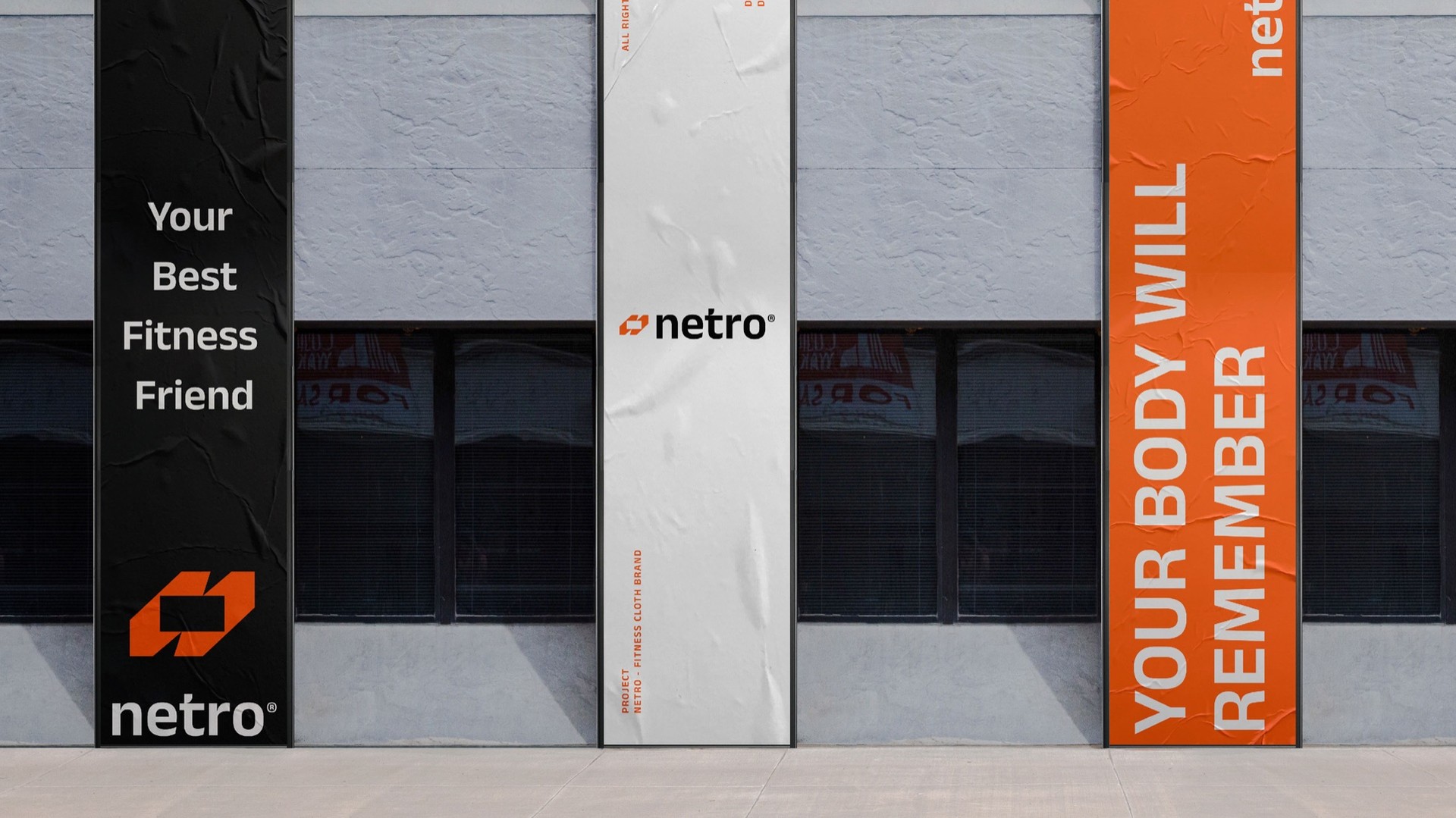
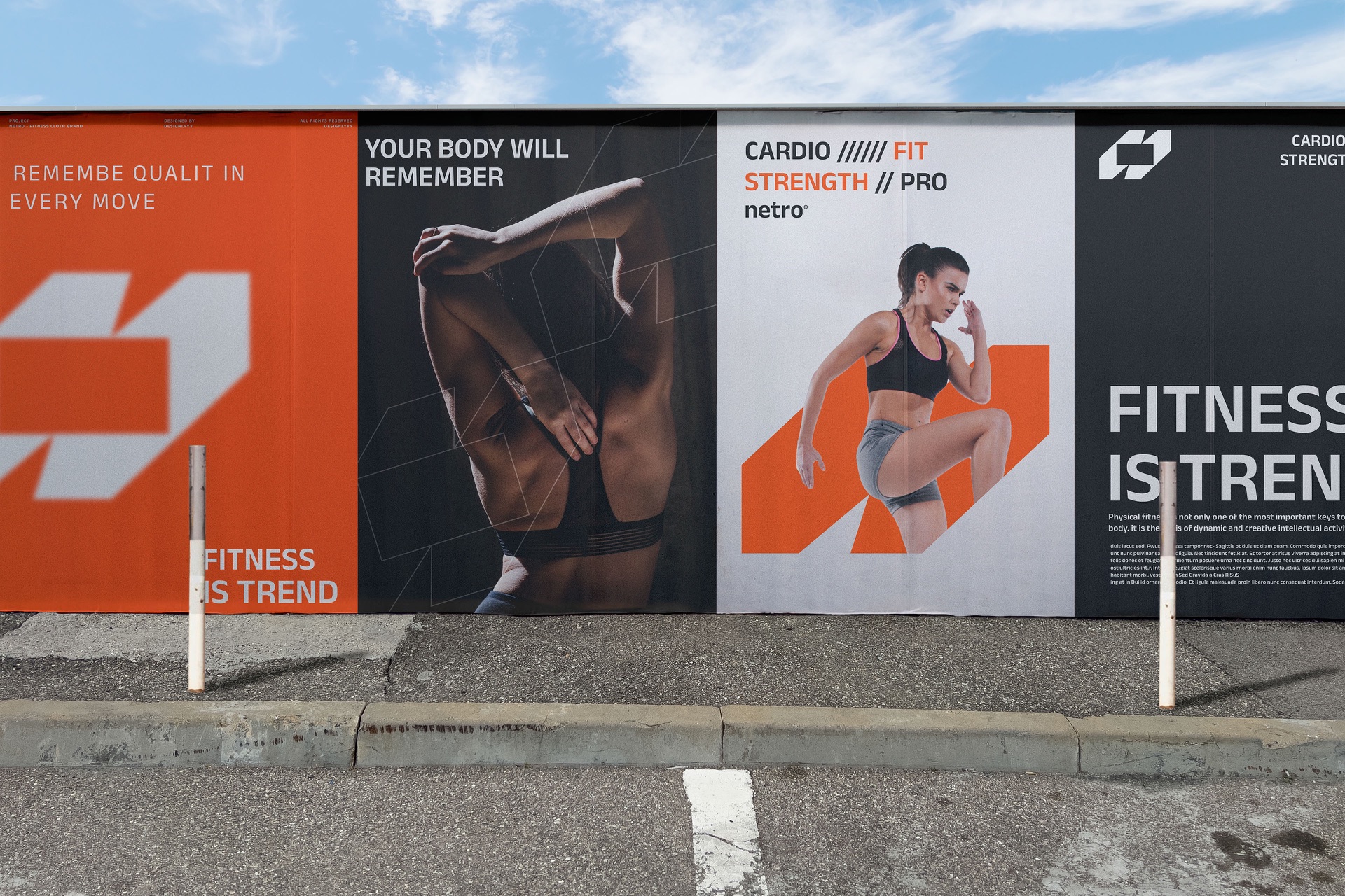
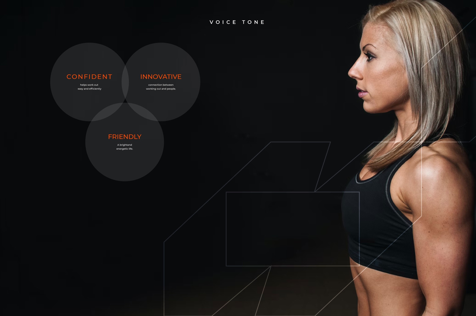
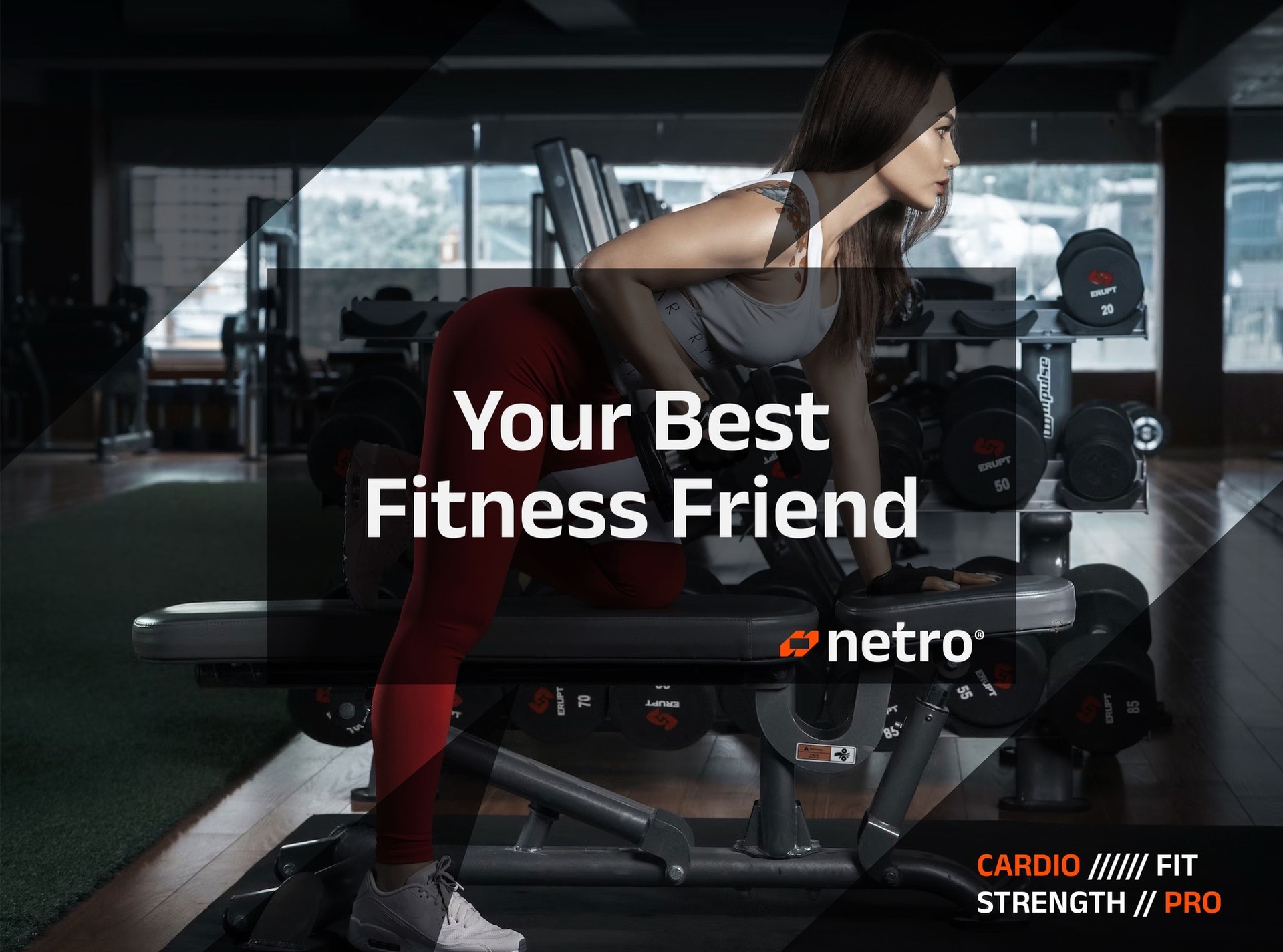
Confident, innovative, friendly. Lines are short and made to be shouted across a gym: Your best fitness friend, Your body will remember, Fitness is trend.
Print & merch
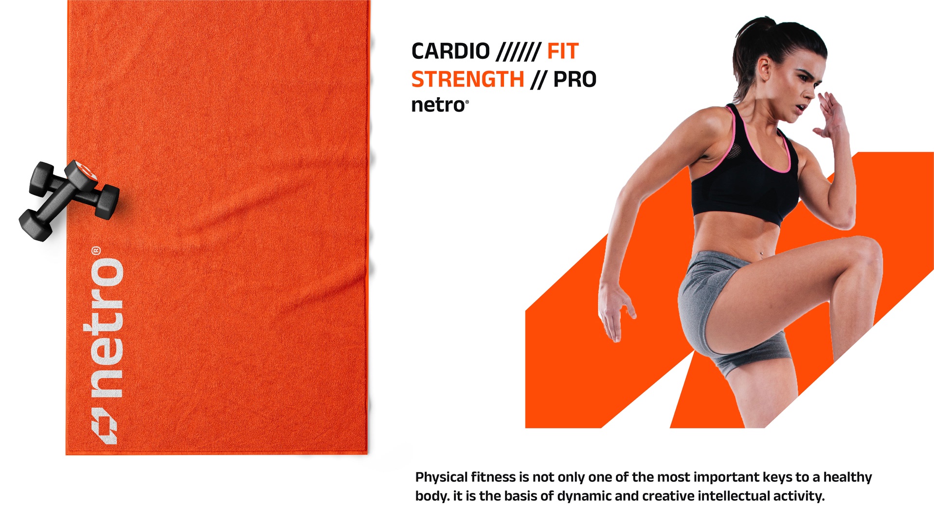
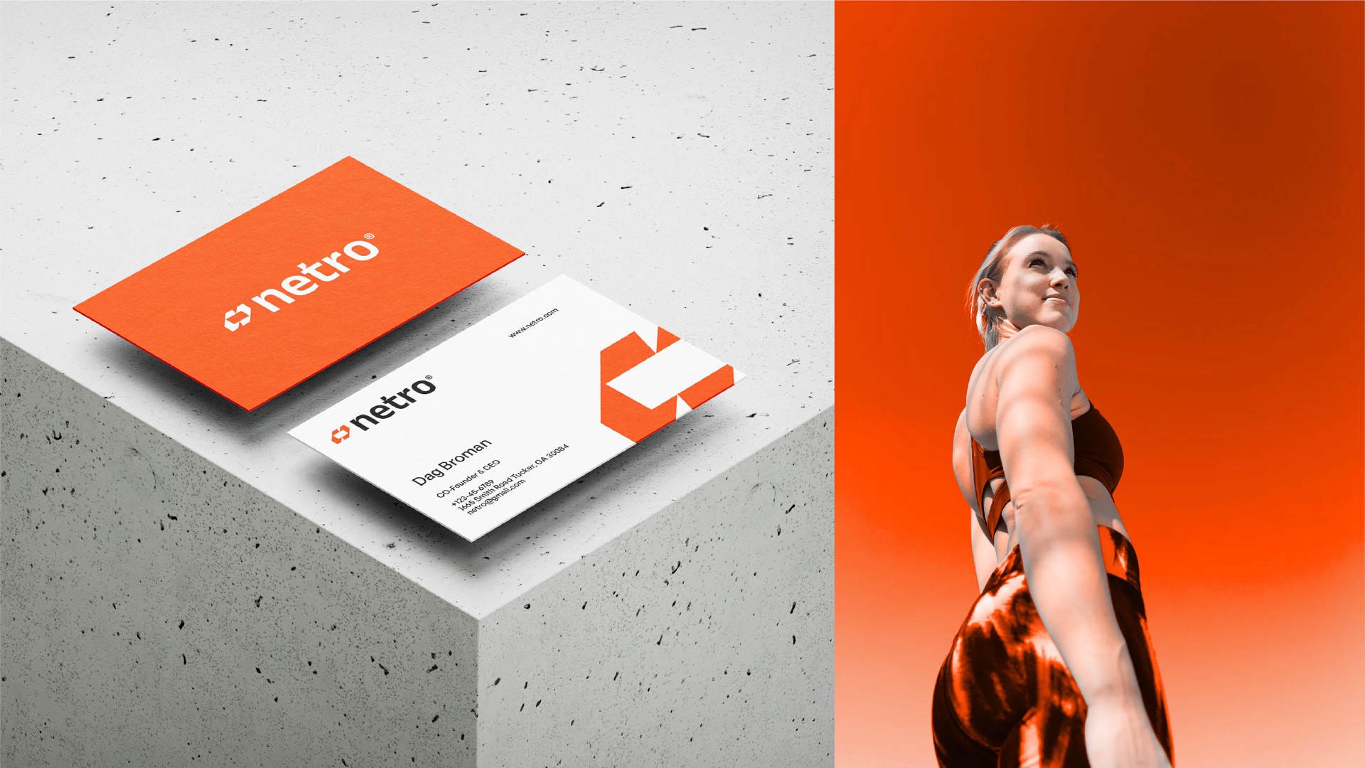
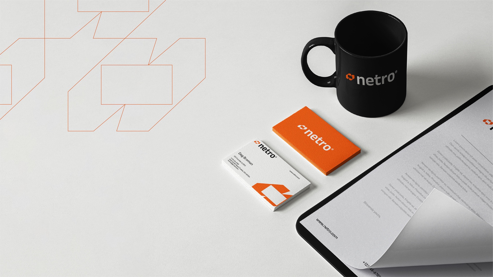
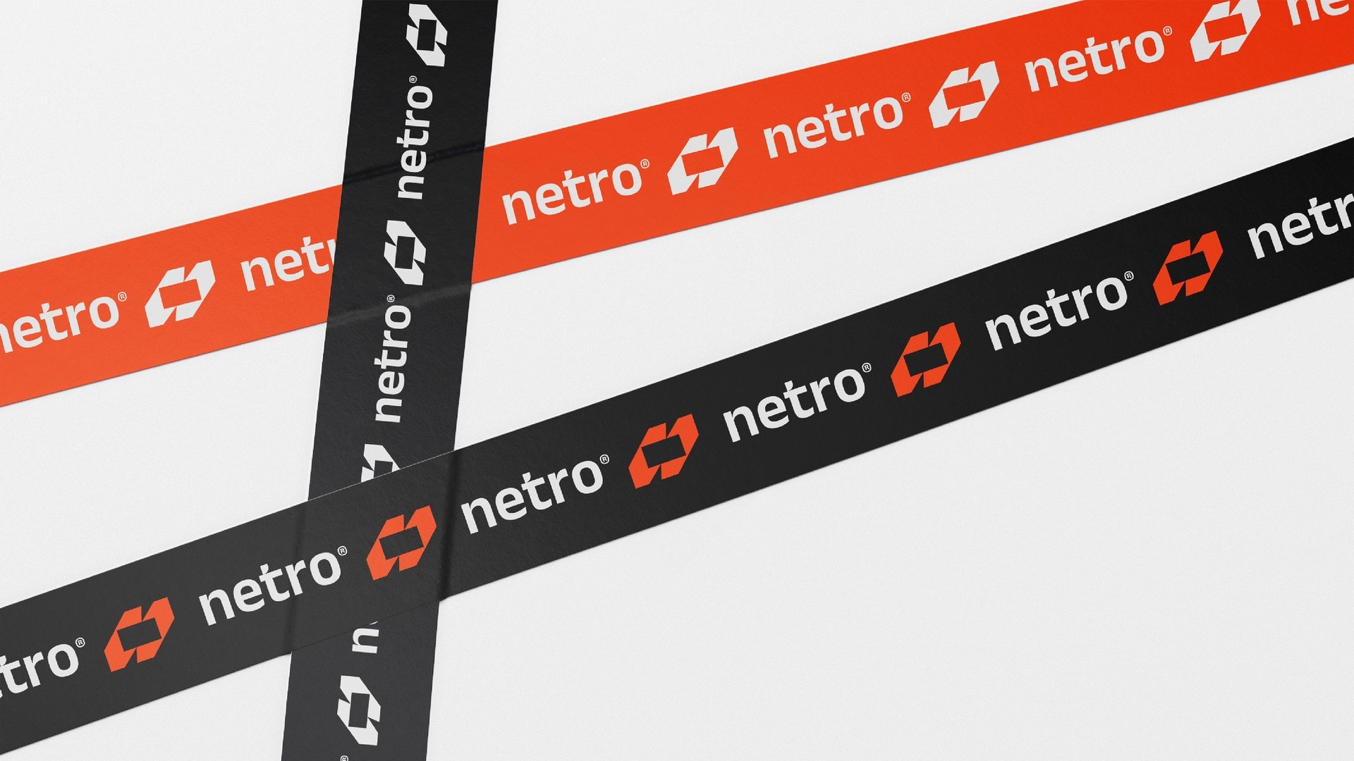
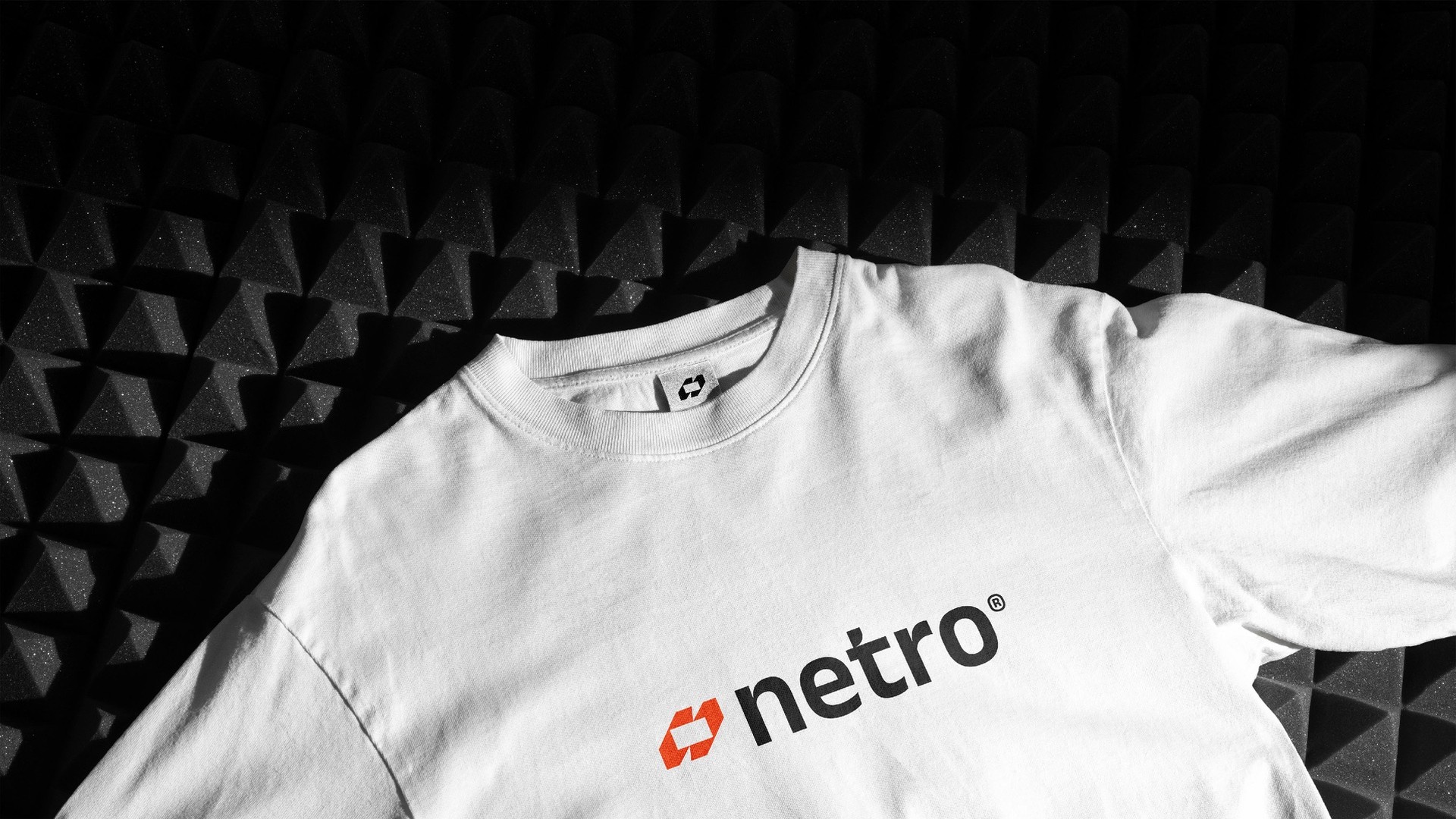
Cards cut on the slant, a gym towel, a mug, branded tape and a white tee with the logo right where it counts.
Out in the world
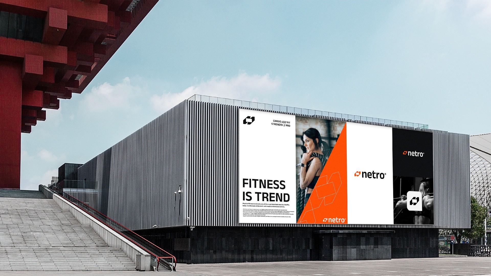
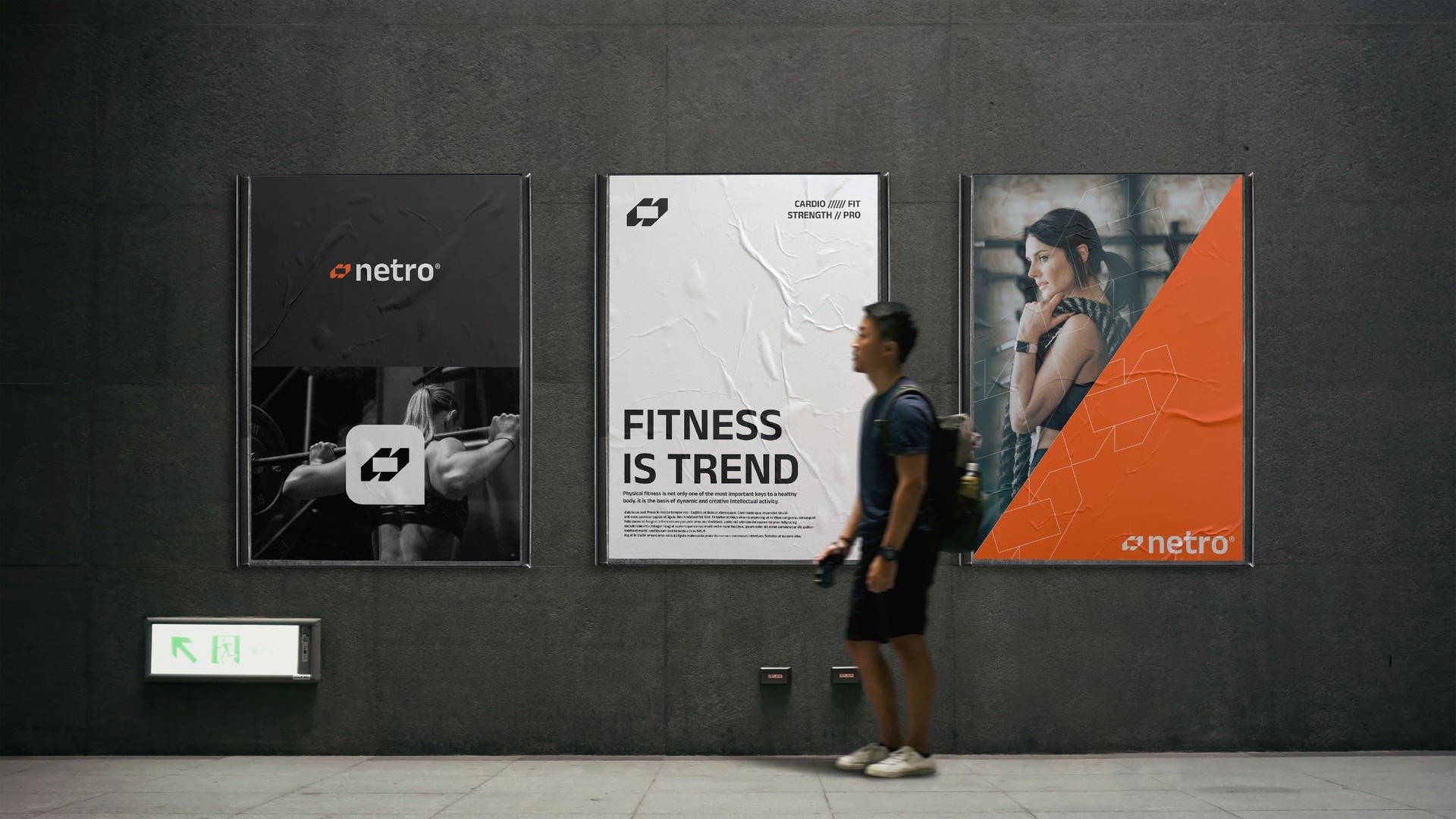
A social feed that runs in orange and black, a site that opens on the tagline, and billboards and posters sized for arenas and city walls.