Green Oak
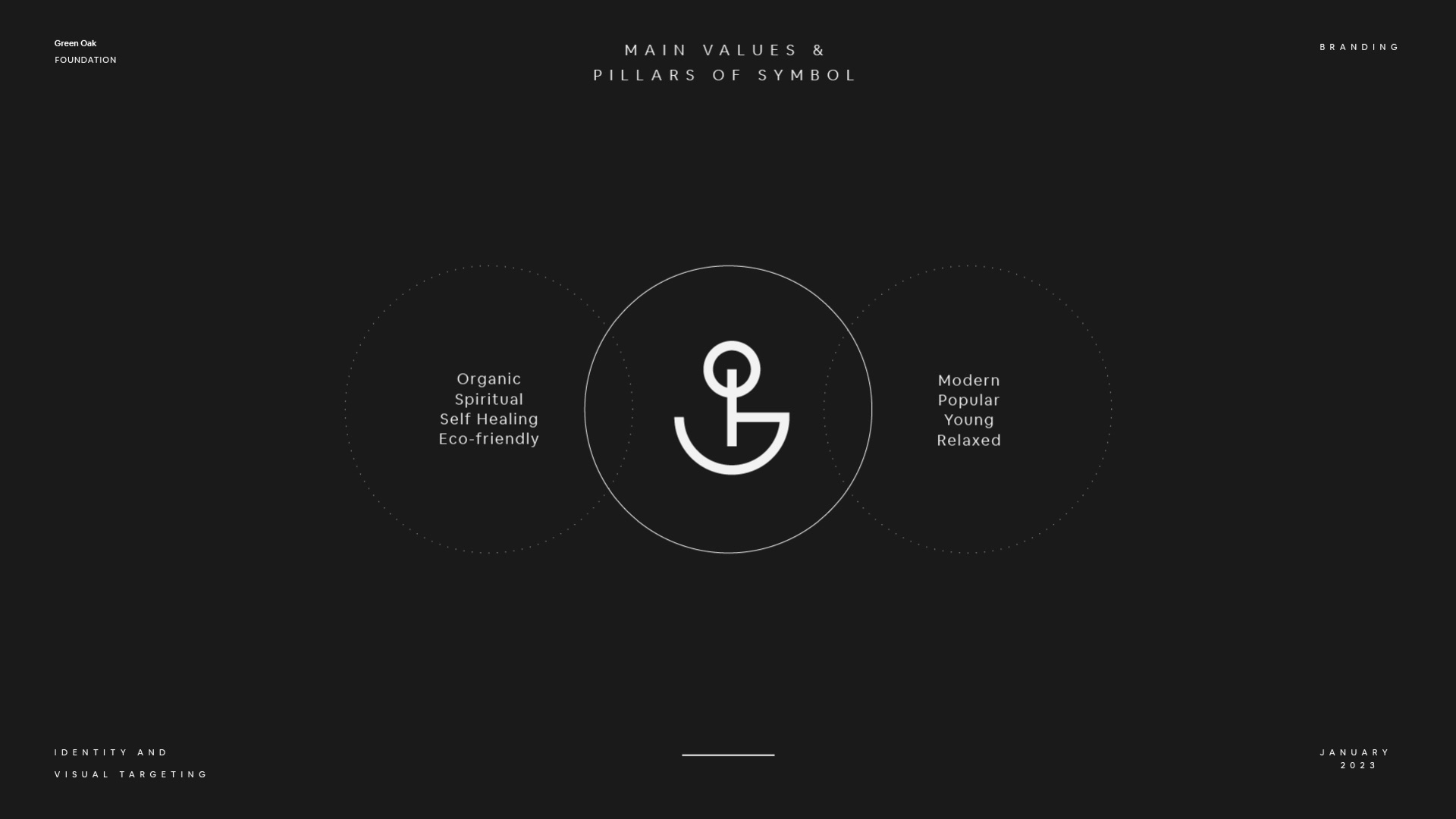
A charity that has funded green projects since 1985, from farm workshops to plant nurseries. It needed one mark that could stand for a tree, a field and the people who tend them.
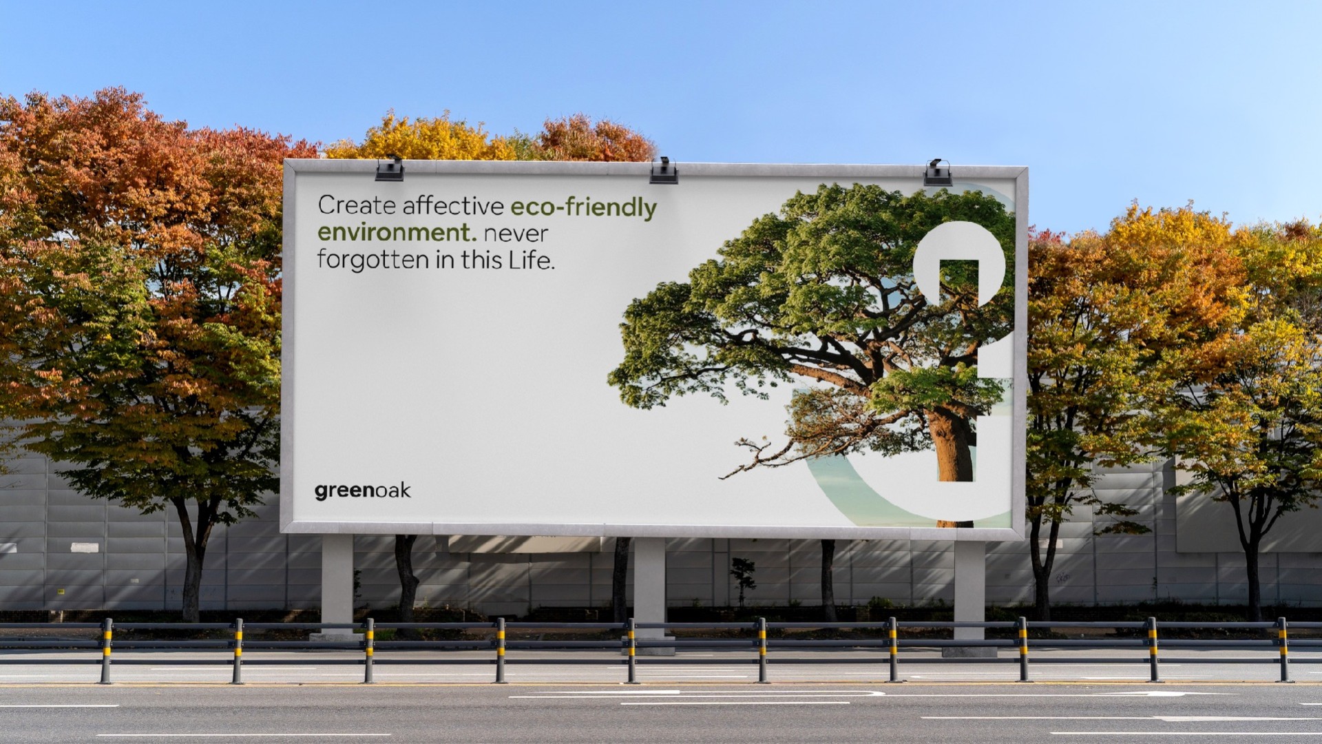
Create an eco-friendly world, never forgotten.
A nonprofit working with farmers and tree conservation had a clear mission but a brand that looked small and underfunded. Annual fundraising was $180K against a $500K target, with a 40% grant success rate.
Research into nonprofit branding showed that many organizations communicate through guilt or crisis. Green Oak's work was fundamentally about partnership, growth, and long-term possibility.
A continuous line became the core identity, representing connection between people, land, and future. The visual language was simple, hopeful, and focused on solutions rather than problems.
Reported donor acquisition increased 180% year over year. Average donation increased from $420 to $680, annual fundraising from $180K to $520K, and grant success from 40% to 68%.
When the work is about possibility, the brand can communicate possibility too.
Identity
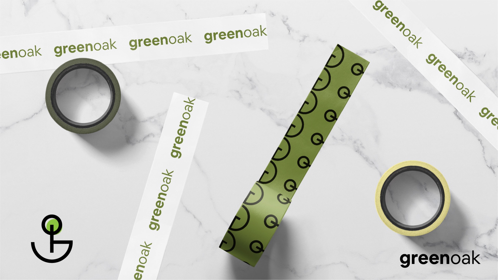
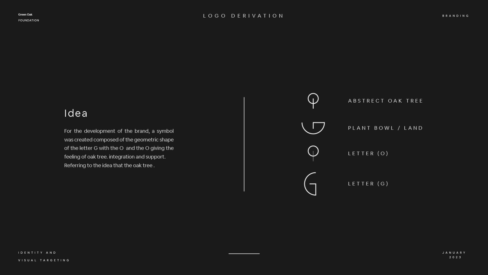
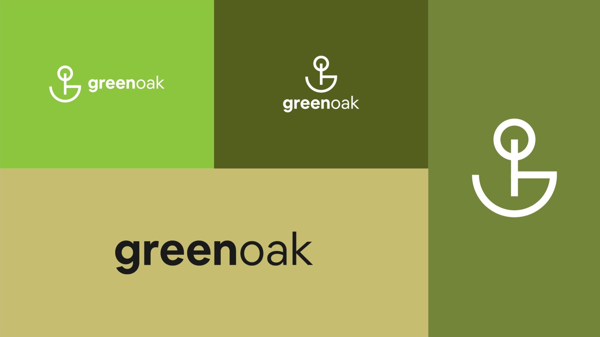
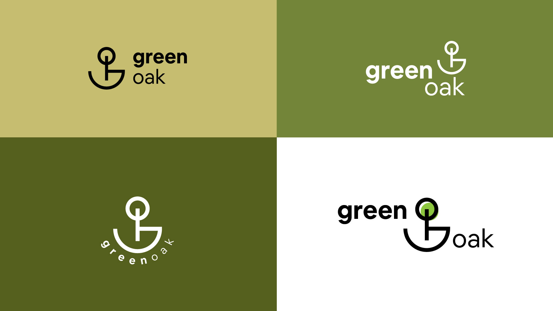
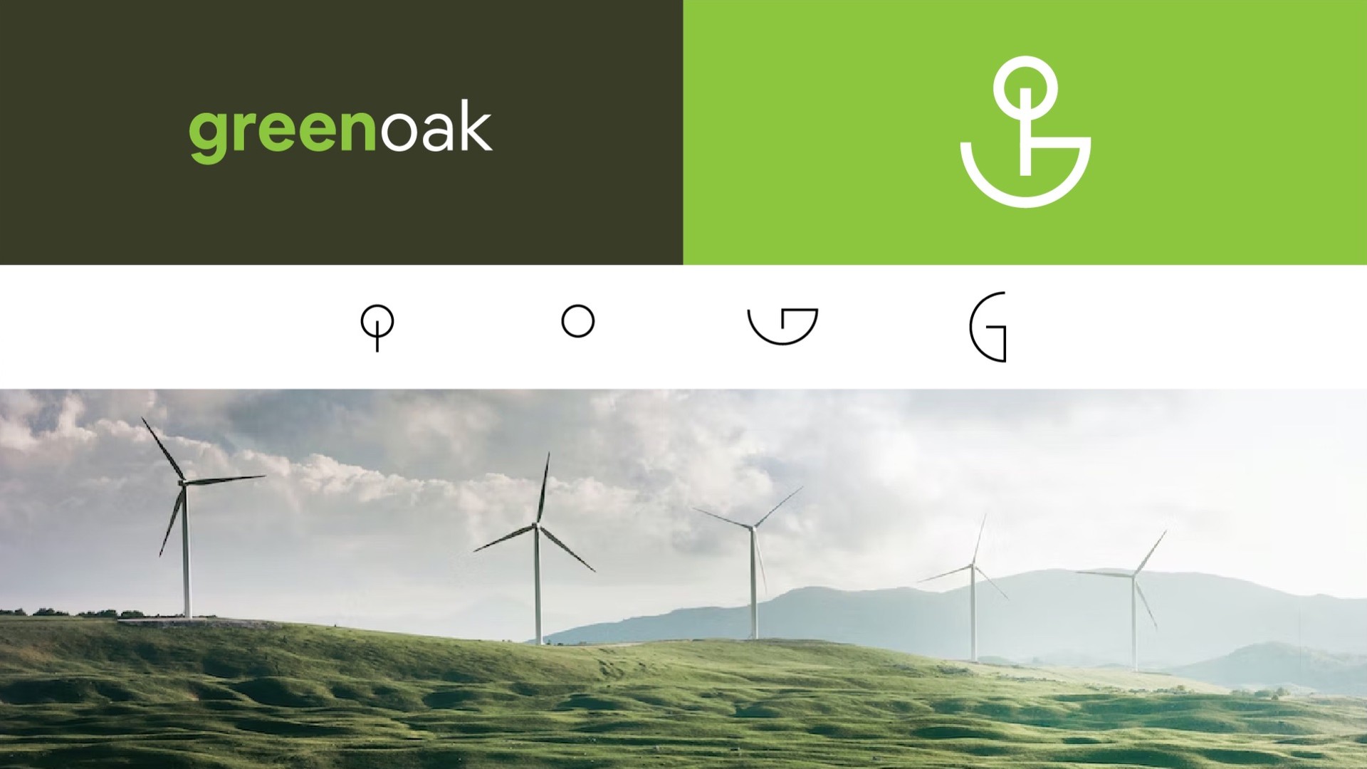
An abstract oak, a bowl of land, an O and a G, drawn with one line. The wordmark sets green in bold and oak in regular, so the name reads as two ideas in one.
System
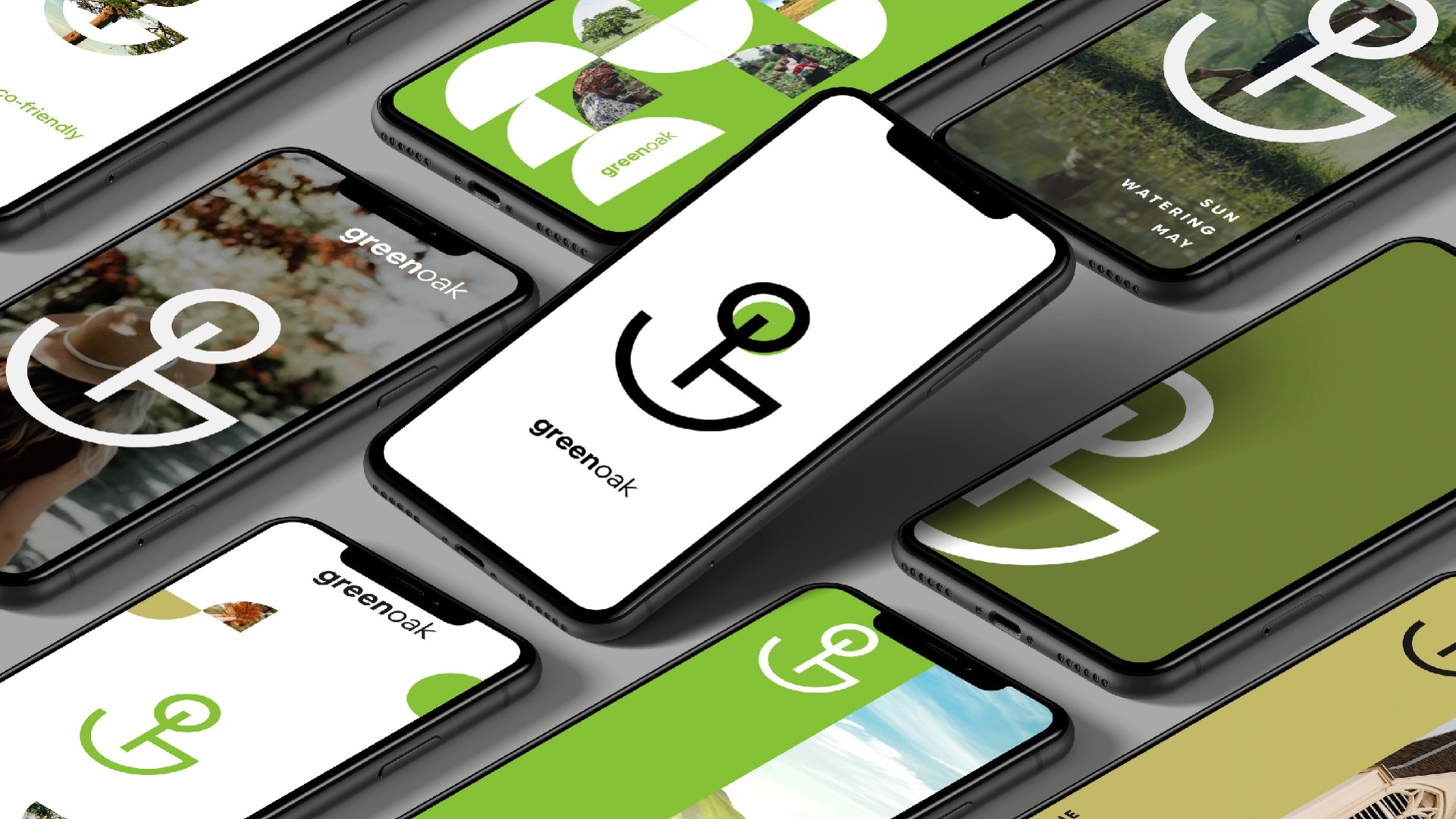
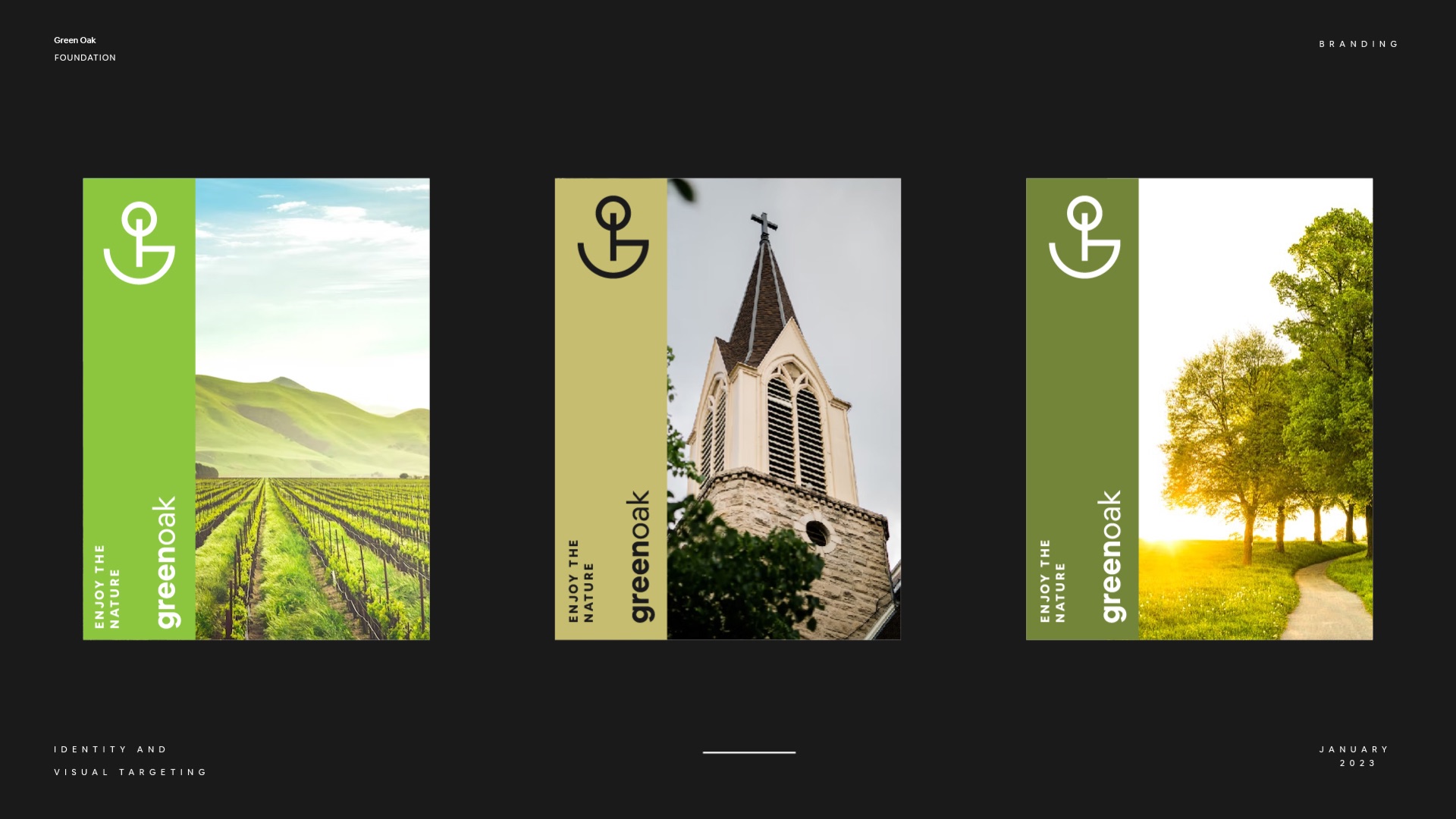
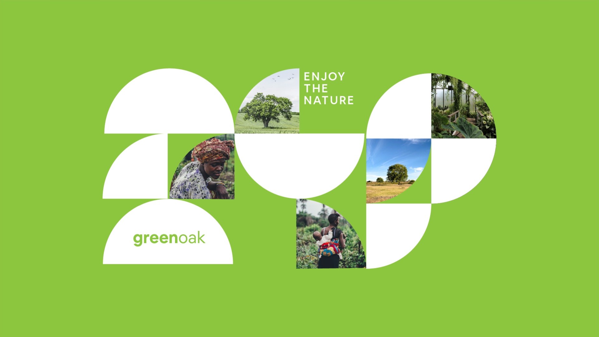
The symbol breaks into its parts and becomes a pattern. Half circles crop photos of trees and farms, so every layout feels like the same field seen through different windows.
Out in the world
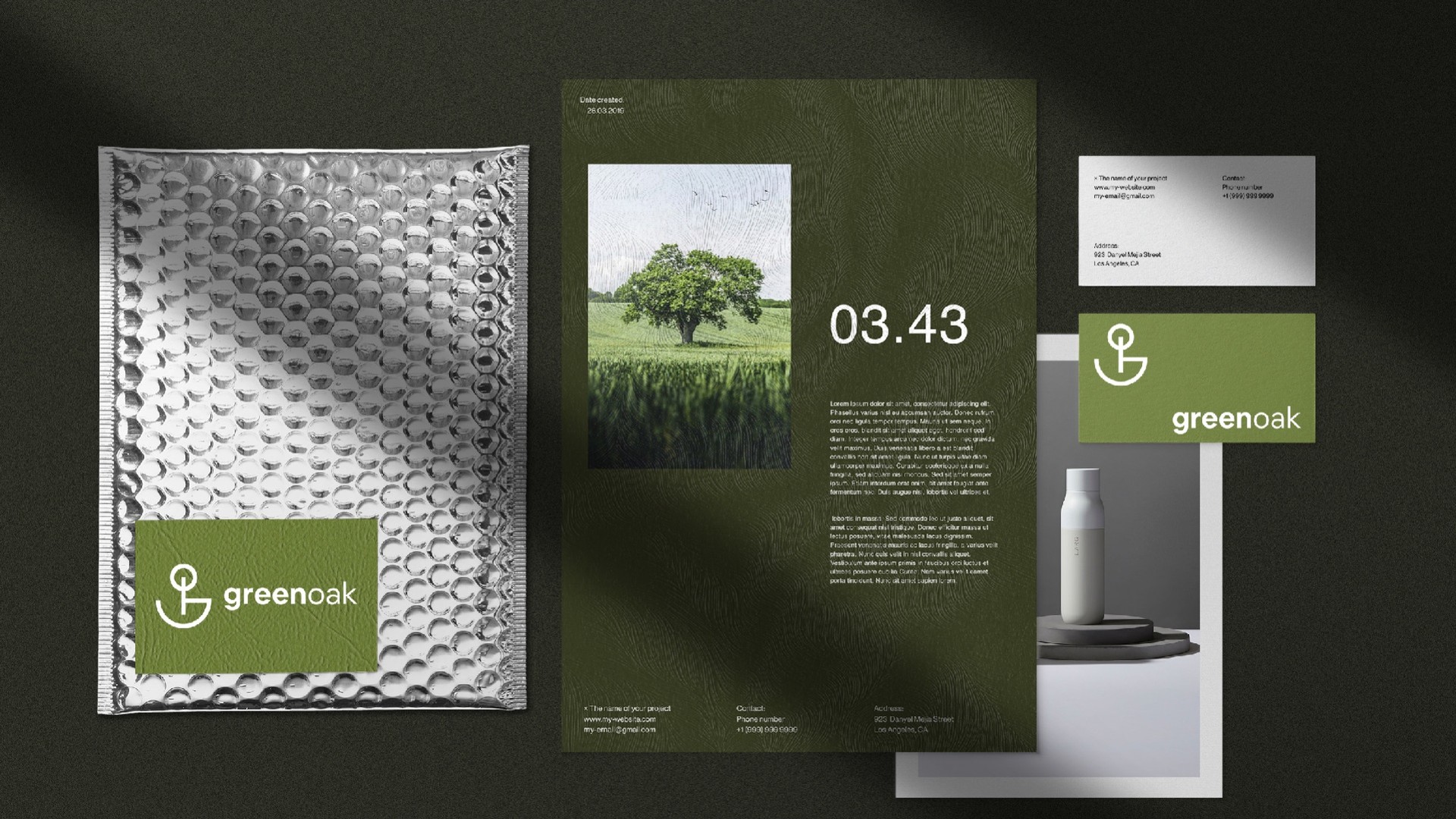
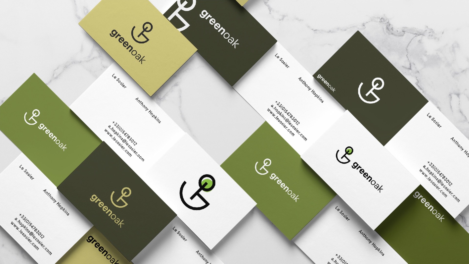
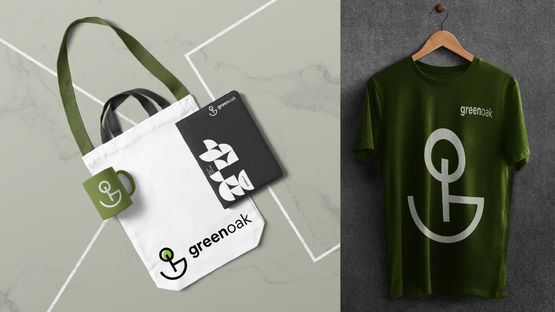
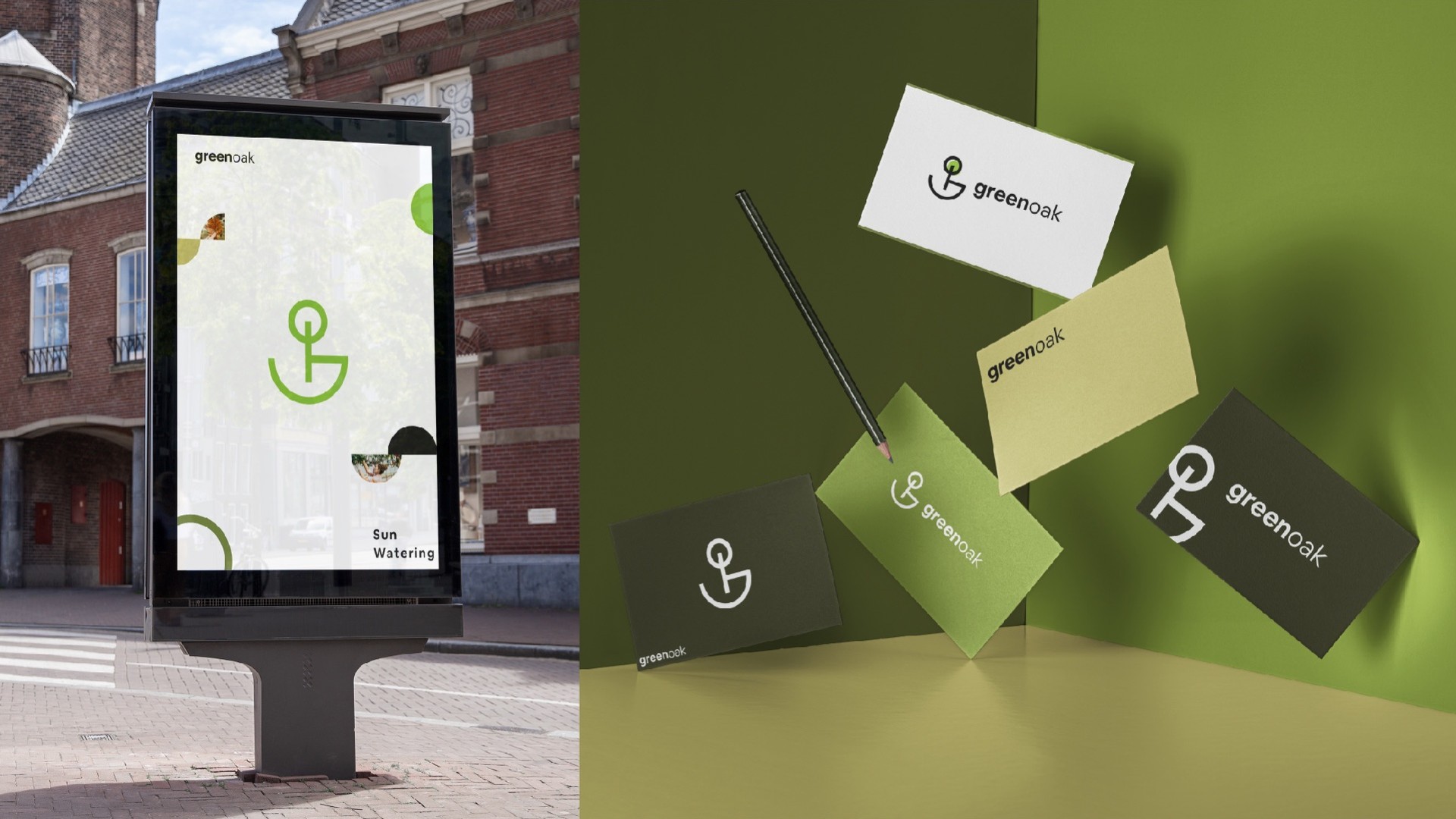
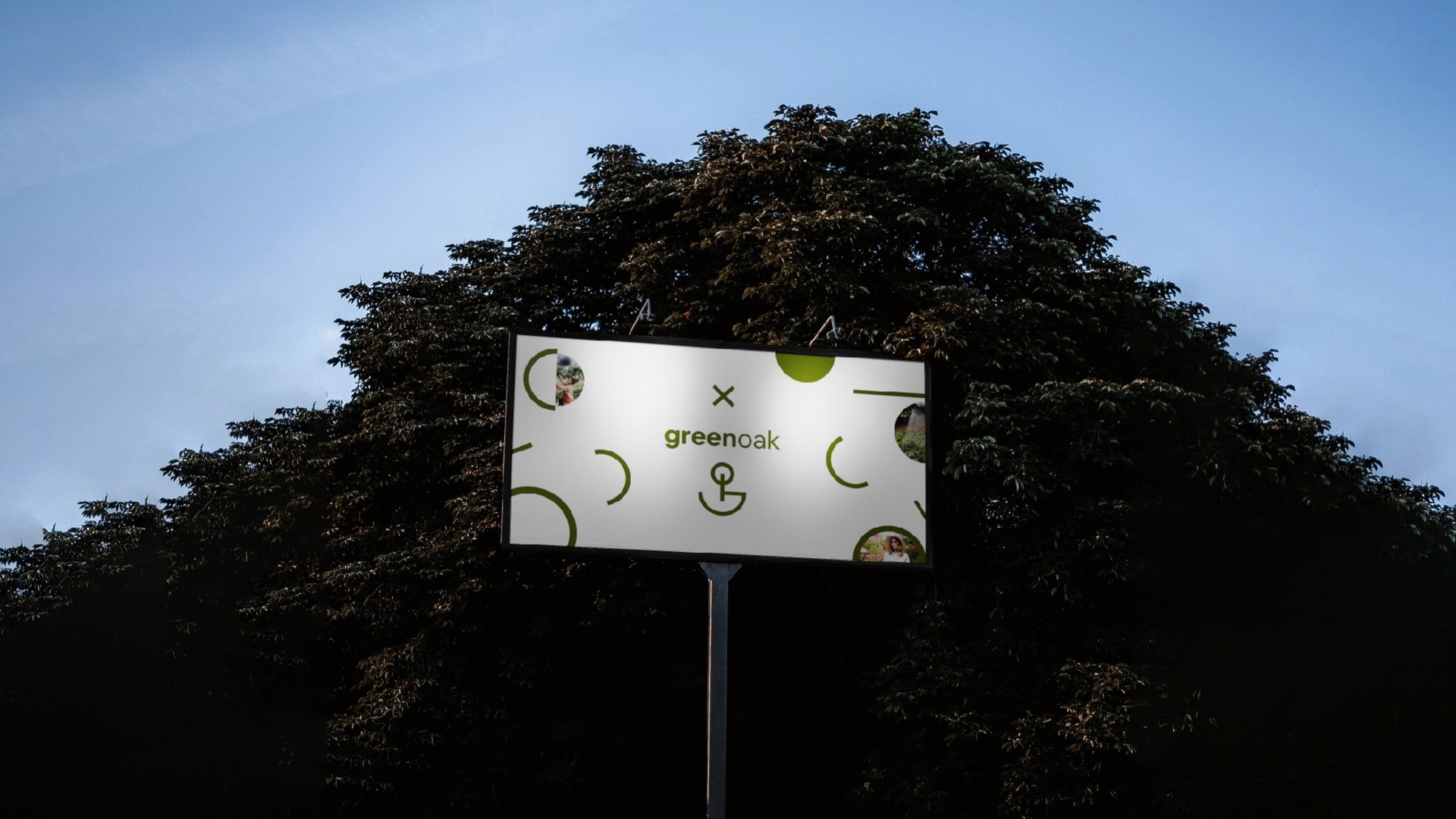
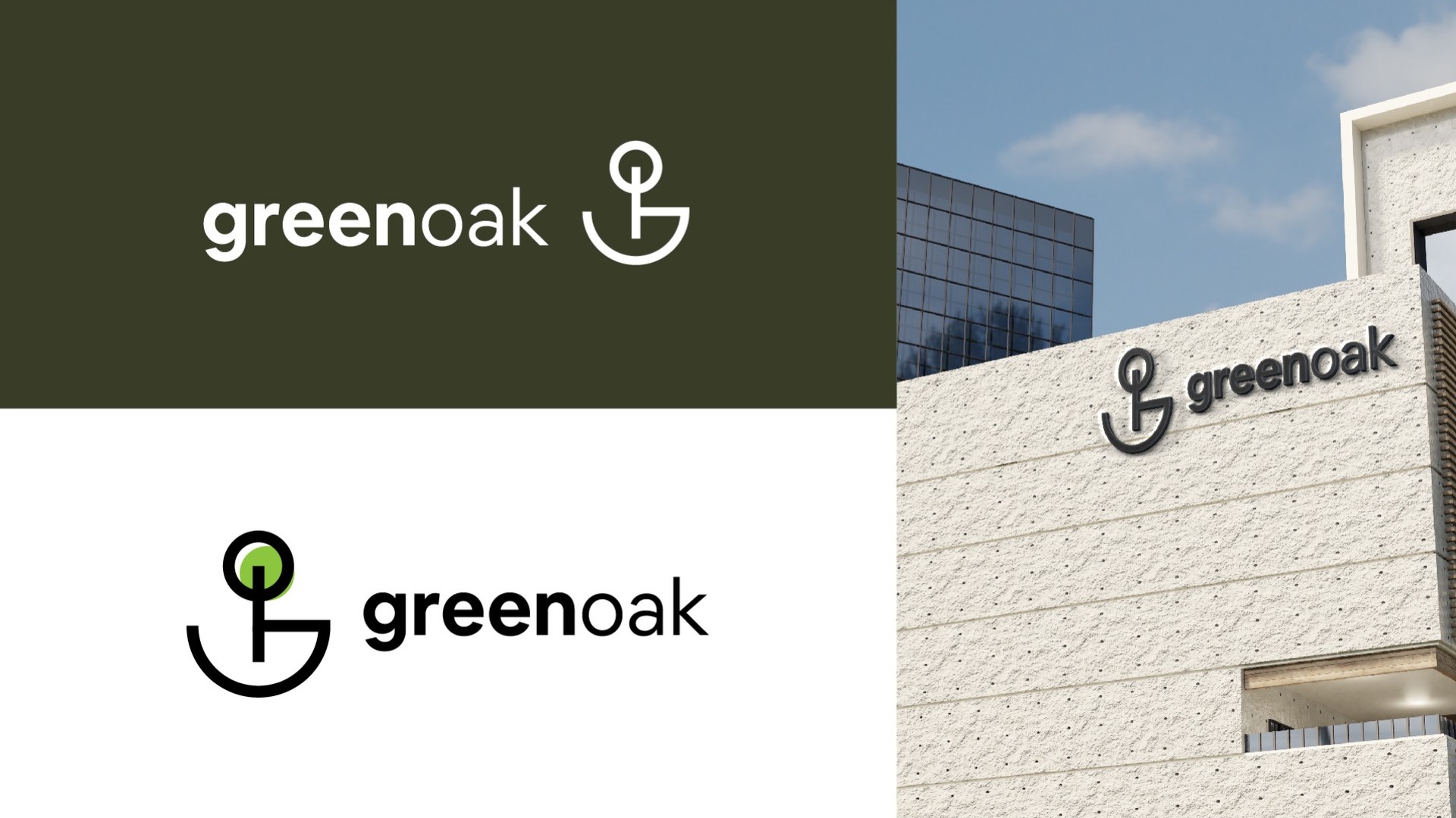
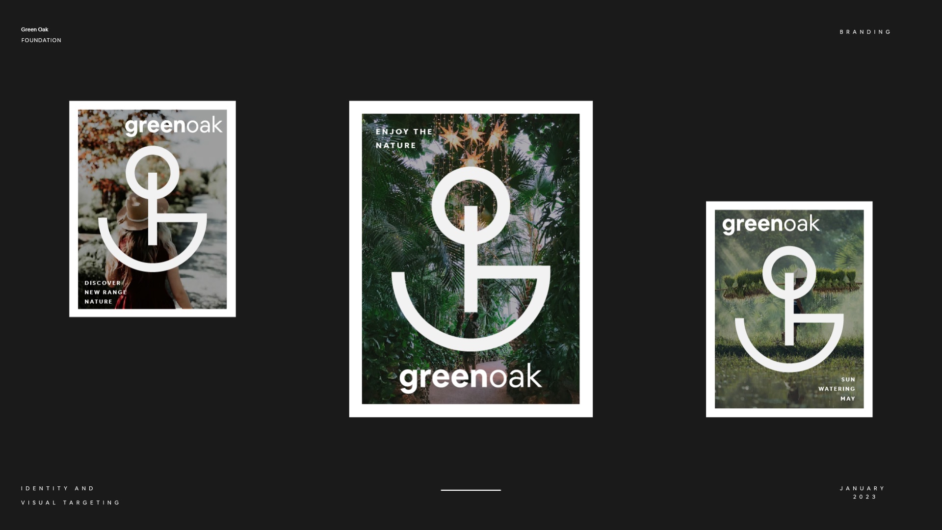
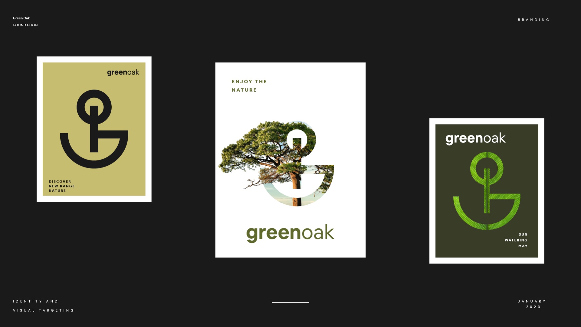
Letterhead, cards and mailers in the greens, a social grid, a tote and T-shirt for volunteers, and signs big enough to read from the road.