EcoGround
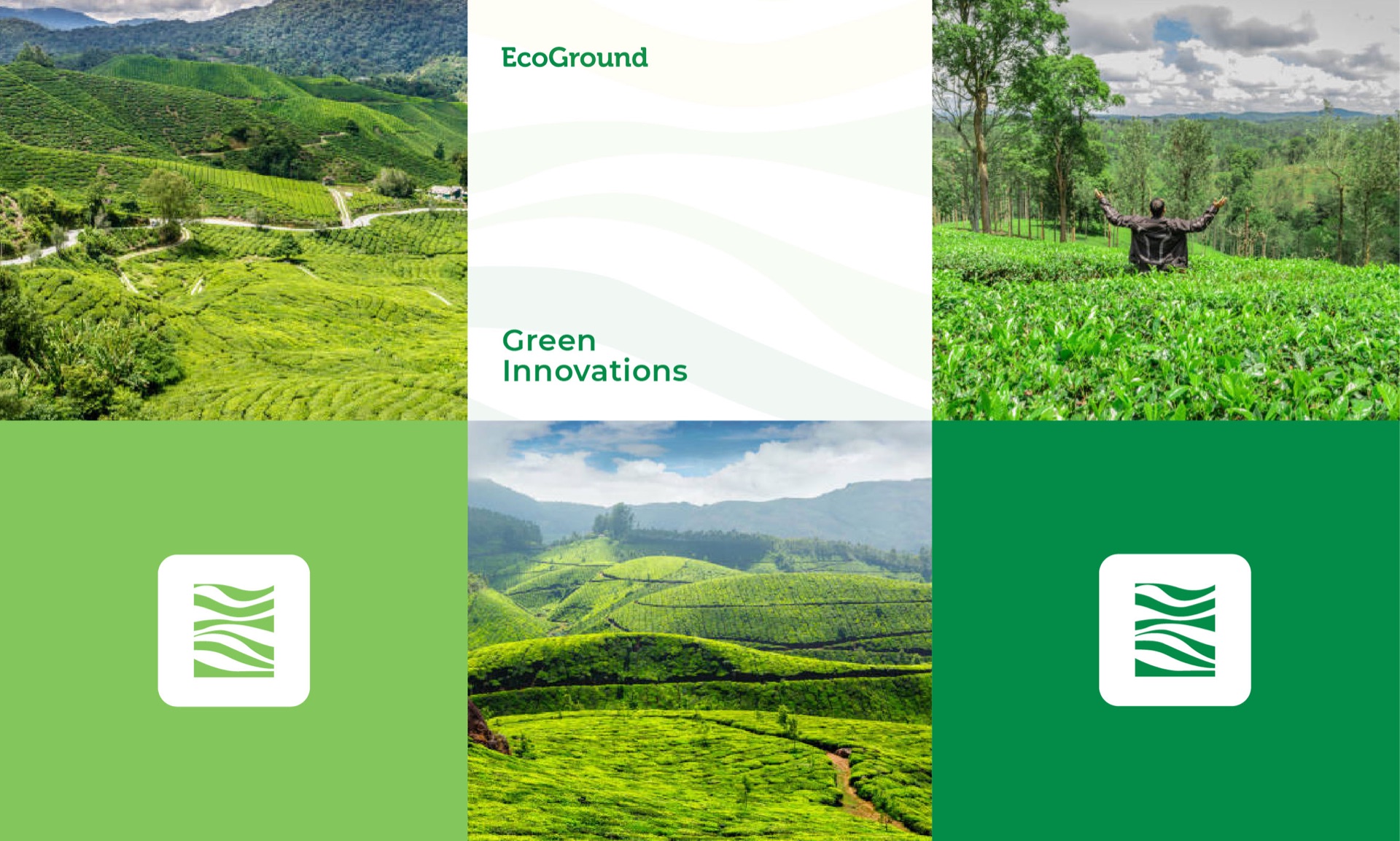
A green company working on organic farming and careful use of land and water. The mark had to look like the ground it cares for.
Bridging dreams, cultivating growth.
An AgriTech company had a strong product but unclear market positioning. Farmers saw it as too technical, while corporate buyers saw it as too earthy. First-year revenue was $240K against an $800K target.
The buying behavior was different across the two audiences. Farmers valued trusted, practical signals, while corporate buyers needed credibility and technical confidence.
The identity was designed to bridge both worlds. A field-inspired logo created agricultural relevance while the system remained structured and scalable. Earth tones were paired with a more precise visual language, and messaging emphasized yield rather than ideology.
Sales calls increased 160%, proposal-to-close rose from 18% to 38%, and reported year-two revenue reached $2.1M. Farmer adoption increased from 8 to 120 farms, alongside three major enterprise pilots.
B2B brands need to speak to buyer priorities. When buyers recognize themselves in the brand, the solution becomes easier to understand.
Identity
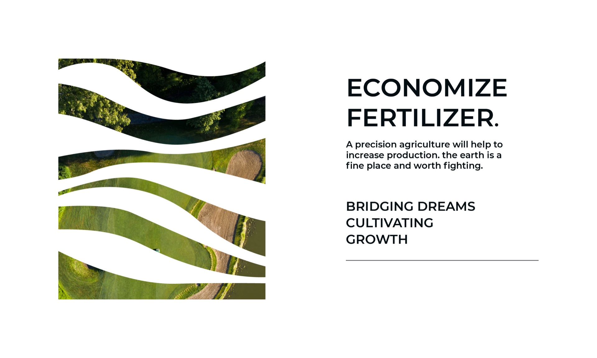
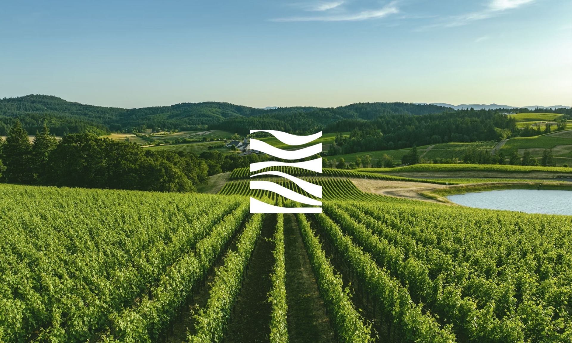
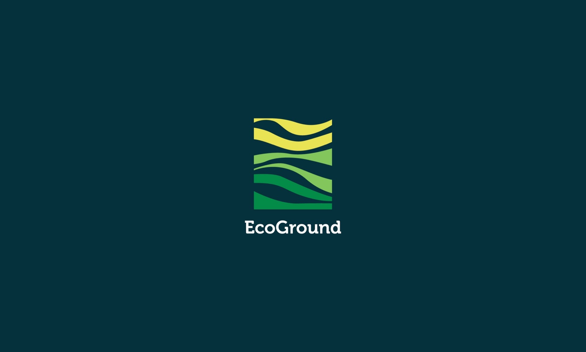
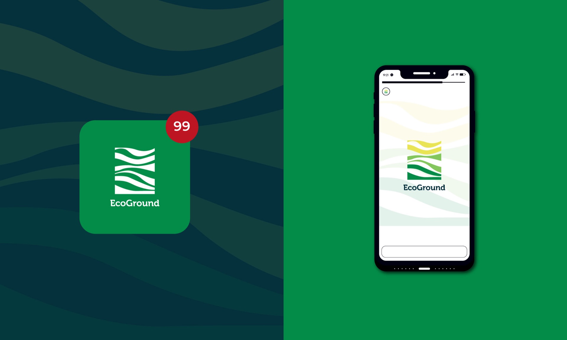
Four waves in a square, from pale yellow at the top to deep green at the base, like a field catching light. It works in full colour, in one colour and knocked out of a photo.
Print & digital
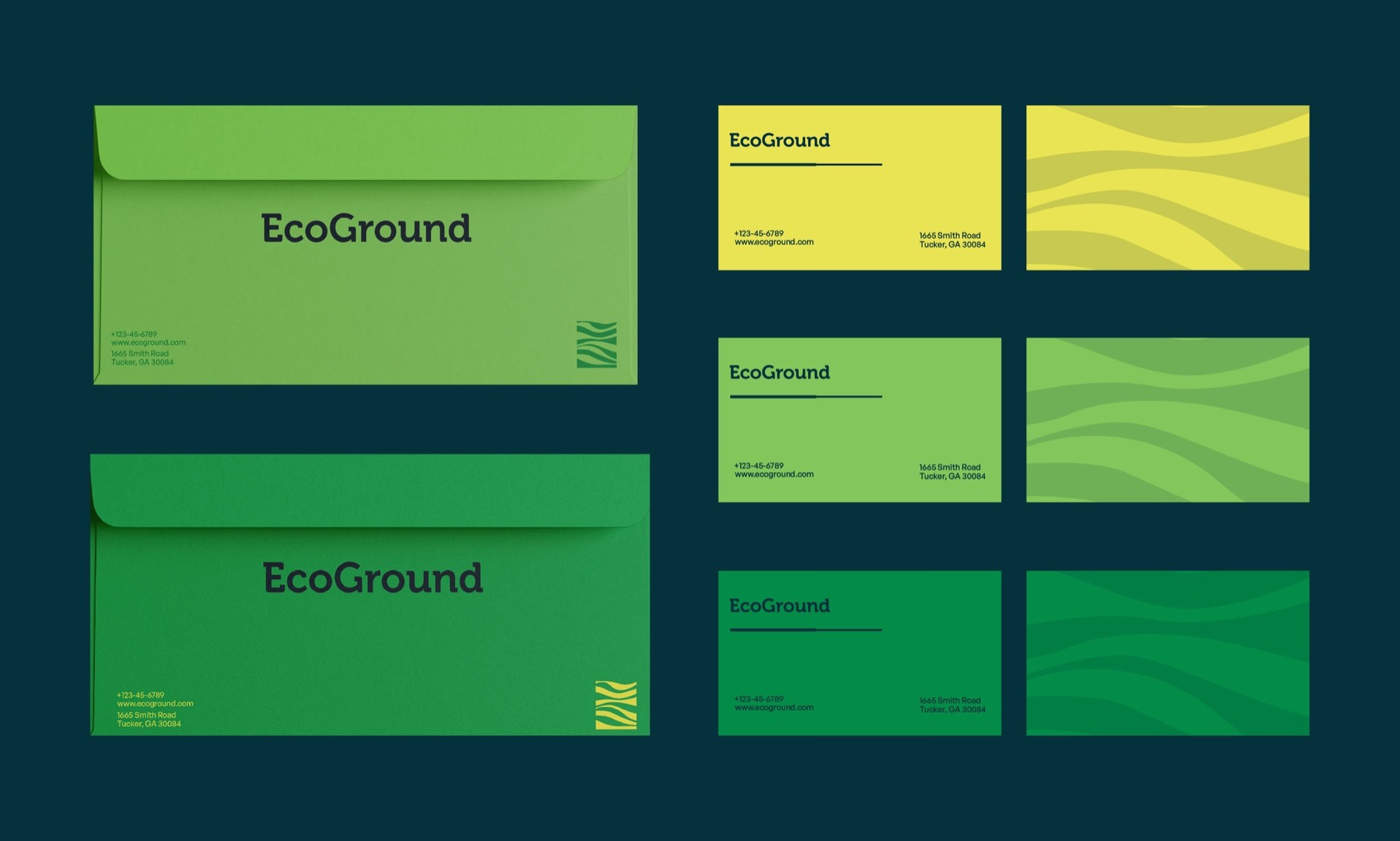
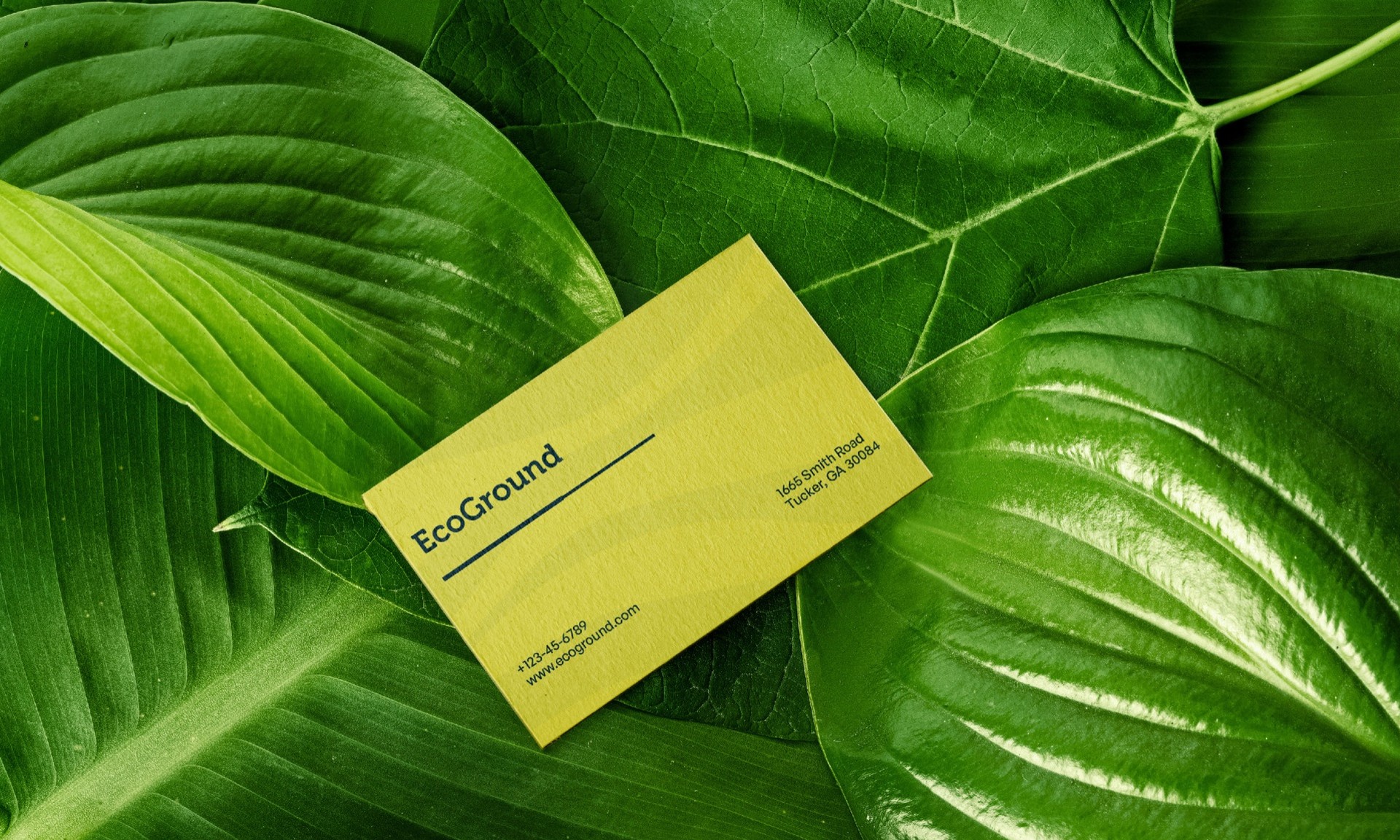
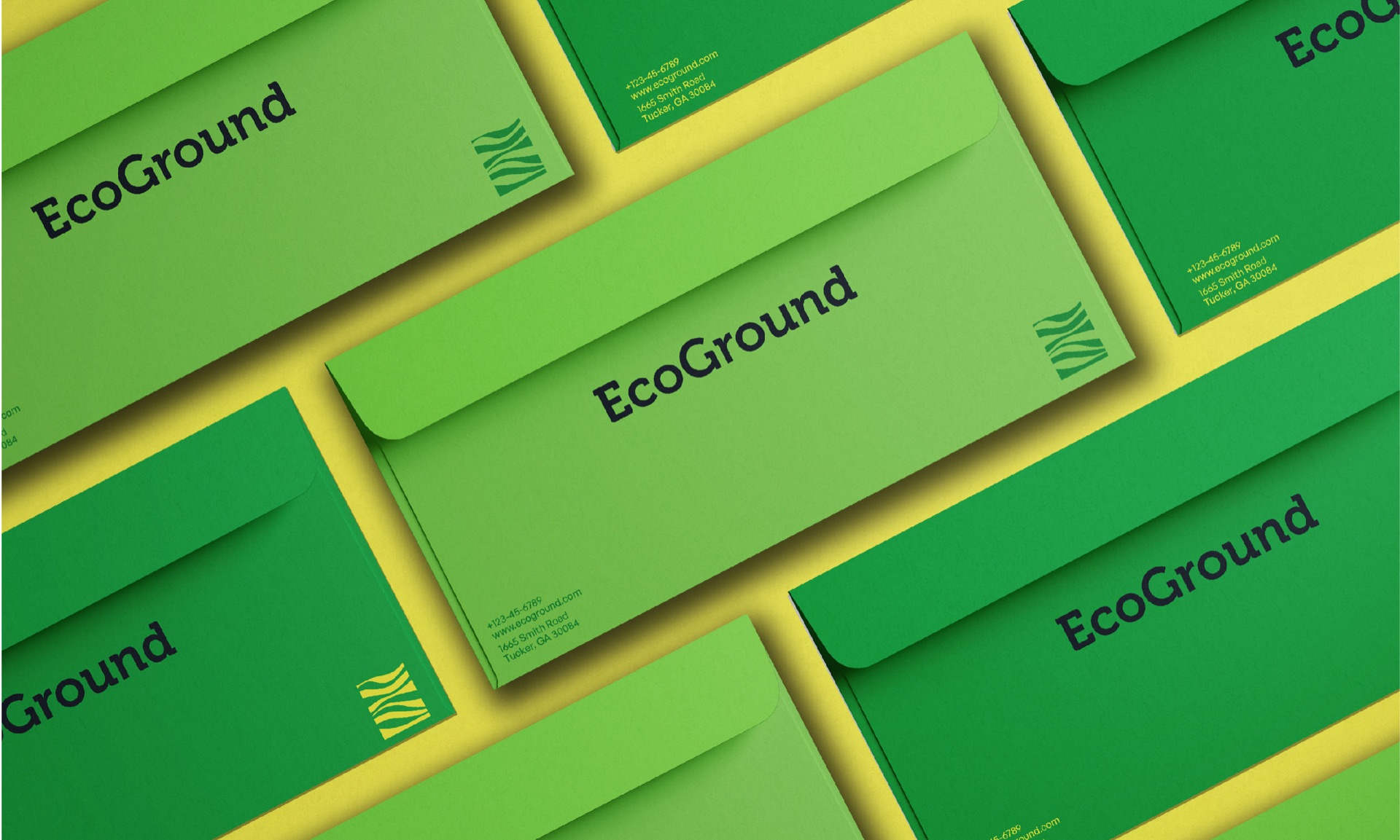
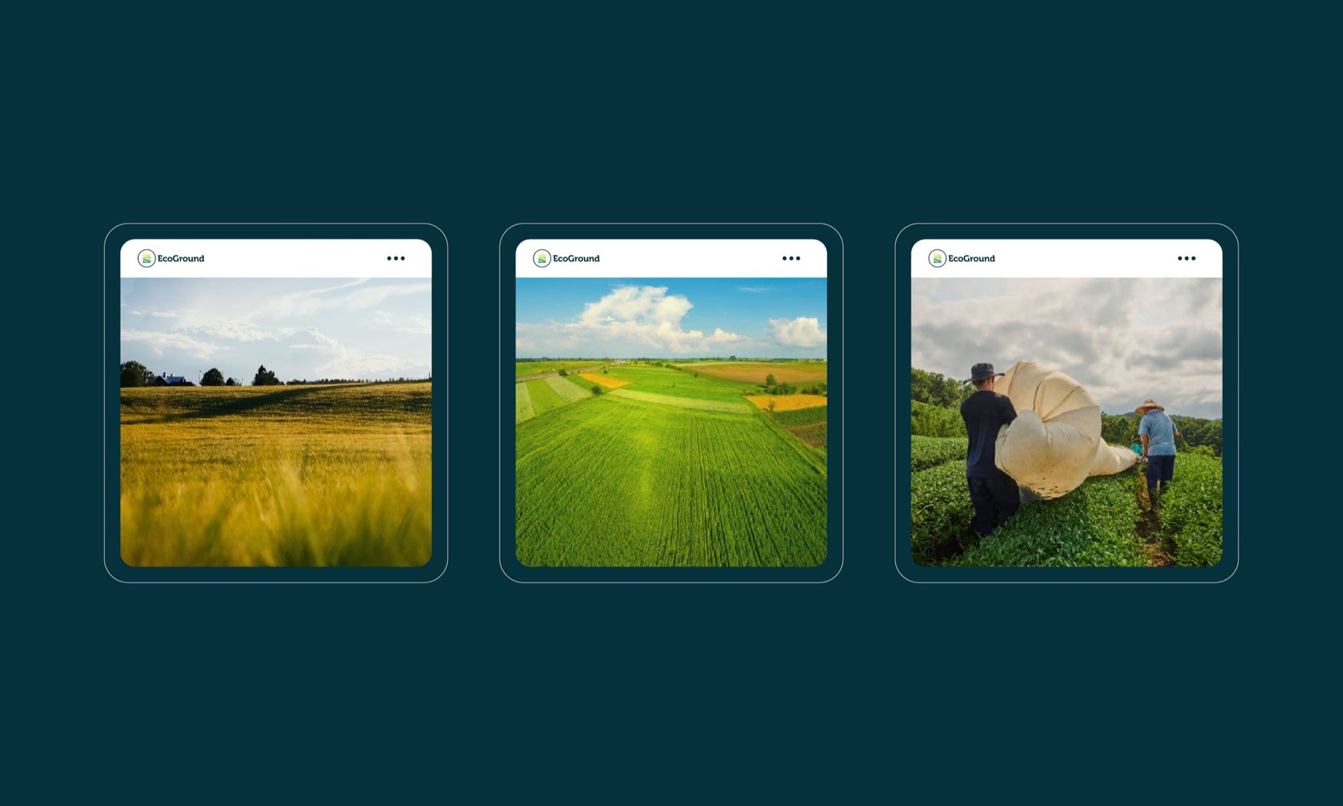
Envelopes and cards that pick up the wave pattern, an app that opens on the symbol and a social grid made almost entirely of open fields.
Out in the world
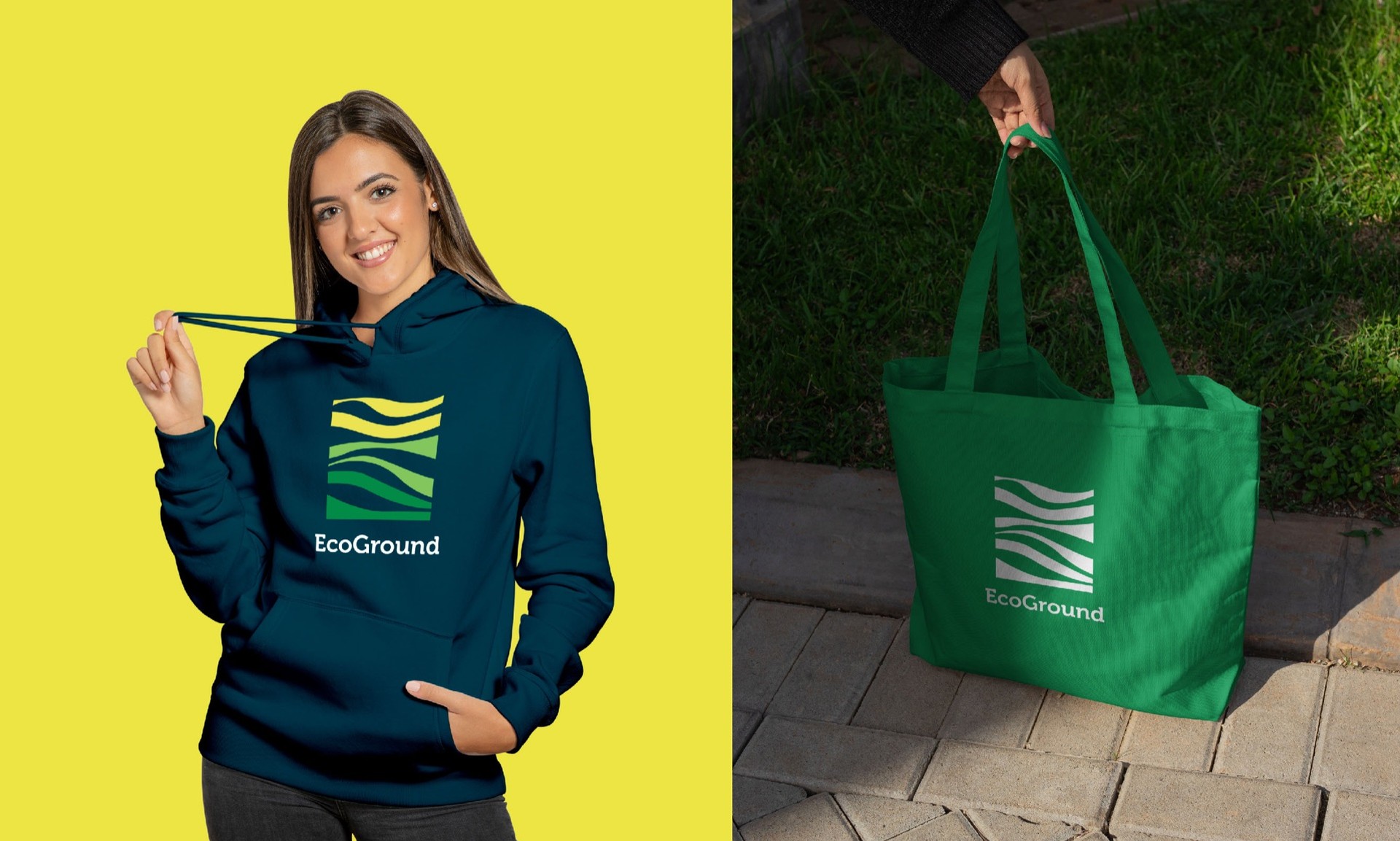
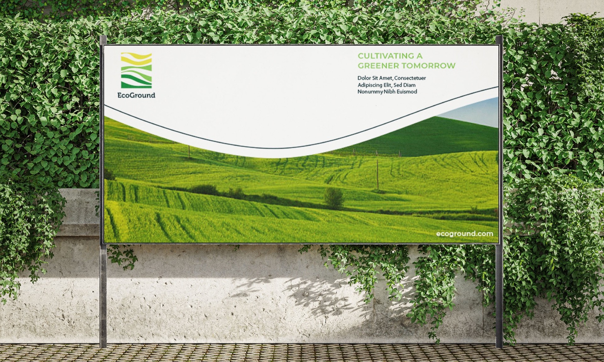
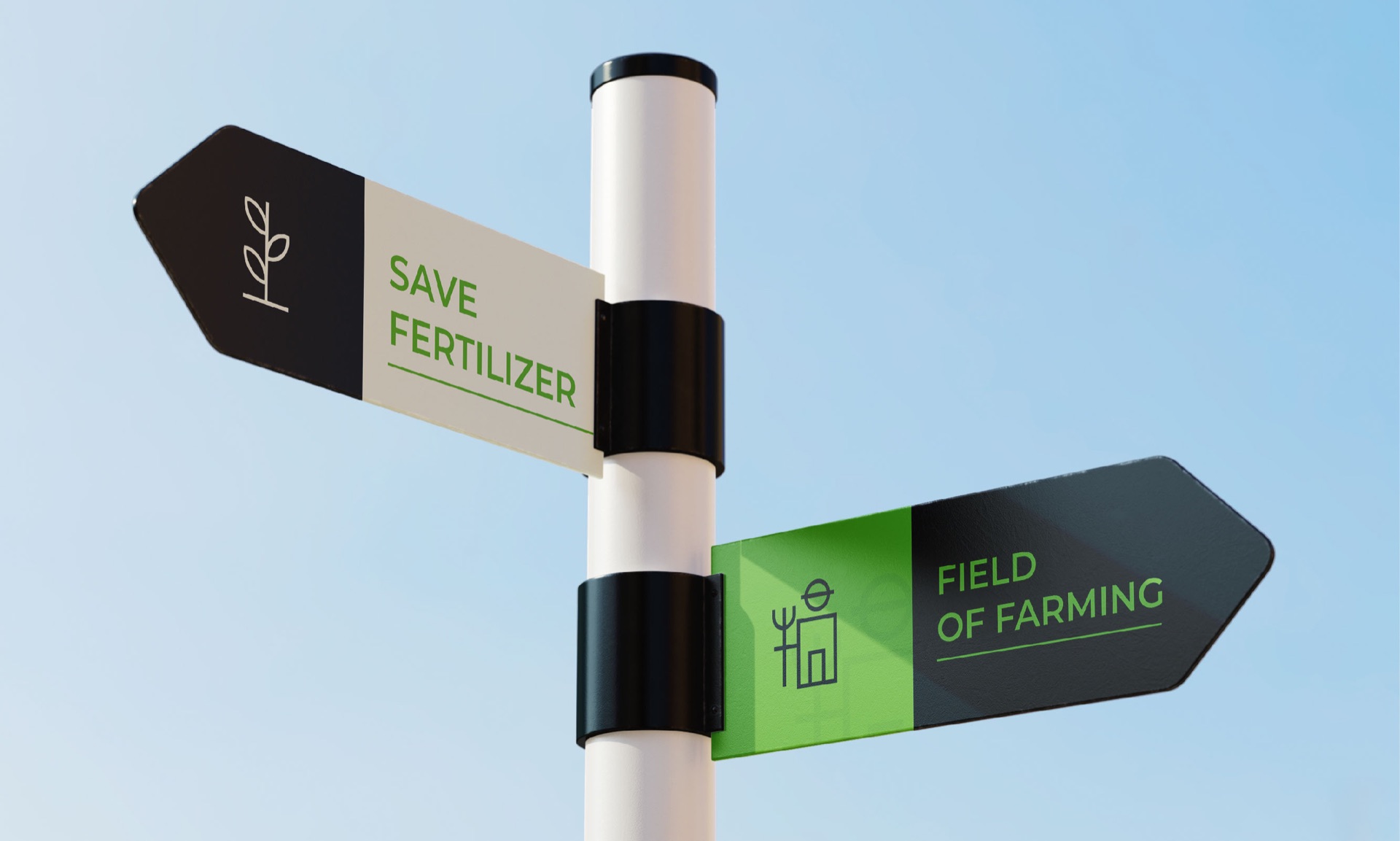
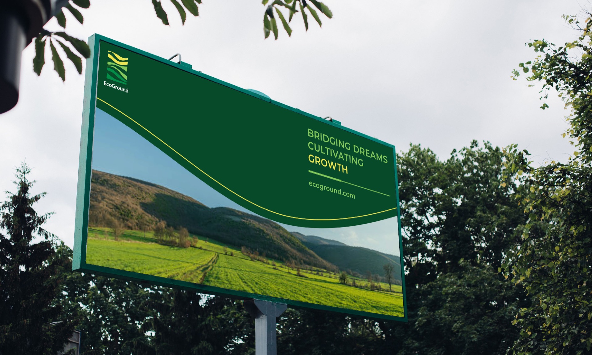
A hoodie and tote for the field team, road signs that point to the farm and billboards that let the landscape do the selling.