Barista Roasters
A coffee brand from Iraq that wants to put the country back on the world coffee map. The identity had to carry that history and still feel warm to someone tasting it for the first time.
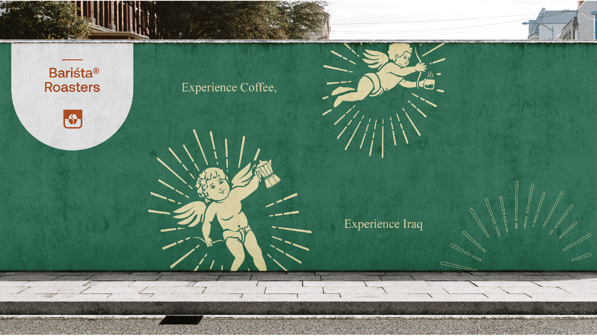
Experience coffee, experience Iraq.
An Iraqi specialty coffee brand was entering Western Europe with a strong product, a $2K budget, and a story rooted in Iraqi origin and ethical sourcing. The challenge was communicating heritage without becoming clichéd or overly exotic.
Research into premium coffee in Germany and France showed that single-origin brands win through transparency and story, but many visual identities overplayed heritage cues.
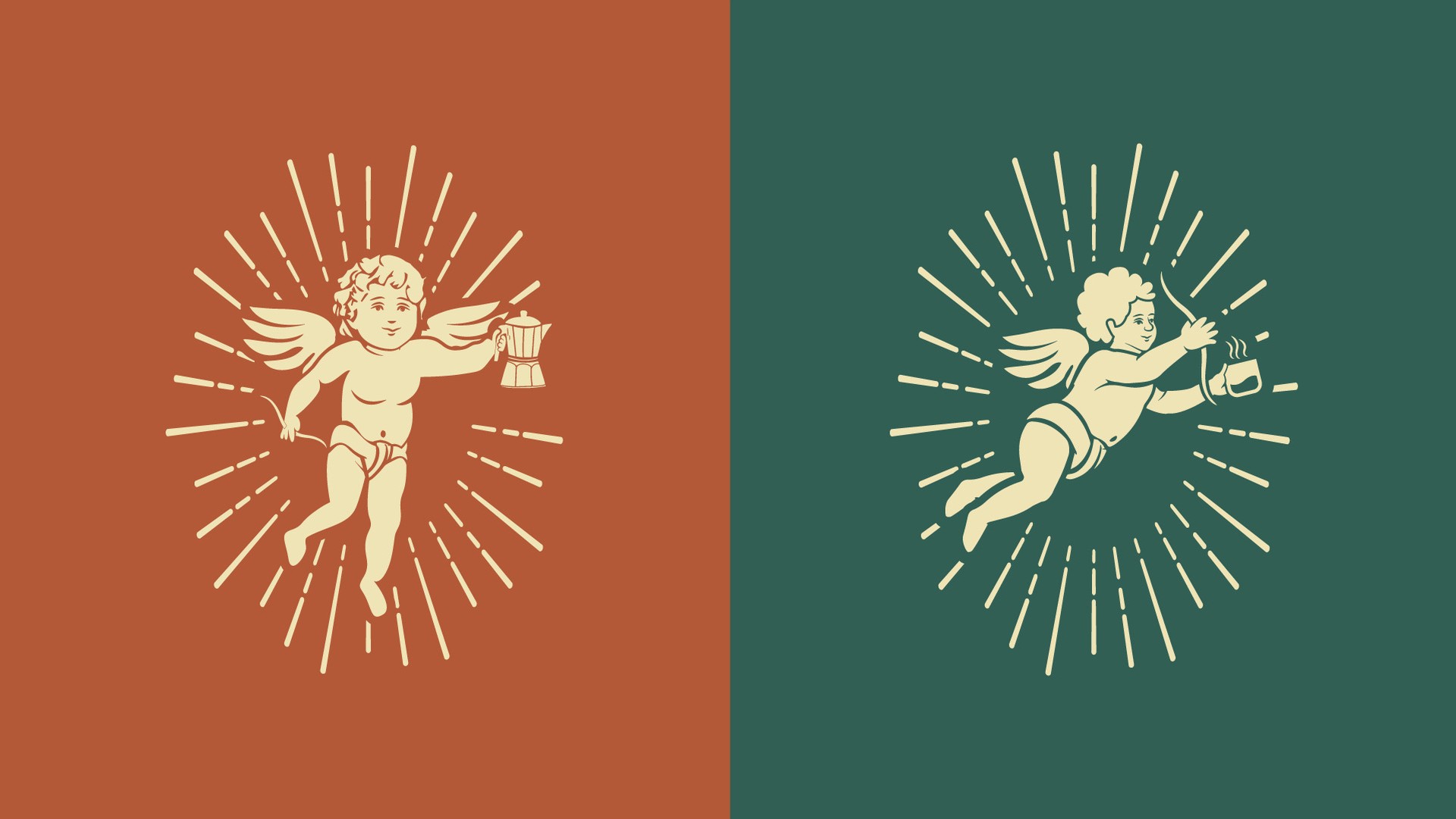
Arabic script was integrated with European typography, while a playful cherub illustration referenced heritage without becoming heavy-handed. Each bag carried part of the brand story.
The brand launched in 12 specialty cafes. The project reported 60% first-month repurchase, retail partners ordering 3× the initial amount within six months, 12K organic followers in year one, and four specialty coffee publication features.
Heritage does not need to shout. When the story is built into the packaging, the product can communicate before the brand statement is read.
Identity
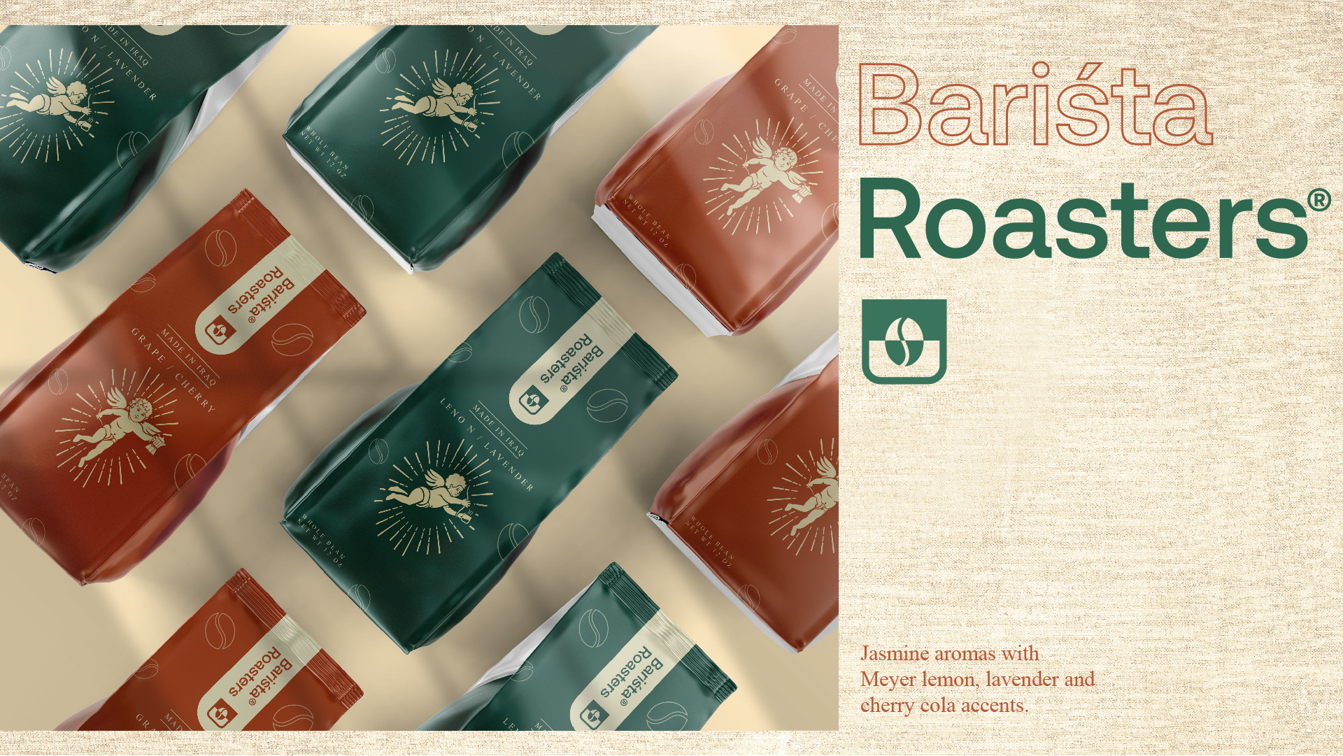
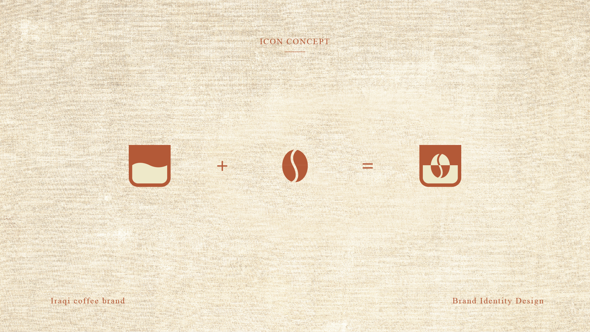
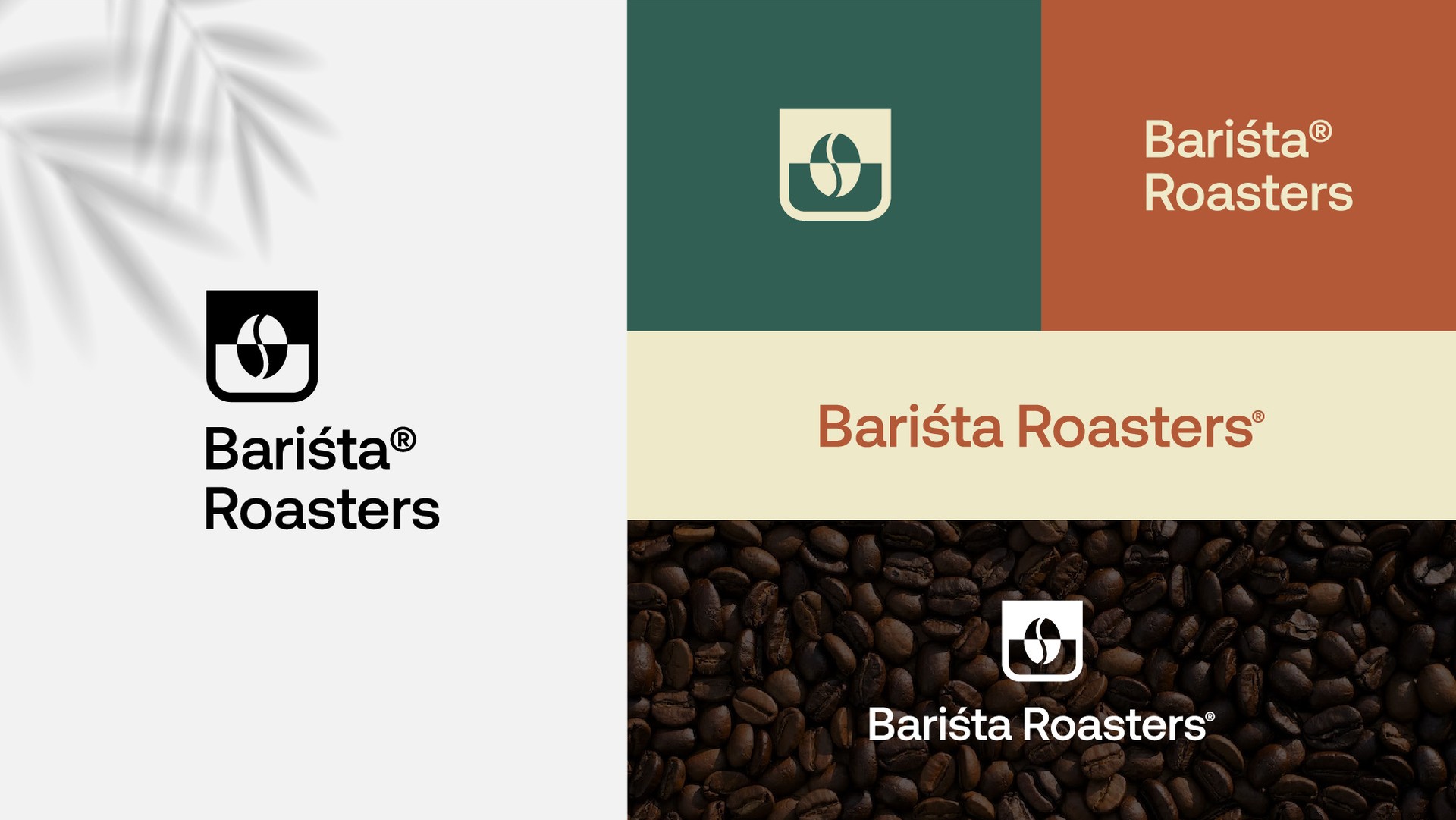
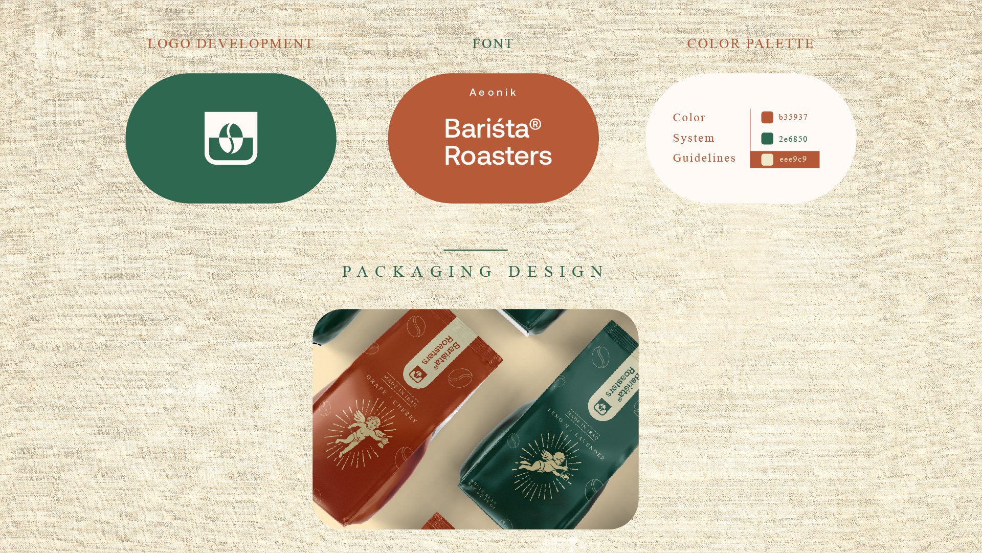
A coffee bean dropped into a cup makes the icon. It sits next to a clean wordmark with an accent on the s, a small nod to the Arabic roots of the name.
Packaging
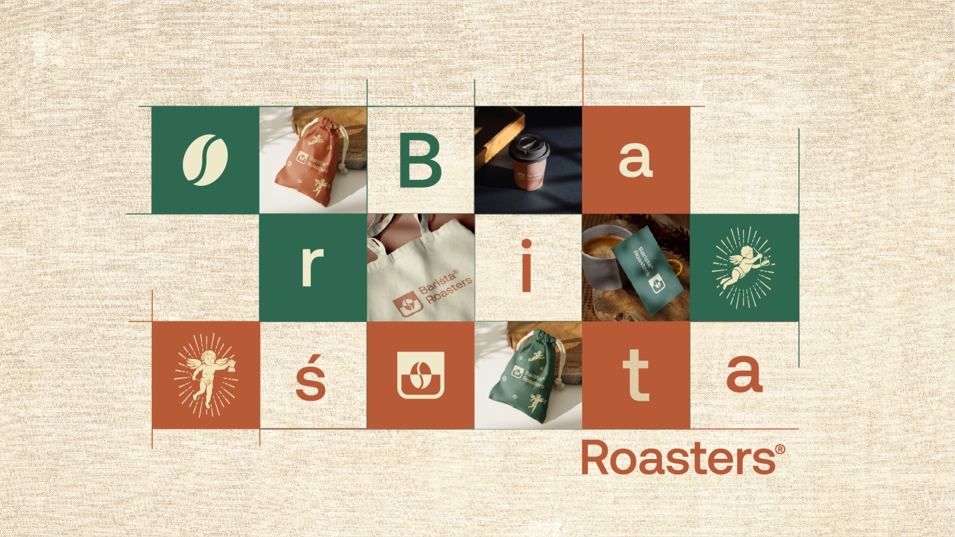
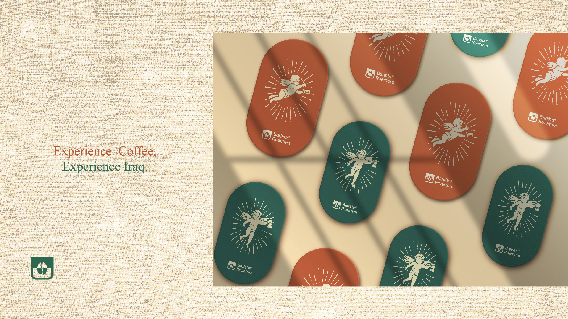
Rust and green bags that split the range by roast. The cherub flies across every one, and oval stickers seal the bags and cups.
Out in the world
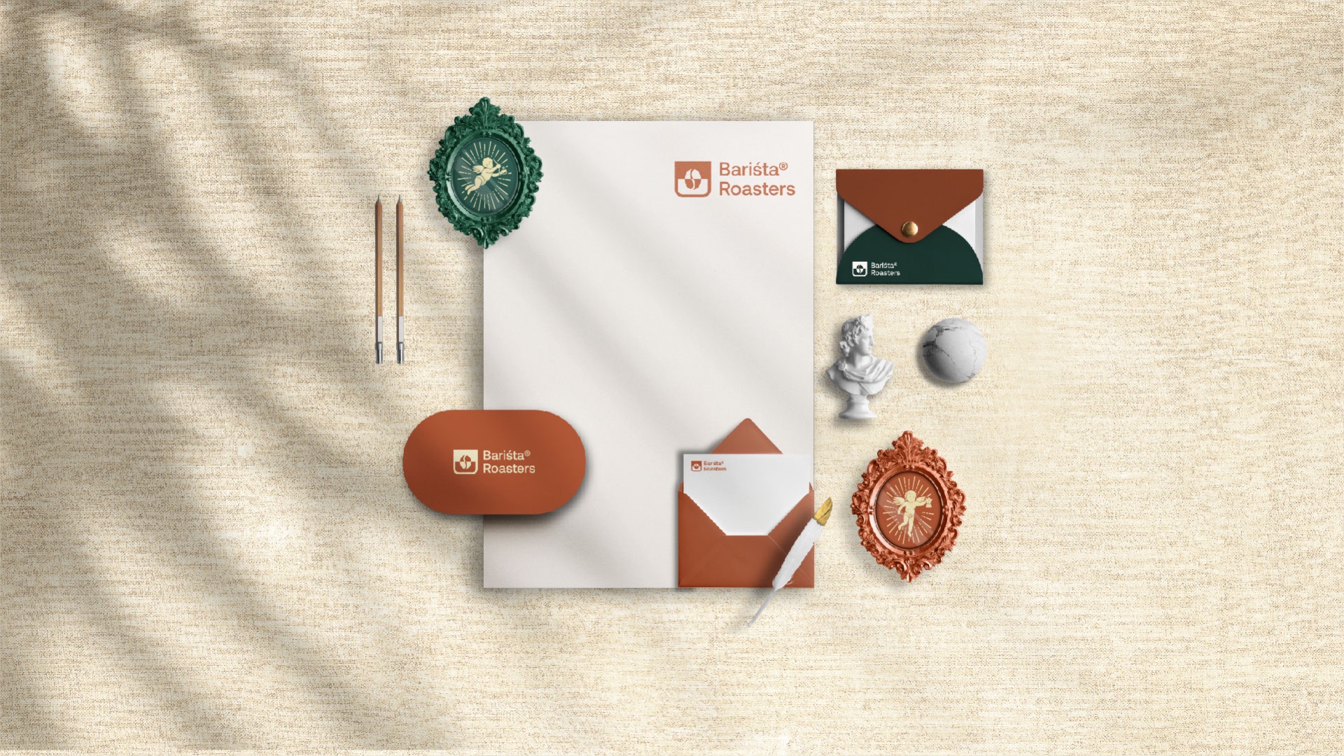
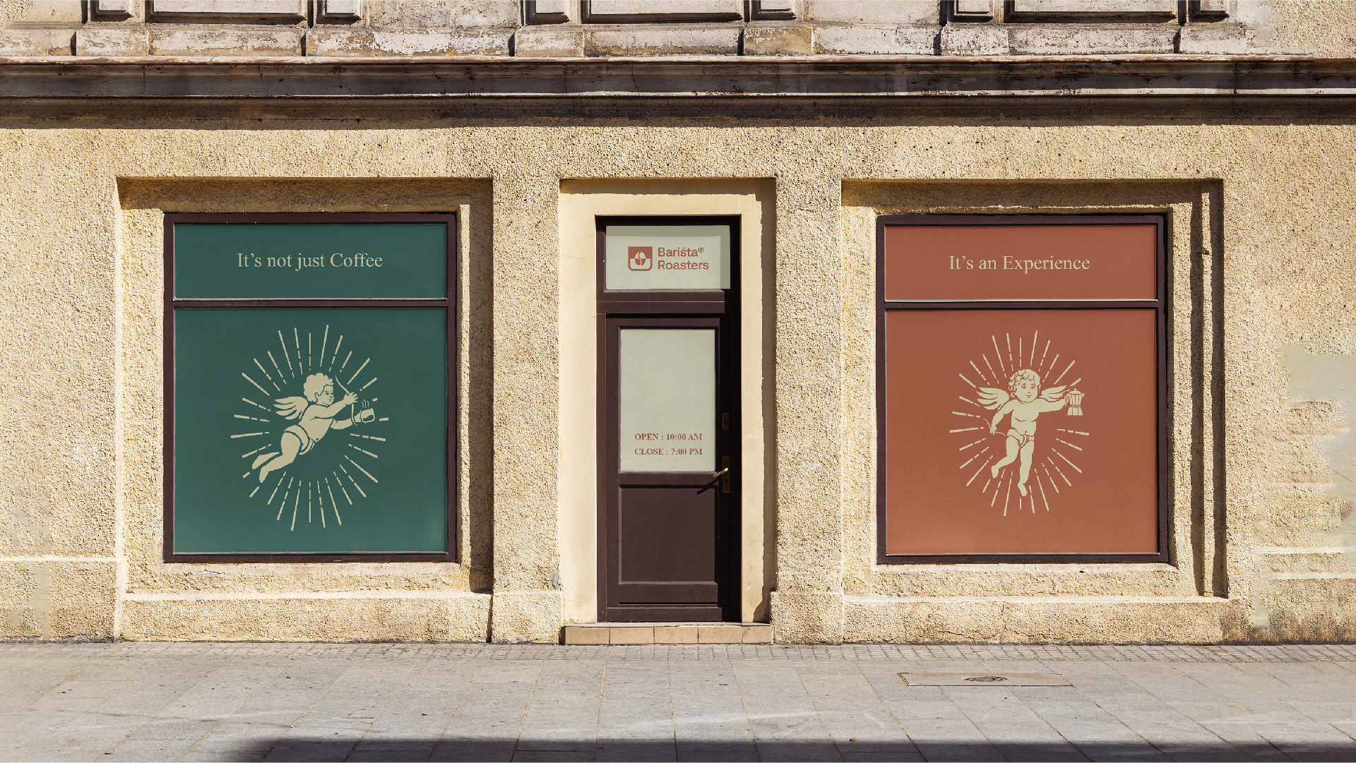
Letterheads with wax seals and framed cherubs, a shop front that says it is not just coffee, and a wall big enough for the angel to fly across.